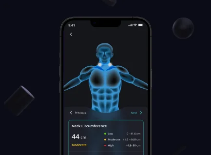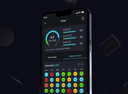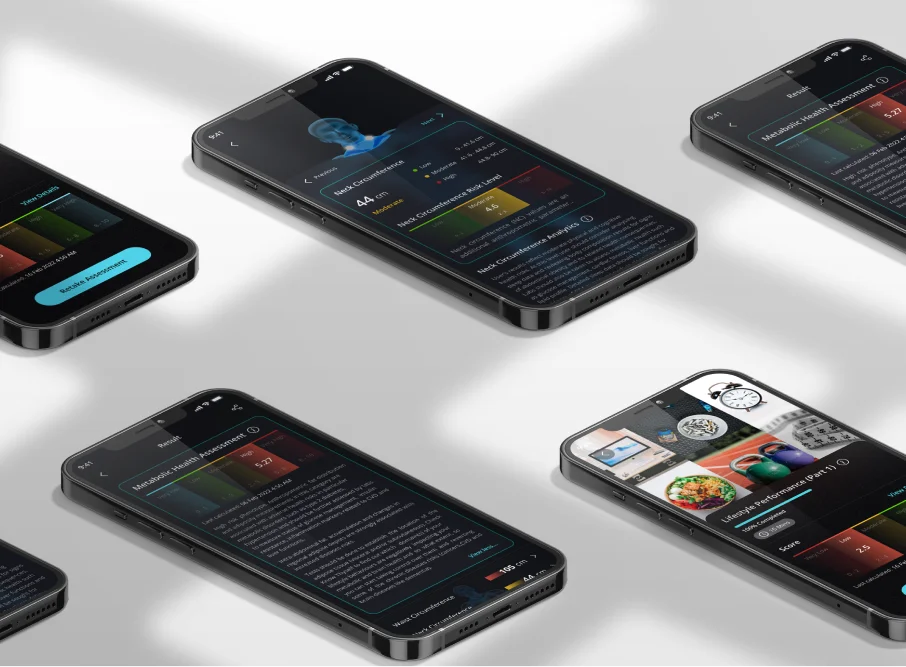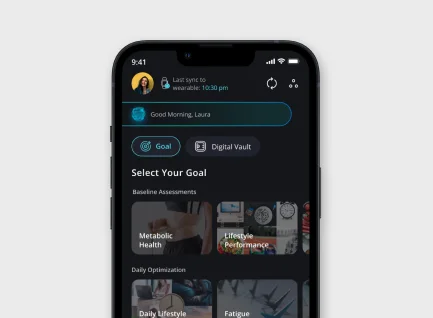

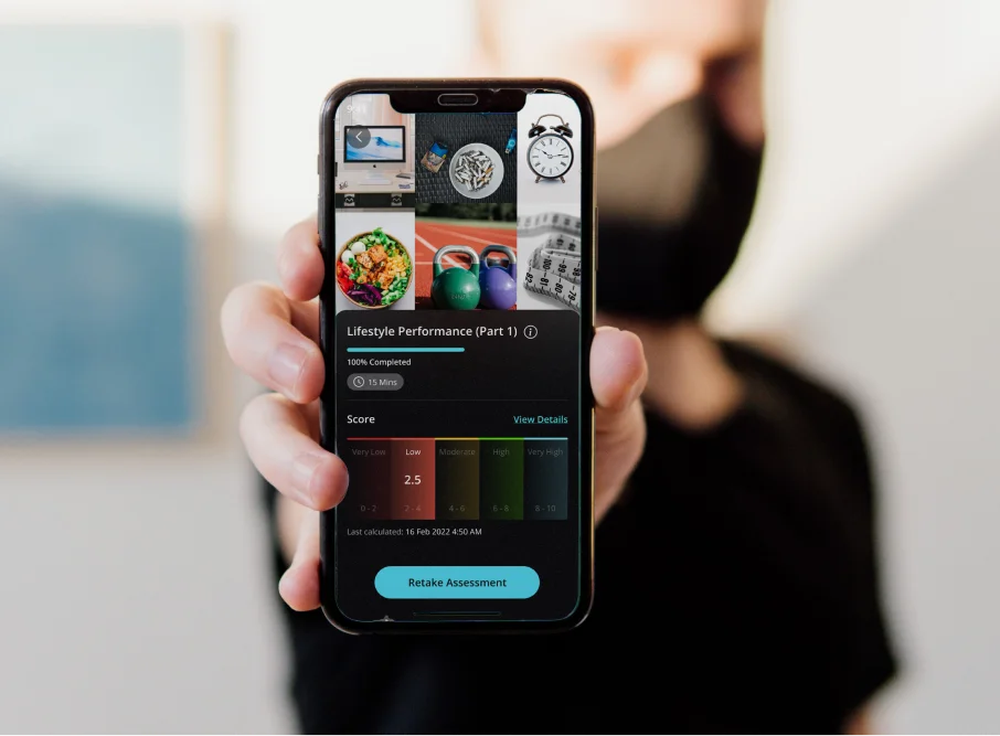
To solve readability challenges related to the usage of dark hues, our design team systematically improved contrast ratios and created subtle variations in color tones. This guaranteed that text and critical UI elements remained visible against dark backgrounds, improving readability and overall accessibility.
We focused on building a familiar yet unique interface to solve the challenge of including Detalytics 42 in users' existing tracking routines. The design included recognizable designs and iconography present in health-tracking apps, which reduced the learning curve for customers switching to Detalytics 42.
The onboarding process was made super easy. We implemented a short tutorial/guide during the first few screens to give guided instructions for user onboarding. After the user is onboarded the user will need to add their personal information like height, weight, country, and so on. This personalized approach guarantees that users get custom information to the app's features.
Our team combined real-time feedback and guiding features to meet the challenge of displaying a Lifestyle Impact Score (LIS) that is systematic and clear. This entailed deliberately inserting contextual prompts and notifications within the app to provide instant insights regarding user behavior and its influence on the LIS.
User Retention
Different Countries Users
Users Live Transformed Already
