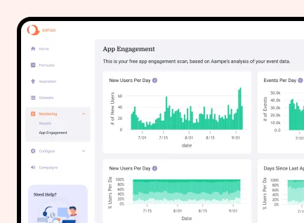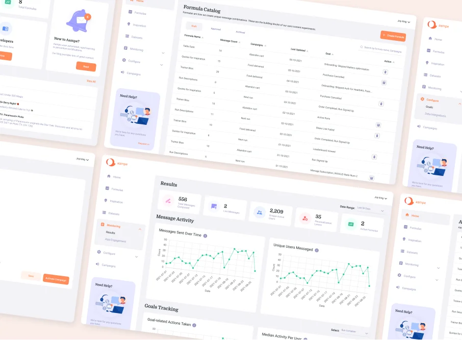
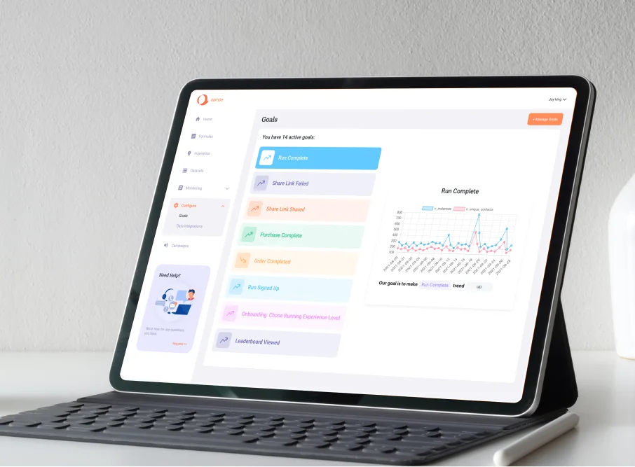
We created low-fidelity representations of the portal's layout, focusing on functionalities and content placement rather than design elements. Decide where different elements such as headers, footers, menus, buttons, forms, and content blocks will be located. Ensured that we followed the logical flow and intuitive user pathways defined by the customer.
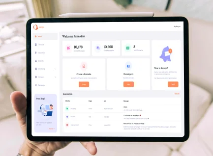
We developed a visually engaging interface. This involved choosing the appropriate color schemes, typography, icons, and other visual elements that align with the brand and enhance user experience. We ensured that the portal was responsive across various devices and screen sizes (desktops, tablets, mobiles).
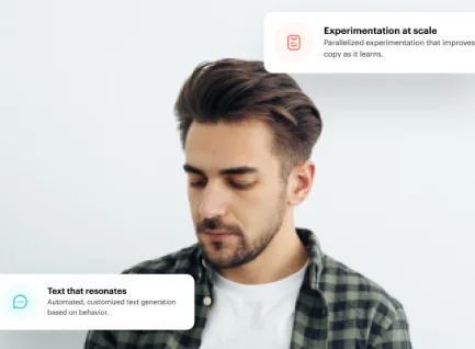
MindInventory designed a system that helped the end user create, publish, and manage messaging campaigns with ease. Once the campaigns were in motion we also helped them to track the performance and generate relevant analytics.
We conducted thorough testing to identify and fix bugs, usability issues, and ensure cross-browser compatibility. MindInventory also performed usability testing to gather feedback from users and make necessary improvements.

