Wireframing for Mobile App Development: Benefits, Types, Examples, and More
- UI/UX
- September 20, 2024
Good UI/UX designs are crucial for mobile apps to succeed, and wireframing, as a fundamental aspect of the design process, offers significant benefits in mobile app development. This blog post provides detailed insights into all aspects of mobile app wireframing, from the types and benefits of wireframing to examples and more.
Developing a mobile app without a wireframe is like building a house without an architectural blueprint.
Just as you wouldn’t start constructing a house without first creating a detailed plan to guide the process, you shouldn’t begin designing a mobile app without a wireframe.
Without a wireframe, the design process can become chaotic and inefficient.
Important elements might be overlooked, the user experience can suffer, and the overall vision of the app can become unclear.
To begin understanding more about mobile app wireframing, let’s first explore the fundamentals.
What is Mobile App Wireframing?
Wireframing is a process that involves creating wireframes, which are two-dimensional outlines of a mobile app’s structure and user flow. It serves as the skeletal framework of your app, including screen layout structure, navigation bars, menus, positions of buttons, input fields, placeholders of text/images/videos, visual hierarchy, not fully functional interactive elements, and more.
In the initial phase of the mobile app design process, the designs begin with drawing pen-and-paper sketches(known as low-fidelity wireframes) of the basic structure of the essential app screens. These sketches offer room for iteration, allowing UI/UX designers to collect feedback and refine the design to achieve an optimal user experience.
Now, let’s explore the various types of app wireframes.
Types of Mobile App Wireframes
From basic sketches that outline fundamental layouts to detailed, interactive wireframes that closely resemble the final product, these different types of mobile app wireframes serve unique purposes and provide distinct benefits.
So, let us explore each of these mobile wireframe types.
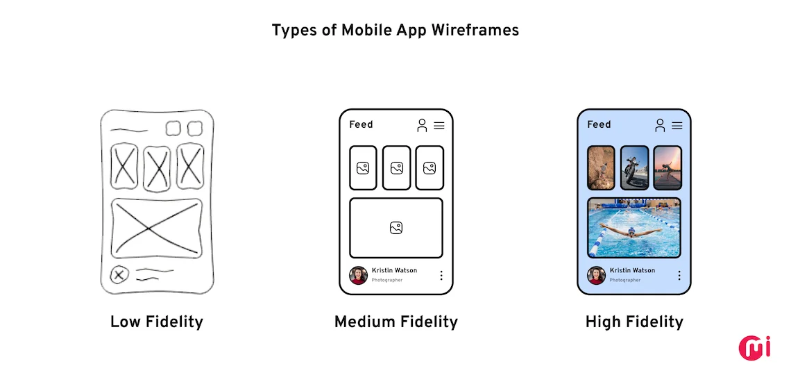
1. Low Fidelity
Low-fidelity wireframes are simple, basic representations of an application that are either hand-drawn or created using basic wireframe design tools. Critical to the conceptualization strategy, these wireframes focus on functionality and user flow rather than visual details.
This wireframe design consists of simple shapes, lines, and placeholder text, providing a clear representation of the layout without the distraction of colors, fonts, or images.
By using low-fidelity wireframes, UI/UX designers can lay a solid foundation for developing user-centered and effective mobile apps. These app wireframes are ideal for early-stage brainstorming and design exploration, as they encourage rapid iteration and prevent designers from becoming attached to specific visual elements.
2. Medium Fidelity
Medium-fidelity wireframes are useful for refining the layout and user flow established during the conceptualization stage. This design goes beyond low-fidelity sketches but is not as detailed as high-fidelity wireframe prototypes. They bridge the gap between early design concepts and detailed visual designs by connecting the conceptual leap between rough sketches and more polished mockups.
Although these wireframes include basic elements like typography and color(grayscale color schemes or simple shades), they still prioritize functionality over aesthetics. This stage allows designers and stakeholders to assess the application’s flow, make decisions on navigation, and determine the placement of essential user interaction elements like UI buttons, input fields, forms, and menus.
Medium-fidelity wireframes offer a balanced view of layout and functionality, facilitating effective communication, efficient iteration, and an improved user experience.
3. High Fidelity
With a close resemblance to the final mobile app design, high-fidelity wireframes include detailed UI elements (buttons, input fields, icons, navigation menus, and more), accurate typography (font style, size, etc.), and sometimes even content that mirrors what will be used in the final product. These wireframes often come with annotations that describe the functionality of specific elements and establish a clear visual hierarchy, guiding the user’s attention to key areas of the mobile app design.
High-fidelity wireframes may also include interactive elements, providing customers and developers with a clear view of how the product will function. They are particularly useful for testing specific interactions/user flows and gathering feedback from customers. However, they can be time-consuming to create and may limit flexibility in later stages of the mobile app design process.
To bring these wireframes to life, mobile app designers use a wide range of wireframe tools beyond just pen and paper, including Sketch, Figma, Adobe XD, Adobe Illustrator, Balsamiq, InVision, Marvel, Lucidchart, Whimsical, and more.
Key Benefits of Wireframes in Mobile App Development
Wireframes serve as a foundational tool that bridges the gap between conceptual ideas and tangible designs. By providing a visual blueprint of an app’s layout and functionality, wireframes help teams align on goals, streamline the development process, and enhance user experience.
Here we will explore the key benefits of using wireframes in mobile app development, highlighting how they can save time, reduce costs, and ultimately lead to a more successful product launch.
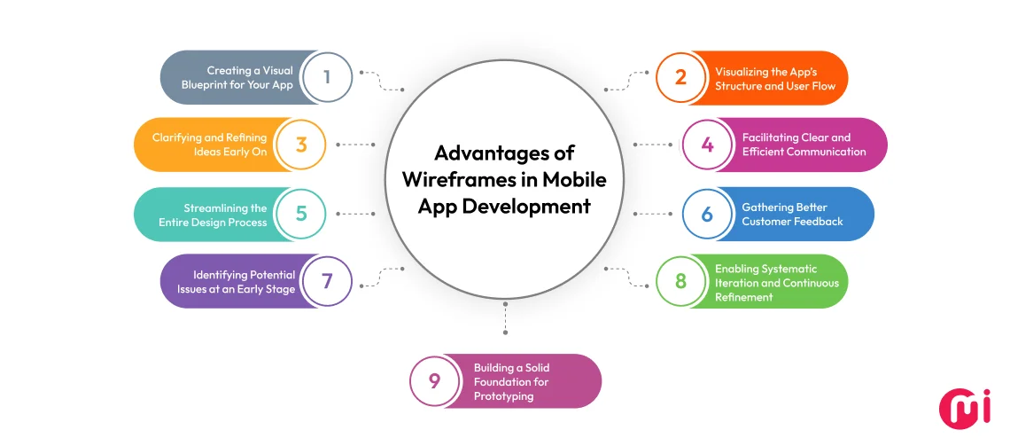
1. Creating a Visual Blueprint for Your App
Just as blueprints serve as detailed plans for construction, wireframes act as blueprints for mobile apps, providing a clear and detailed layout of the app’s structure, functionality, and user flow.
By offering a clear view of the app’s layout, wireframes ensure that everyone involved in the project has a shared understanding of how all aspects of the app will be organized.
2. Visualizing the App’s Structure and User Flow
For mobile app developers and designers, it’s crucial to visualize the structure and flow of the application before it is fully designed. UI wireframes, acting as blueprints, allow them to see a skeletal representation of the mobile app’s user interface.
It helps highlight the major components positioned on the screen and illustrate how users will navigate through the app, including the flow between different screens. This clarity allows the mobile app development team to visualize the sequence of actions a user will take and how the app will perform in real-world situations.
Overall, wireframes empower the team to launch a mobile app that is not only functional but also user-centric.
3. Clarifying and Refining Ideas Early On
Wireframes are dynamic and evolve through iterations based on feedback from customers. During meetings or user testing sessions, designers collect valuable insights that highlight areas for improvement. This feedback is crucial for refining ideas and making informed design decisions.
Additionally, designers test these wireframes for usability and user flow by simulating interactions and navigating paths. This early testing allows designers to refine the wireframes further, ensuring that the final mobile app design is user-friendly and intuitive.
4. Facilitating Clear and Efficient Communication
Mobile app development is inherently collaborative, often involving multiple teams with different areas of expertise. Having a concrete wireframe instead of abstract ideas allows all team members—designers, developers, project managers, and the customer—to understand the project’s direction from the outset. This helps ensure everyone is on the same page and prevents misinterpretations that could lead to inconsistencies between the wireframe design and the final mobile app.
Additionally, customers may not have a technical background, making it difficult for them to convey their ideas or understand complex design and development concepts. In such cases, wireframes can simplify the process, making it easier for them to grasp the wireframe design. This gives them confidence that their expectations are clearly understood and met.
Beyond customer interactions, wireframes are essential during development handoffs, providing a clear understanding of the app’s intended functionality, layout, and user interactions, to ensure that the final product aligns with the design team’s vision. Wireframes often include annotations and notes that explain specific features or interactions, further aiding developers in understanding the nuances of the wireframe design.
Moreover, wireframes can be used to facilitate discussions during team meetings, making it easier to address questions and concerns as they arise.
5. Streamlining the Entire Design Process
Though mobile app wireframing may seem simple, it involves crucial steps such as early-stage decision-making, gathering feedback from customers or users, iterating for refinement, and communicating with clients who may have a non-technical background. Failure in any of these aspects of the mobile app design process can lead to costly revisions, delays, misalignment of the project’s vision, frustration, and customer dissatisfaction.
By outlining the app’s structure early on, wireframes minimize the need for back-and-forth revisions between design and development teams thus streamlining the entire process.
Additionally, they enhance communication, ensuring that everyone involved in the project has a clear understanding of the app’s goals and how it will function, reducing the risk of misunderstandings or misaligned expectations.
6. Gathering Better Customer Feedback
One of the critical aspects of mobile app wireframing and even creating an app is obtaining ‘meaningful’ feedback. The visual clarity of the wireframes helps the customer see how the app will look and function before it’s fully developed. This enables them to review the wireframe and provide actionable feedback or clarification of their requirement that the design team can further use constructively to iterate, improve, and gradually evolve the mobile wireframe into a more polished and user-friendly UI UX design.
Along with this, the early and continuous feedback loop helps ensure that the final product aligns with the customer’s expectations, thereby improving overall satisfaction.
7. Identifying Potential Issues at an Early Stage
A mobile wireframe allows designers to create and test different layout concepts and interactions, which helps identify potential issues early in the development process. For example, if a wireframe design reveals that a navigation menu is too cluttered or a call-to-action button is not prominently placed, these issues can be addressed before advancing to more detailed design and development stages.
Additionally, having a visual blueprint facilitates collaboration between the development team and the client, aiding in the identification of potential issues that might not be obvious to the design team alone.
When issues are discovered later in the process, they often require significant changes to code, design, or both, which can increase development time and costs.
Therefore, taking a proactive approach by making adjustments and refinements based on early detection of issues before any actual coding begins leads to a more efficient development process and a more cost-effective project overall. It also helps ensure a smoother transition to high-fidelity designs and development.
8. Enabling Systematic Iteration and Continuous Refinement
Wireframes offer designers flexibility to explore various mobile app design approaches, allowing them to experiment with different layouts, navigation structures, and interaction patterns without the constraints of detailed visual design. This makes it easier to evaluate and decide which design choices work best in terms of usability and functionality.
Furthermore, through iterative review sessions, teams can collectively evaluate design choices, discuss potential improvements, and reach a consensus on the app’s direction. The iterative process driven by wireframes ultimately leads to a more polished and successful mobile app.
9. Building a Solid Foundation for Prototyping
Wireframes serve as the crucial foundation for developing prototypes. Prototypes, being clickable, are more advanced models that simulate the user experience of the actual mobile app. They allow users and customers to engage with the app’s functionality, navigation, and flow.
As a mobile wireframe outlines the placement of navigation menus, buttons, and content sections, this structure serves as a blueprint for developing a wireframe prototype for mobile app, where these elements can be made interactive and tested in various scenarios.

Examples of Well-Designed Mobile App Wireframes
To give you better insight into how wireframes serve as a foundational layout, guiding the development of both user interface and user experience, here are some examples of mobile app wireframes:
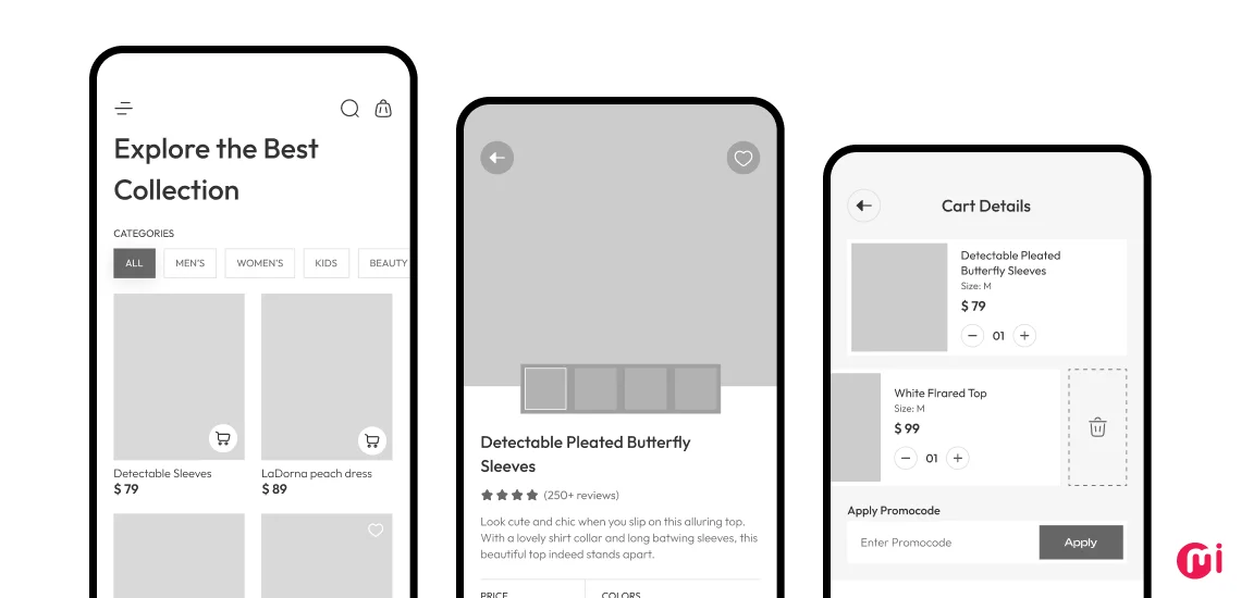
ECommerce Mobile App Wireframe
Here is a streamlined and user-friendly wireframe designed to enhance the online shopping experience:
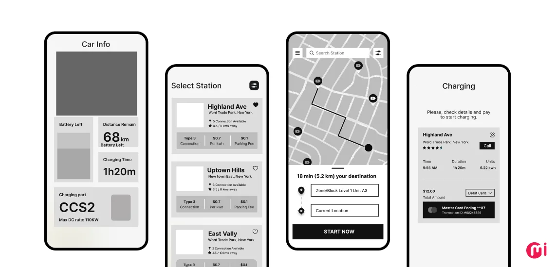
Car Charging MVP App Wireframe
Here the wireframe focuses on essential features for locating and managing car charging stations:
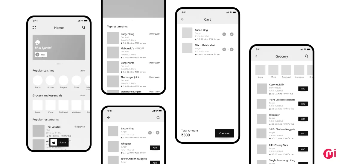
Food Delivery App Wireframe
Here is a wireframe illustrating a polished interface with seamless order and delivery tracking:
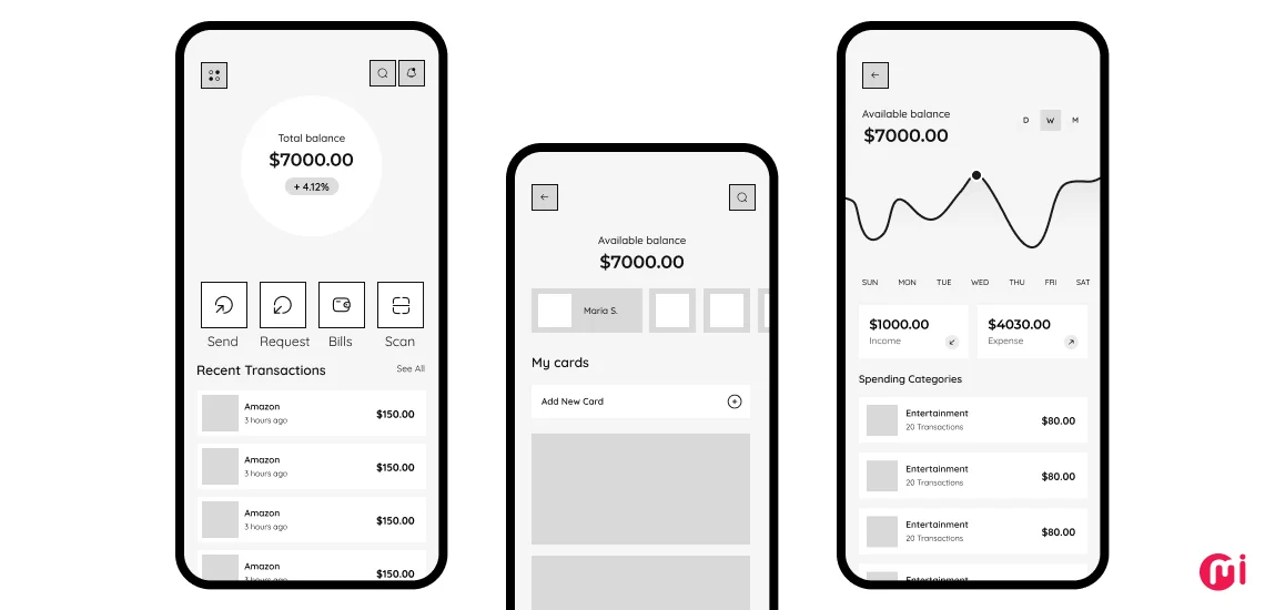
Expense Tracker App Wireframe
Here the clean and organized wireframe is designed to simplify budgeting and expense management:
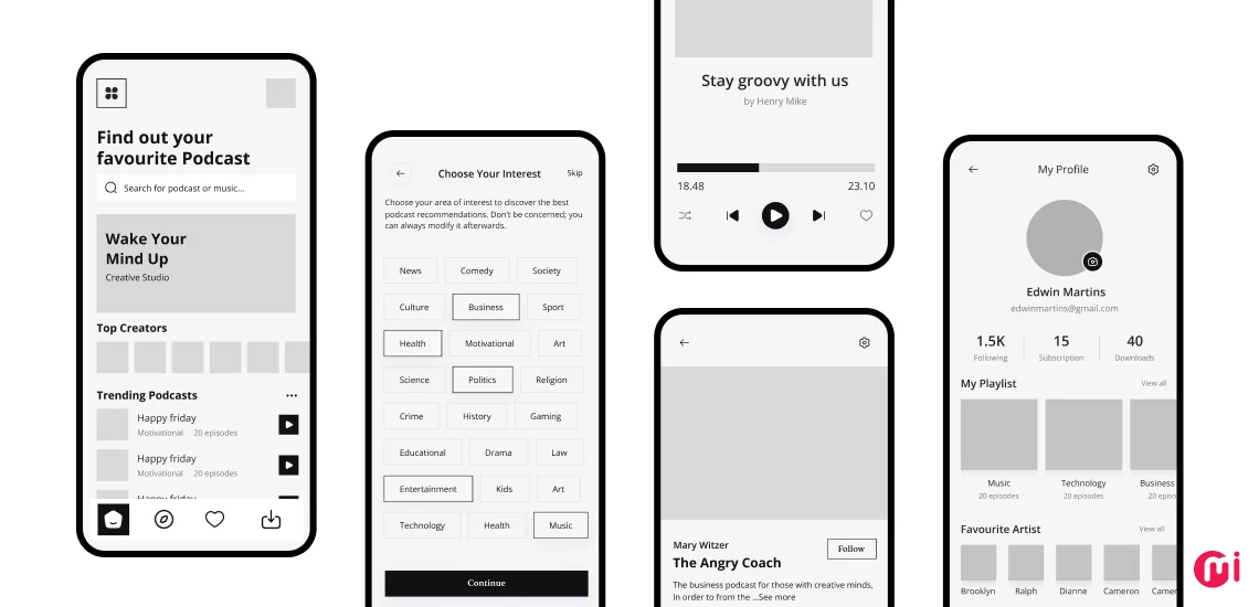
Podcast App Wireframe
Here is the user-centric wireframe highlighting easy access to episodes, playlists, and personalized content:
Transform Your Mobile App Vision into Wireframes with MindInventory
As a leading UI UX design company, we understand that the foundation of a successful mobile app begins with a clear, well-structured wireframe. That’s why in our collaborations with clients—such as the 6 Pack Promise app and EnneaApp—we meticulously crafted wireframes for their mobile applications, ensuring each app met functional requirements while resonating with users.
Our focus on intuitive design and seamless usability has led to significant outcomes, including over 10 million collective downloads and positive customer feedback.
Whether you need low-fidelity sketches for early-stage brainstorming or high-fidelity wireframes that closely resemble the final design, we offer solutions customized to your needs. Our UI UX designers for hire have extensive experience in wireframing and stay updated with the latest industry trends and best practices to deliver wireframes that are both innovative and effective.
If you are planning to create your own app, contact us now to begin transforming your mobile app vision into detailed wireframes with our expert design team.
FAQs on Mobile App Wireframing
The key difference between wireframes, mockups, and prototypes lies in the level of detail and interactivity they offer. Wireframes are basic, low-fidelity sketches that outline the structure and layout of a mobile app, focusing on functionality rather than design. Mockups are high-fidelity, static designs that include visual details like colors, typography, and images, providing a realistic preview of the app’s final look. Prototypes are interactive models that simulate the user experience, allowing users to test and explore the app’s functionality and navigation before development begins.
A mobile app wireframe should include the basic layout structure, key UI elements (like buttons, navigation menus, and content sections), placeholders for images and text, and an outline of functionality to guide the user flow and interactions within the app.
Wireframes are essential in UI/UX design because they establish the app’s structure and functionality, allowing designers to map out user flows and interactions before committing to detailed design. This ensures a clear, user-centered layout and helps identify potential issues early, leading to a more efficient design process and a better final product.
Mobile app wireframes differ from web app wireframes primarily in their design constraints and user interactions. Mobile wireframes are optimized for smaller screens and touch interfaces, focusing on simplified navigation and responsive layouts. In contrast, web app wireframes cater to larger screens with more complex interactions and greater content density, often incorporating additional features like multi-column layouts and detailed navigation options.
