Learn Everything About Visual Hierarchy – The Most Important Element of UI/UX
- UI/UX
- January 3, 2023
As a designer, you must have surely built a persona for yourself. But regardless of how you perceive yourself, I would like to tell you who you all are: A clan of colorful magicians! I consider you fortunate by noticing the fact that you have the absolute freedom to play with people’s eyes and minds with your eye-popping creativity.
Well, our topic for the day is quite similar to your freedom of playing with users’ minds. Today, you and I are going to talk about one such concept that’s invisible only when it’s properly undertaken.
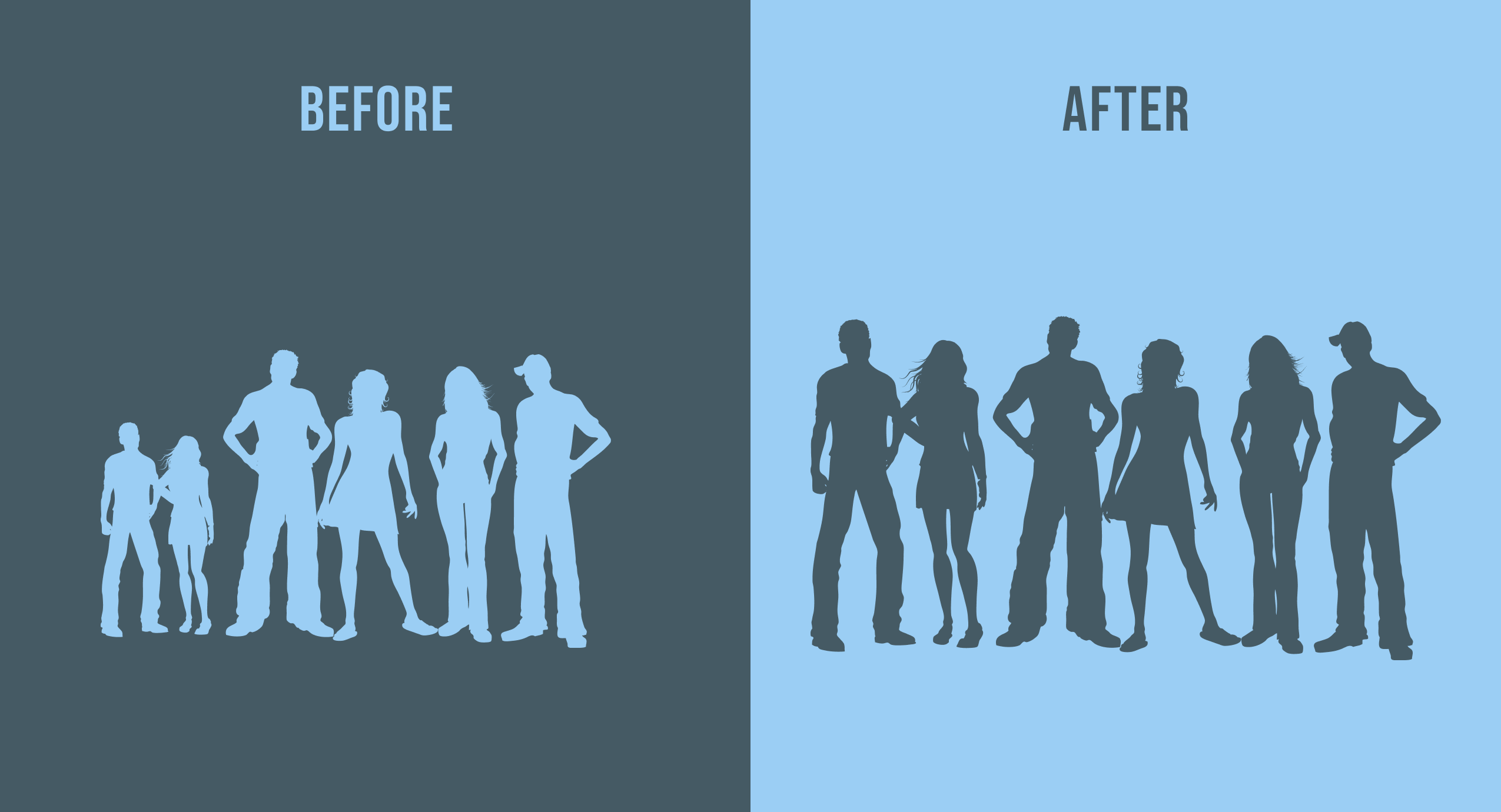
Astounded?! It’s nothing but the visual hierarchy. Yeah, now you got me, didn’t you? Although, this is just the beginning of discussing visual hierarchy in UI/UX. We are going to do a thorough analysis of this concept, starting from scratch to the happy ending. Let’s initiate!
What is Visual Hierarchy?
Visual Hierarchy is nothing but the concept of emphasizing the elements of UI as per their influence on the users, which, in turn, helps them reach a call to action seamlessly.
Designers, with the help of their skills, add the required amount of attentiveness to every element of the page that easily helps users decide the significance and order of every element and move accordingly.
What is The Importance of Visual Hierarchy in UI/UX Design?
Visual hierarchy is not just concerned with the design, it is concerned with user experience to a great extent. If done correctly, visual hierarchy in UI/UX design can lead you to unexpectedly significant results. Because a correct visual hierarchy does not trouble users with navigation, instead, it highlights the elements to grab users’ attention and ultimately help them take action.

So, the designer’s job is to carry out the process in such a way that seems so natural to users even though it’s manipulative in a positive way. Then only businesses can achieve their target users to offer them great deals ahead.
What Are The Key Principles of Visual Hierarchy?
Let’s learn about the principles that are key to achieving a flawless visual hierarchy:
1. Let users’ eyes catch the design as per the size and scale
This is the easiest way to draw users’ attention to any particular element. The user is certainly going to have a glance at the element that is the biggest of all; it easily catches users’ sight.
But, bear in mind, you being a designer are not supposed to expand the size of too many elements for the sake of aiming for users’ attention. Performing this gimmick with negligence will take the value of other elements downwards, and that is something you don’t want whatsoever.
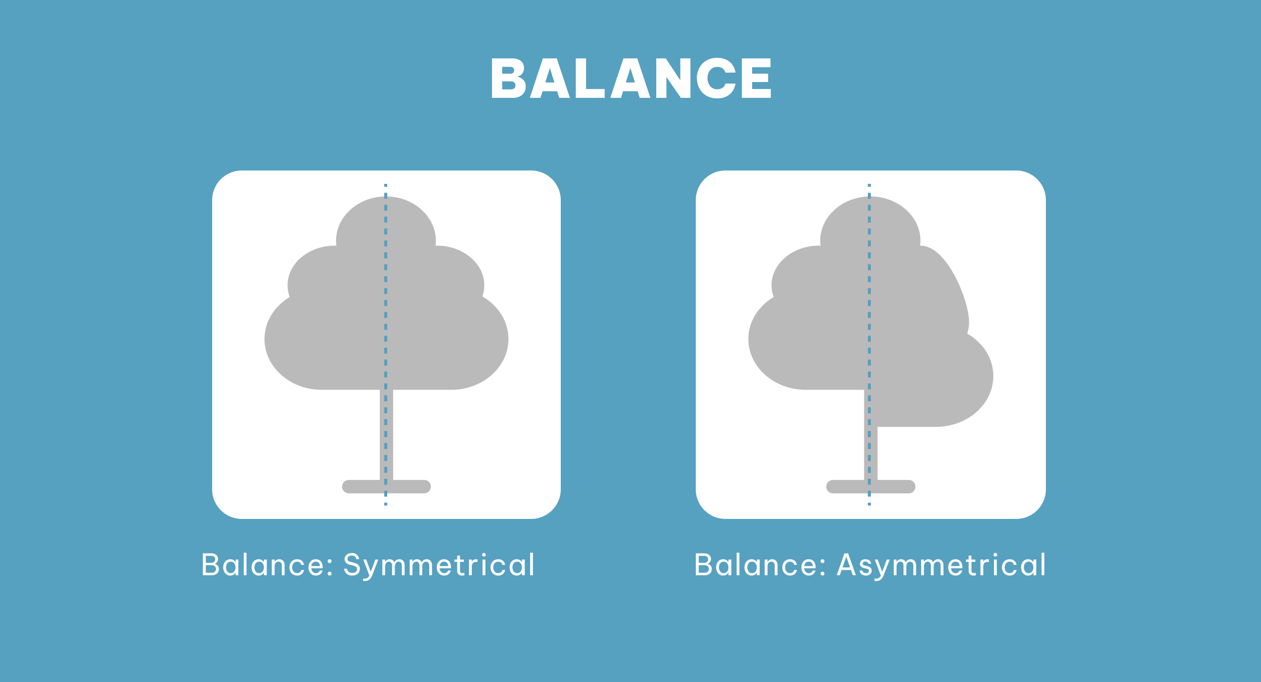
Here, the key is to embed the visual hierarchy by following the principle of enlarging certain elements of design that need to be noticed at first glance simultaneously by taking care of visual appeal.
In a nutshell, the enlargement of an element and other elements of design should go hand in hand and make complete sense to users.
2. Be friends with colors and contrast to create magic with them
Take a look at the below-mentioned image:

What did you notice about this image? Well, let us guess, instead of all the blue blocks all over around a single yellow block, that very single block would have caught you darting at it, isn’t it? This is the power of choosing a color as per the importance of every element.
Every color has a different psychology behind it that is connected with users’ emotions. That’s why there are the terms like red signals and green signals that people often use in different contexts. Unwittingly, we are pretty much connected with the psychology of colors.

Carrying color psychology forward, if I talk about contrast, it is somewhat familiar with the concept of color psychology; but still, it has a different purpose to serve. You, being designers, already know it helps you enhance the visuals and helps you add the enhancement as per the element’s vitality.
So, the combination of color and contrast is one of your secret sauces to implement the desired visual hierarchy in UI design.
That is why I address designers as a clan of colorful magicians that can play with human psychology and emotions in a whiter than white way.
3. Design according to the cognitive traits of your users
Generally, businesses opt for a two-dimensional design approach for their websites and applications. By playing with users’ perspectives, you can add an illusionary quotient to your designs by emphasizing the elements you want to seek your users’ attention on.
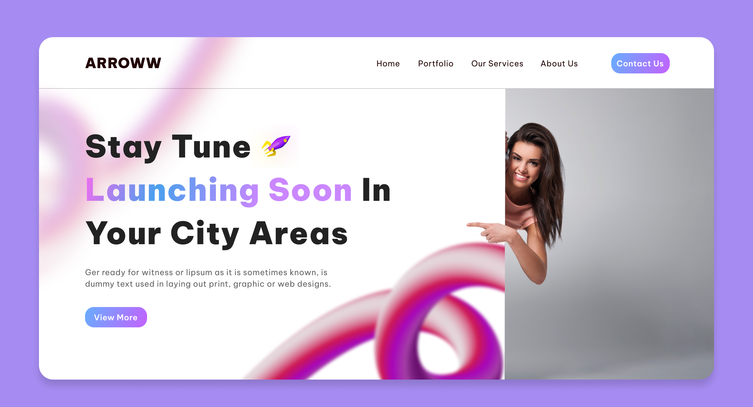
You can always opt for 3D design elements, animation, and other stuff. Also, you can increase the size of the elements that are mentioned above already. You can opt for these techniques to bring an illusionary feel to your design.
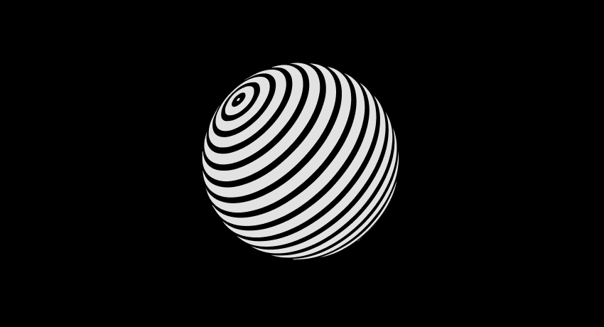
The idea is to grab users’ attention in one go just to make sure they reach the call to action and then, yes, your purpose is served.
4. Pay attention to users’ viewing patterns
Here I am talking about the most misprized principle of visual hierarchy. Paying attention to users’ viewing patterns could be considered a trivial thing to be taken into account by some of us. But it is actually something that helps you understand the users’ psychology to the core and design accordingly.
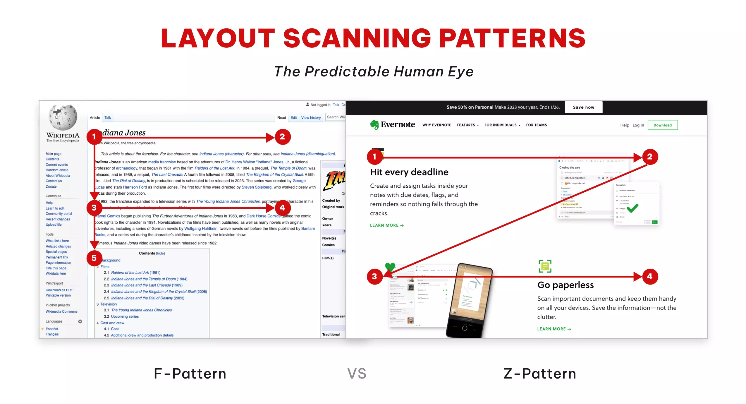
Everyone has their own pattern of checking out the design, many people tend to follow the same patterns with certain variations of viewing the design. Of all the viewing patterns, the most common ones are the F pattern and the Z pattern. Let’s learn about these two patterns.
The F Pattern
This kind of viewing pattern is for text-oriented pages like articles and blog pages. In the F pattern, users are prone to scan the content from the top left to the top right pattern and move toward the next line with the same pattern.
When you are designing the layout of the page according to the F pattern, the user shall go through the first few lines of the page taking note of almost all the details. But as he/she will move downwards, he’ll tend to pay more attention to the left side as he will develop a tendency to scan the content with the F pattern only. So, designing the layout as per users’ tendencies would lead you to obtain desirable results.
The Z Pattern
The Z pattern directs users from top-left to top-right, then down to the lower left, and across to the lower right.
This pattern is the best option when you want the users to check out every element quickly and get an idea of where you emphasize the significance of each element.
5. Play with typefaces to leave a distinct impression on users
Let’s learn about these 2 typeface usage techniques:
Emphasize the hierarchy of Typography
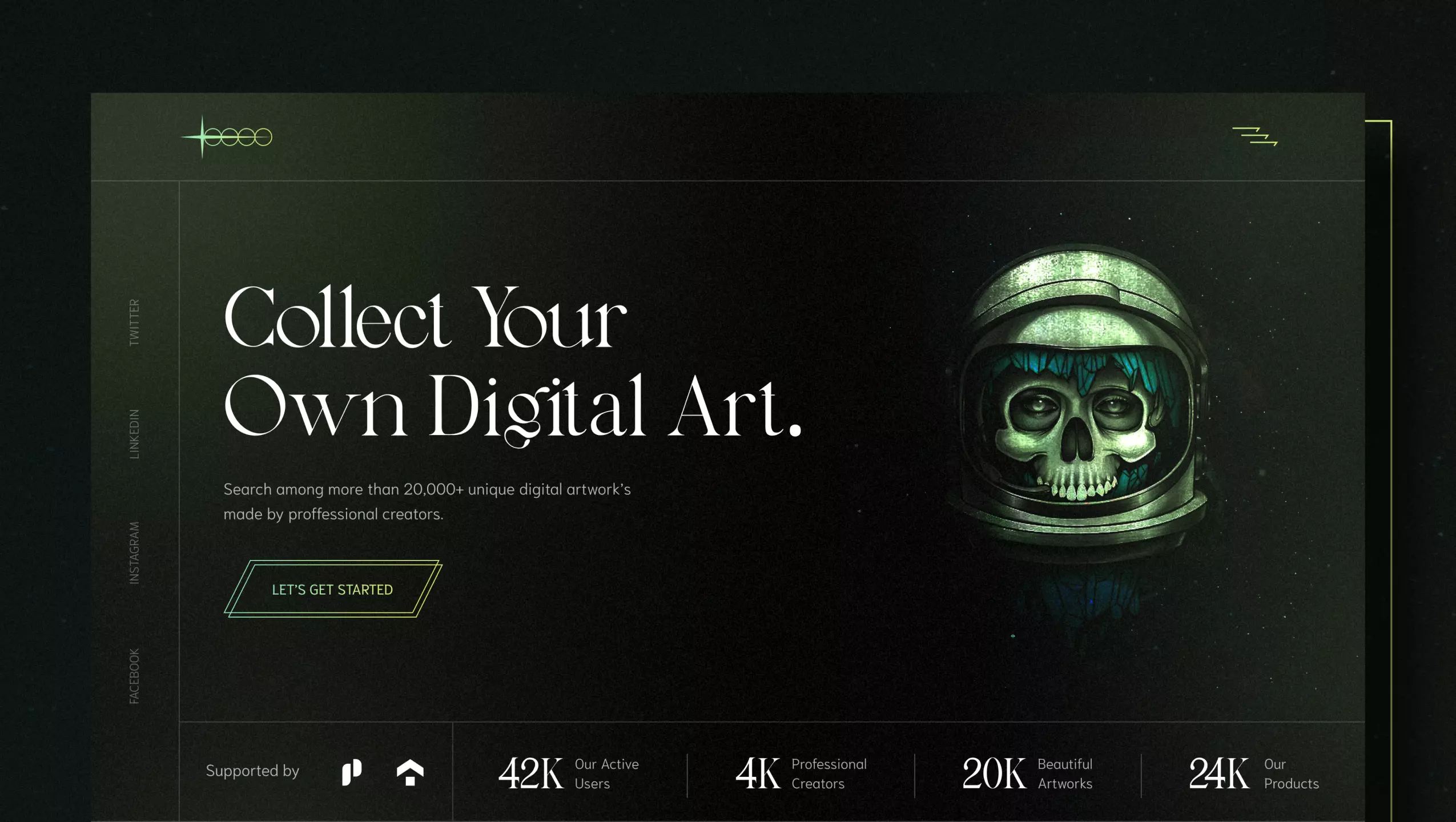
Using fonts that draw users’ attention is something that helps them reach the call to action rapidly. The below-mentioned image is an ideal example of the same. Adding fonts that are the epitome of emphasis themselves are the surefire way to catch users’ first glance.
Here you can have your copywriter do the magic with his/her words and make users reach the CTA.
Choose fonts that are in line with your brand voice
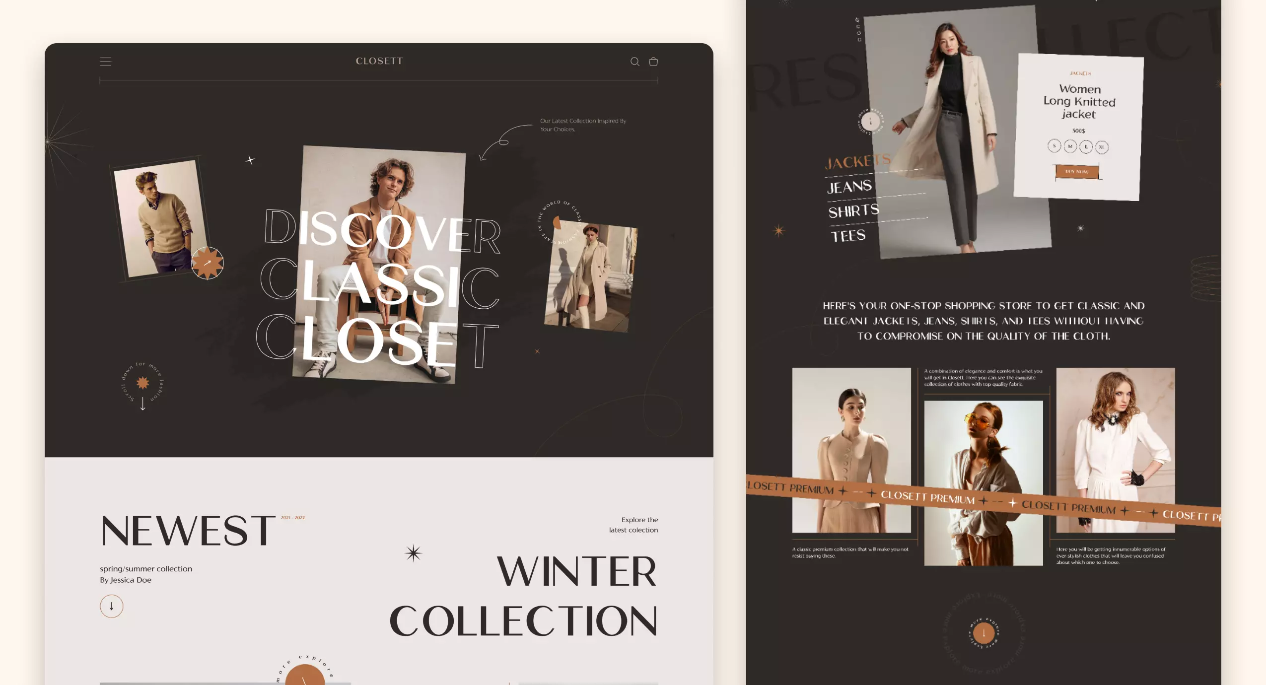
While you are in the process of choosing the typeface, putting light on this concept on a serious note would definitely make you thank yourself a ton in the near future. As your font speaks for your brand while users are interacting with your product. So, ensure choosing the fonts after a meaty analysis.
6. Significance of Negative Space to grab users’ attention
IDEALLY, MAKING THE BEST USE OF SPACE IS TO FILL IT! But have you ever seen any creative following a legit process like the rest of the world does? Haha, you know what I mean! In design, the best use of space is something that this guide can teach you the best.
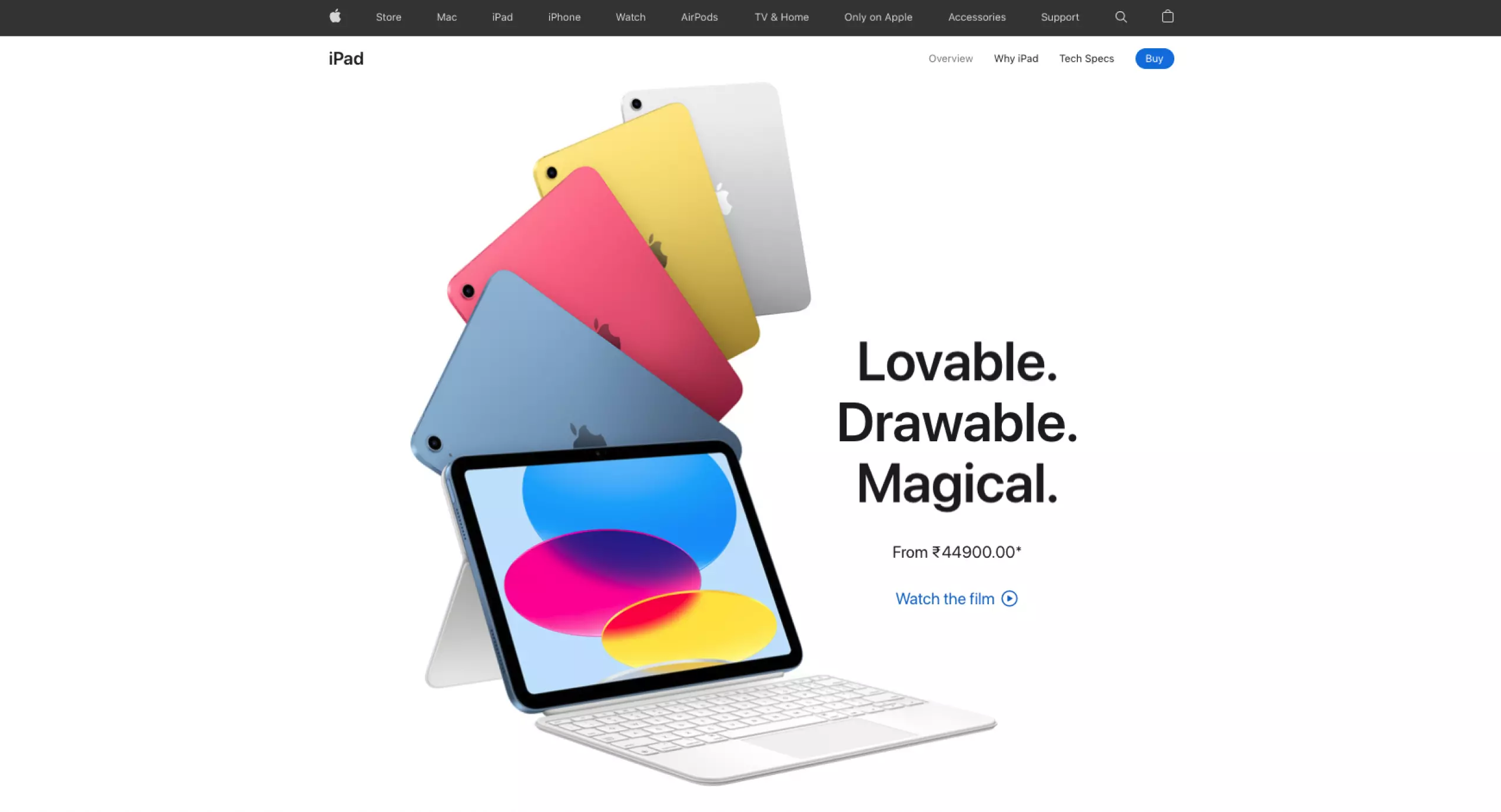
Now, do you agree that minimalism leaves a maximum impact on users? In the concept of UI/UX design, less is more! So, make sure you are putting your creative cells to work and create the best piece out of the negativity?.
7. Experiment with texture and tone
In the process of underlining the elements of higher priority, you can still create emphasis on the elements that are not as important as the underlined elements, but neither are they worth ignoring in the UI.
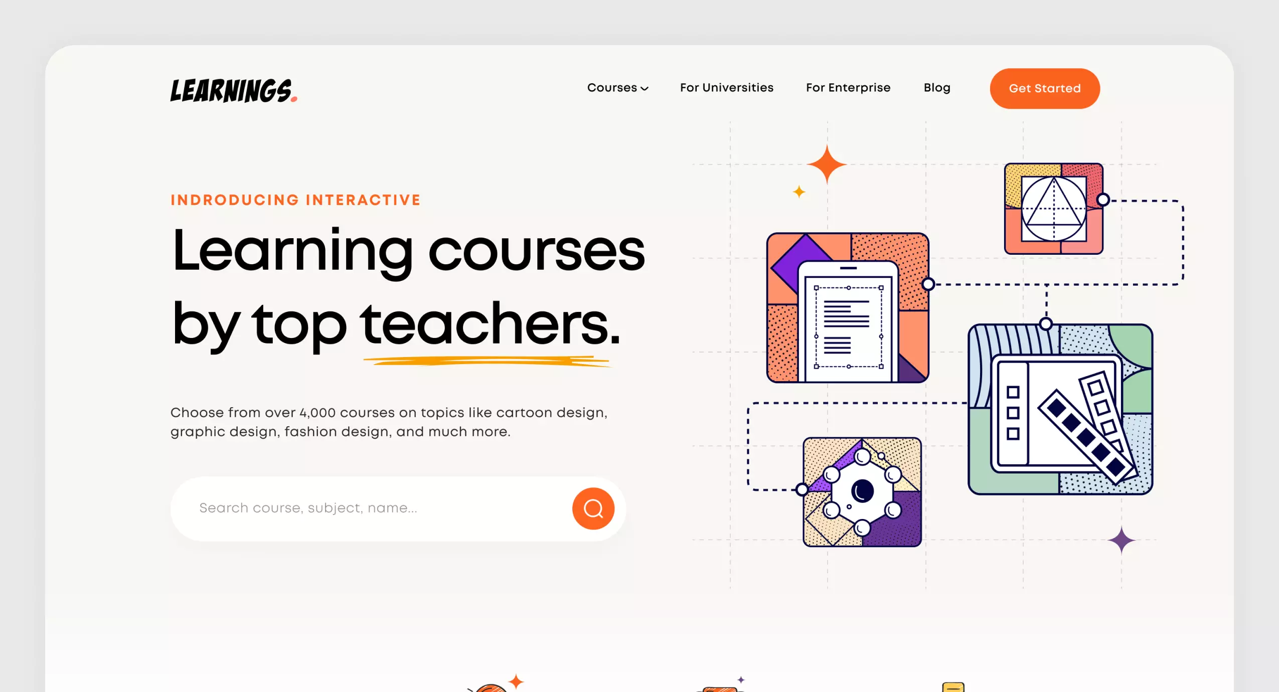
In the above image, almost every element of UI could be easily read, possibly by everyone. This is an example of a smart and functional UI. In this design, they have clearly set the hierarchy that’s why we are giving every single element a view as per their decided order.
8. Alignment is the key
When the alignment is done right, you do not really have to do the job of emphasizing it; the right alignment is enough.

The above image explains the meaning of alignment to the core. When the alignment is carried out correctly, the user does not need to see the imagery with imaginary grid lines; he or she will automatically get the drill of interacting with the UI of an app, product, or web page.
9. Vicinity in the elements of UI
However, it might seem to be a contradictory statement to the principle of negative space; yet this is also one of the prominent principles of all. But, let’s make this clearer to you all, proximity among elements is not supposed to fill in the space unnecessarily.
It’s about executing a sense of connection among all the elements!
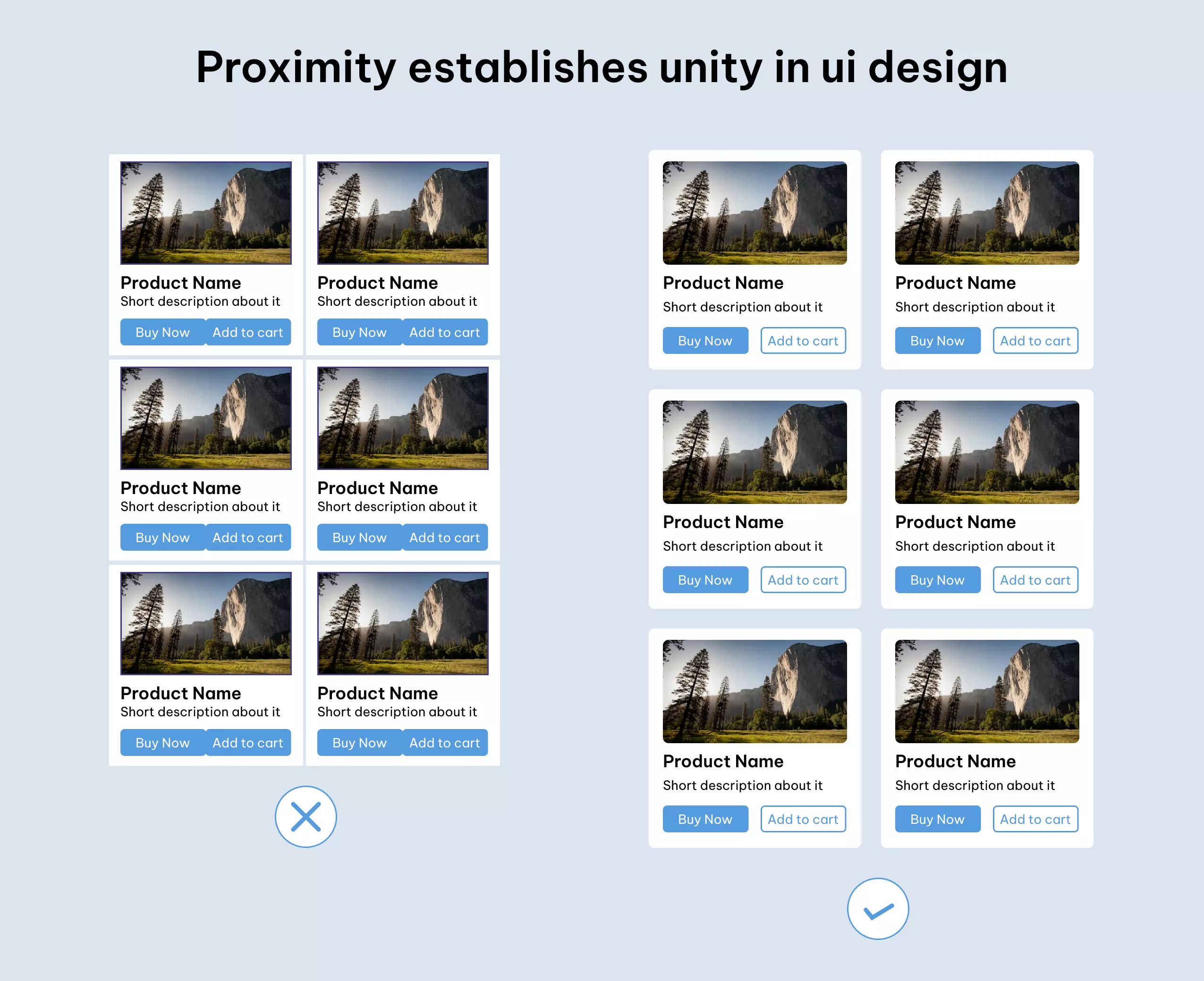
As per the image you have seen above, the law of proximity forms a strong bond in the design. To help your design connect with the user in one go, you, as a designer, have to establish a connection between all the elements of UI by creating a fair balance of space between elements.
10. Majesty of Motion and Animation in the Design
A little MOVEMENT in your design can make your target audience’s eyes STOP and stare at the design!

Motion adds a sense of spark to the design and allows every element of the design to play its part at its best; ultimately helping visual hierarchy serve its purpose.
An apt usage of motion not just acts as an amplifying agent in your design, it becomes the voice of your brand that speaks your niche and reaches the audience more dramatically with its dramatic characteristics.
So, these were the top 10 principles of visual hierarchy that are the ultimate best friends of designers to create magic with their creativity.
Here I sign off
The concept of visual hierarchy is as simple as it seems but far deeper than it is perceived. Though, the thumb rule is, to begin with, baby steps; in the quest of obtaining the perfect visual hierarchy in your UI design, you might end up coming across a different picture.
The drill is to start simple and focus on that one thing of the highest significance that’s going to help drive your design toward success. Moreover, this is the crucial time when you can approach experienced and steadfast UI UX design company that assure you to help with result-driven solutions.
FAQs on Visual Hierarchy
The elements of visual design are line, shape, negative/white space, volume, value, color, and texture which clearly explain the building blocks of a product’s aesthetics.
Visual Design creates a great impact on our ideas of quality, effectiveness, energy, and importance. It relatively amplifies the way your work affects others by using the 5 C’s: Content, Consistency, Color, Connection, and Clean.
A grid is a frequently used element as an underlay to a design, to oversee the positions of elements. A grid can help accelerate that hierarchical process and make it easier too.
Visual Hierarchy is mainly used to rank design elements and emphasize them in the order you want your audience to view them. By using principles like contrast, size of elements, balance, viewing pattern, and more, you can help establish each element of design in its suitable place and help the element of the highest importance look the most prominent of all.


