10 Major UX Design Principles to Watch Out for in 2025
- UI/UX
- November 26, 2023
When you start exploring the world of app or web design, you will quickly come across user experience (UX). However, UX design is a long field. And despite its popularity, very few designers have an idea about it.
Many designers believe that UX design concentrates on the user, but using this principle in real can be pretty more challenging. So, what are the factors that UX designers should deal with while building a new experience for users? Which rules can differentiate good products from bad ones? Check out this blog!
What is UX Design Principle?
User experience design focuses on understanding user requirements, their need for a product, and their restrictions. And designing beautiful components using user experience considers your objectives. The best UX design principles and systems facilitate user interaction quality, your product’s concept, and associated services.
In a nutshell, user experience design principles provide a strong foundation for creating robust solutions through new design patterns, interaction models, and progressing standards.
Top UX Design Principles
Here’s the list of the best UX design principles to show the capability of UX designers and the diversity of the UX world. Let’s read on to learn more!
1. User-Centric Design
This design fundamental is about understanding how to use our empathy when making design decisions in a product. Designers always want to make the best product using their high standards, which can cause them to decide depending on their preference. But a good UX design should be customizable for users, which means forgetting your opinions and preferences.
After all, you will design for the users. So, their wishes, pain points, opinion, choices, and requirements are crucial. You must invest your time and effort in knowing your users.
2. Consistency
Users want products to maintain consistency with the products they have earlier used. If your product is familiar to users, they will easily learn it with a better experience. Therefore, designers don’t need to rebuild every design part.
As consistency is crucial, designers usually move to design languages. A design language is a set of instructions for creating products for a specific format or device. For example, you will need to follow Apple’s Human Interface Guidelines for designing iOS apps. You might need to refer to Android’s Guidelines or Google’s Material Design Guidelines for developing Android apps.
3. Accessibility
Considering accessibility and design is one of the vital UX design rules. The designer must ensure that many people can use the method. Moreover, it implies that people may also use the UX design that features some flaws. As a designer, you need to ensure that there are no hindrances.
One example of how accessibility in design helps users is putting labels outside text entry fields rather than inside them. It supports screen readers reading them for visually challenged users, although it notifies them what data goes in every text field. Likewise, utilizing a high contrast between background colors and text helps visually challenged users and users in low-light settings read the screen properly.
4. Hierarchy
Hierarchy is another key UX design principle. Using this method at the initial design stage gives you several benefits. It allows the users to browse your app or website more easily and discover what they are searching for. Furthermore, it is crucial because it enables you, as a designer, to see precisely how your app or website functions.
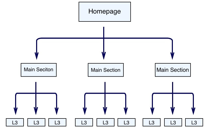
It can ease your function as a designer. Using the hierarchy method in the design must begin with creating an information hierarchy. You can use it for building a site map. And from the site map, you can create a design hierarchy that can interlink your pages logically and consistently.
5. User Control
User control forms in several ways in UX, but users usually have a great experience controlling their activities and using your product. A crucial part of user control is allowing users to correct their errors.
For example, when a user starts building a new item like an event or email, a Cancel button must let him leave the task. An Undo button can also save them for reversing an unwanted or unintended activity.
Another method of improving user control is helping more progressed users boost their efficacy. Keyboard shortcuts can help in this matter. Moreover, macros and templates can also help users achieve repetitive actions more effectively. Combining products and features can also help users move content, and advanced searching helps them discover what they seek more effectively.
6. Context
Context is a crucial part of users’ interaction approach with your designs. In this matter, context means focusing on the devices users can use to access your mobile app or web page. Furthermore, it focuses on how mobile browsing is major web traffic.
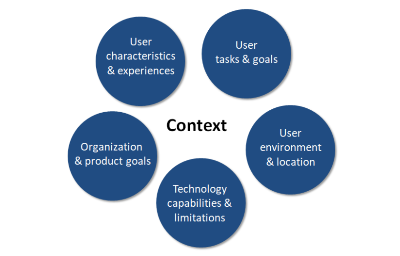
Contextual designing also means focusing on many other factors. Usually, location is a contextual factor, but you cannot overlook many other factors, such as users’ emotional condition, the available time, and the gadget they will use. These factors will perhaps decide the users’ behavior once your design creates a strategy to boost the user experience.
7. Usability
Designers are cautious for several reasons regarding their design’s usability. Creating better usability is the best thing to offer the users. It’s about checking whether your users can do activities comfortably, your product functions properly, and it does its job. Your product may fail to serve the users if its usability fails.
The main challenge for beginners is that usability does not handle black and white. Many design teams follow different rules of good usability. The main thing with this UX design rule is that beginners know the necessity and flexibility of usability in their tasks.
A few teams follow higher usability standards that can be tough to reach. Moreover, this convenience enables design teams to fix the bar very low, creating a susceptible product to puzzled users or user disclaimer.
8. Animations
Animations are one of the best ways to please your users. They add movements to your website and give a real experience to the target audience. Animations can help the target audience know about a website’s functionality if done correctly.
Moreover, the target audience will possibly keep the smallest details in mind. Thereby, it would help if you did not skip the animation as playful pleasure works unimaginably.
9. Confirmation
Designers’ main target is to prevent mistakes. When users unintentionally delete a product or make a payment, they get a poor experience. Needing confirmation for an essential or permanent activity is one of the best methods to resist such errors.
The confirmation allows users to change or cancel an unintended action or think about something again. For example, an order confirmation screen enables you to recheck the entire order details instantly before buying online.
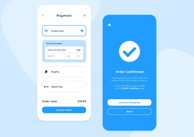
As confirmation activities need additional effort, you should use the ones with an essential effect. Another example is Gmail, which requires users to confirm before deleting bulk emails, a permanent action.
10. Storytelling
As a UX design principle, storytelling means making a product that effectively communicates with users. Users prefer stories, and storytelling works more visually in UX. Design teams use videos, text, imagery, and animations to make the whole screen talk to the user.
Visual storytelling makes a long-lasting impression on the user and evokes emotion. Although it can strongly broadcast a new campaign or brand recognition, visual storytelling has other uses also. It can make data easier to include, like infographics. Moreover, it can amazingly approach user onboarding and enhance its learnability.
Making a compelling UX design is the first priority for designers. This blog explains 15 best practices for mobile UX design to attract and convert your target audience.
Bottom Lines
UX design is an exciting, quick, and strategic function that can be uplifting. Many mobile and web UX design principles apply from small to large-scale design. Paying attention to potent users, describing and achieving business goals, embracing trendiest technologies, planning data design, using designs by different methods, taking care of consistency, and considering users’ requirements a priority will assure a constant user experience.
If you want to develop your business using the latest and current technologies, ensure to update your design techniques and team up with a UI/UX design company that understands the rapidly changing market requirements. Be sure to choose the best one to hire UI/UX designers from – known for delivering quality results through impressive digital product designs.

