Common UX Button Types and Best Design Practices to Follow in 2023
- UI/UX
- March 19, 2021
While people don’t notice them if they are executed inappropriately, buttons are an important element that creates a productive and positive user experience. UX buttons are usually styled links to attract users and drive them in a specific direction. Through buttons, we can link to other pages or finish tasks like a form submission or buying online.
Sometimes we use them as CTA (Calls to Actions) when we need our users to finish their actions on our website. If you are thinking about enhancing your button design for making it simpler for your users to click through, take a look at this guide to learn the most common types of UX buttons and best practices of button design. This will help you keep your user journey seamless and hassle-free on your website.
What is a Button?
Being an engaging and interactive element, a button allows getting the interactive feedback that is expected from the system following a specific command. It’s a control that enables users to communicate directly with a digital product and sends important commands for accomplishing a specific objective.
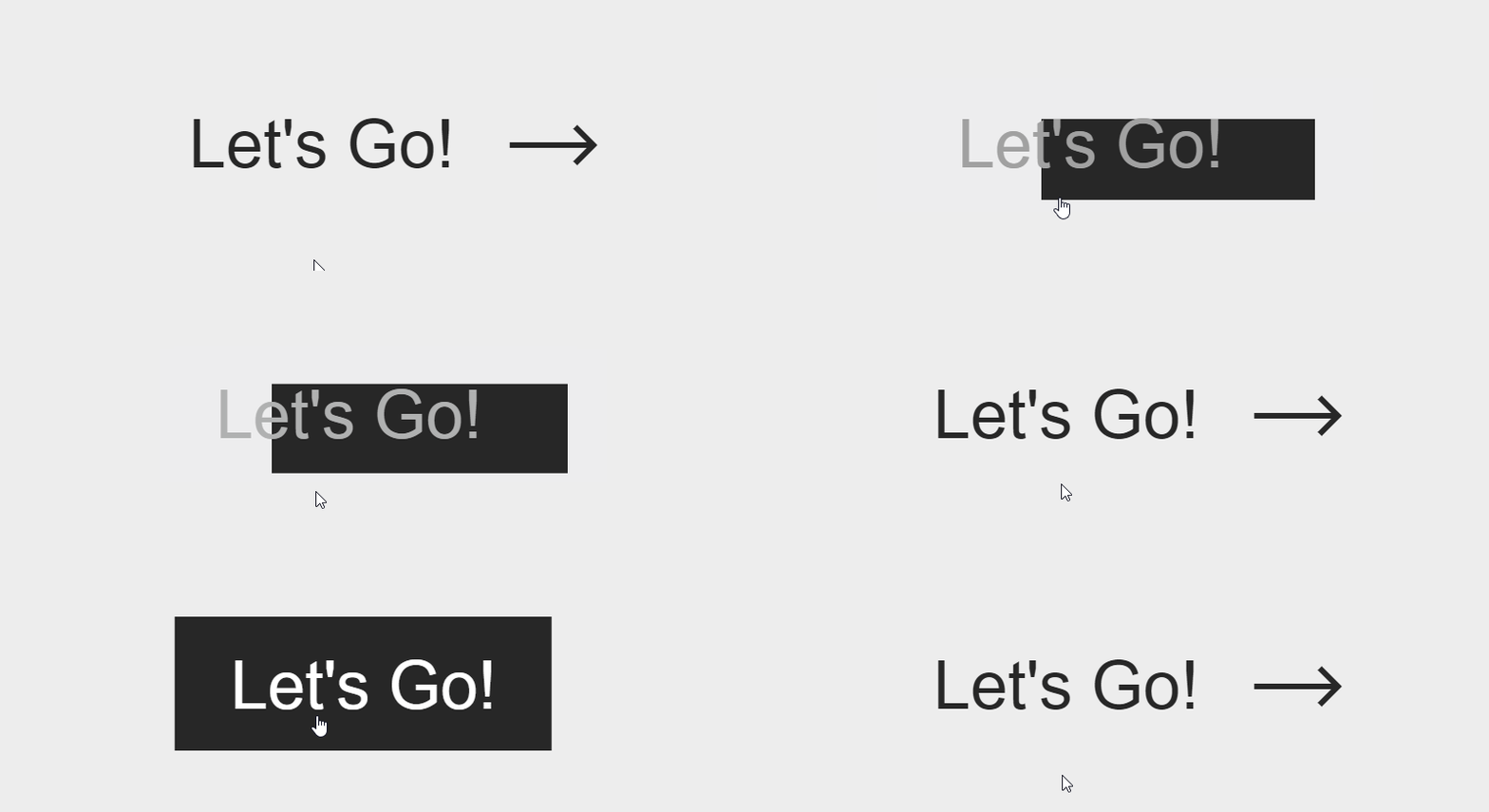
Modern UX buttons are popular due to their effective imitated interaction with the physical objects and user-friendliness. These buttons have different functions to meet different purposes. They present an interactive zone that is generally marked out for having a specific geometric shape and visibility. Designers must utilize significant time and effort for designing noticeable and effective buttons.
Common Types of UX Buttons
Buttons enable users to make choices and take action, with just one click. Users can take the actions communicated by buttons. Usually, they are placed throughout the website UI and buttons must be recognizable and easily findable while signifying clearly the action they enable a user to finish.
Here are the major and common types of UX buttons:
1. Dropdown Button
When you click the dropdown button, it shows a drop-down list of unique products. Sometimes, you can see the same type in the settings button. If a user selects an option in the list, it is generally labeled as active, for instance by color.
2. Text Button
These buttons are text labels that happen outside of a text block. The text must explain the action that will happen in case a user taps or clicks a button.
These buttons comprise a low level of stress and users use them for less crucial actions. Since text buttons have no container, they cannot distract from adjacent content.
3. Hamburger Button
This button hides the hamburger menu. So, if you click on it, the menu extends. It’s an extensively used engaging element of mobile and web layouts these days.
Moreover, hamburger menus free the space creating the UI more airy and minimalist. It saves lots of space for other essential layout elements.
There are arguments against the hamburger menu depending on the fact that it can make people confused if they don’t use websites frequently. So, it may impact badly on navigation and can result in poor user experience. Hence, do proper user research before applying the hamburger button.
4. Toggle Button
Toggle buttons enable users to change the settings between 2 or more states. These buttons can be utilized as the On/Off button. Moreover, you can use them to group associated options. But make sure to arrange your layout in a way to convey that specific toggle buttons are part of a group.
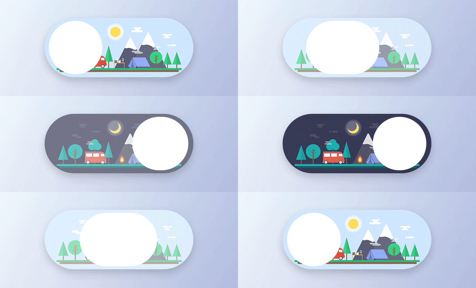
Source: Toggle
There must be at least 3 toggle buttons in a group. Moreover, toggle buttons need label buttons with icons, text, or both. Icons are required for toggle buttons that enable one option to be chosen or not chosen, like adding or removing a star to a product. Icons are usually found in toolbars, app bars, toggles, or action buttons.
5. Floating Action Button
This button is a part of Google Material Design. This is a circular material button that showcases and lifts an ink reaction if you press it. You can use this button for a promoted action.
A circled icon floating above the user interface makes this button remarkable. This button has motion behaviors incorporating a transferring anchor point, launching, and morphing.
6. CTA Button
A CTA (Call to Action) button is another engaging element of UI the main objective of which is to encourage users for taking a particular action. And this specific action presents a conversation for a certain screen or page. In short, it converts a passive user into an active one.
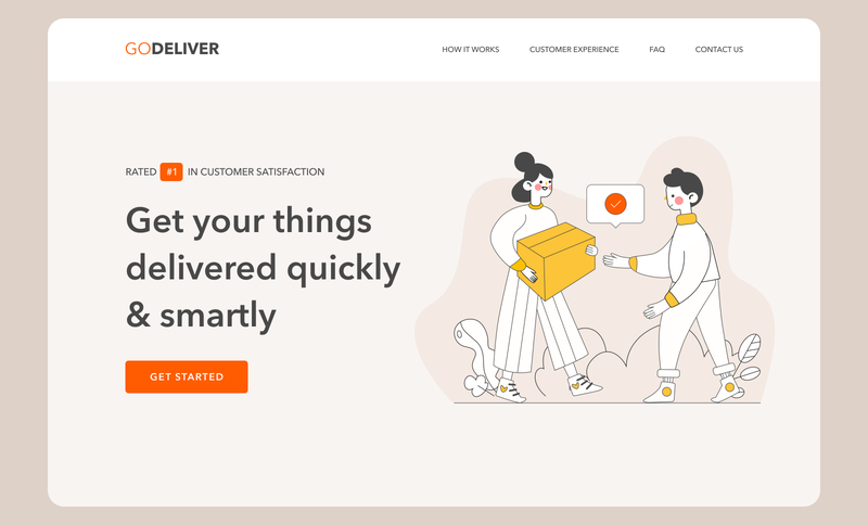
Source: Landing Page Hero Section
Thereby, technically this button can be any type that is supported using a call-to-action text. Its interactive nature is its prime difference from all other buttons on the screen or page. It grabs attention and encourages users for taking the necessitous action.
7. Ghost Button
Ghost buttons, also known as outlined buttons are a boost in the emphasis and complexity from the text button in button design.
Basically, they signify important actions, which are not the main action on a page. These buttons precisely must be an outline without fill the surrounding text that signifies an action.
8. Raised Button
Contained or Raised buttons are basically rectangular shaped and they lift from the screen surface by using a drop shadow. This shadow signifies that you can press, or click the button. These buttons mostly add a dimension to flat layouts and they mainly feature functionality on wide, busy, or crowded spaces.
9. Share Button
With the immense popularity of social platforms, emailing and chatting, share buttons ease the process of connecting a website or app content to the social profiles of users.
This kind of button allows users to share their content or accomplishment straight on social hubs. These buttons are presented with icons for making the connection clear. These icons highlight a brand sign of specific social channels that is identifiable easily.
In case the sharing is not the primary activity done by the user on a page, this is not anyway marked as a button (no color marking, extra shapes, underlining, etc.) – you only find the icons, but they are engaging. This approach promotes minimalism and efficient utilization of negative space.
10. Expendable Button
After being tapped or clicked by users, an expendable button opens different options. This is another way to arrange the appropriate interaction flow without making the screen overloaded, which is highly crucial for mobile UI restricted in screen space.
11. Plus Button
Being tapped or clicked, plus button allows users to add unique content to the system. Based on an app type, it can be a new contact, post, note, location, and product in the list – everything that’s a fundamental action for the online product.
Often clicking a plus button, users are moved directly to the modal window of producing content. In other cases, there is another medium phase when users get extra choices to select from and make content adding more focused.
12. Delete Button
Using ‘Button + Animation’ will display the buttons’ functions more clearly. When users tap a button for deleting, an animation depicts the action and shows the file getting removed.
This is an imaginative and clear way to display the Delete Button. It’s an efficient way that engages users when they erase many files.
13. Play Button
The Play Button utilizes an attractive hover effect. Once users move across or over this Framer button, the entire button springs out with an amazing 3D Gradient design. If users move their mouse cursor away, the effect will fully append. These designs are interesting and alluring.
You can add different hover and interaction effects for optimizing button designs in your web or app design. They can convince users for clicking and navigating to the further stages, like purchasing a product, playing a podcast, reading more info, or filling in contact details.
Moreover, you can add some changes in animations, frames, opacity, texts, shapes, shadows, and colors of a button as per your action needs for making it more appealing to users.
14. Flat Button
This button does not lift but fills with lots of colors if you press it. The prime advantage of this button is that they reduce distraction from the content.
These buttons are used in line with paddling, so the users can find them easily, on toolbars, and in dialogs for unifying the button action with the dialog content.
Factors to Consider When Designing UX Buttons
It starts with choosing to hire the best UI/UX designers who give special attention to designing unique buttons. They should assess and share ways, principles, and secrets by reading many articles and arrange the size, position, shape, color, and more factors.
Designers should use those designs that follow the fundamental rules of UI/UX designing. Particularly ones that cannot just lead users through a mobile app or website efficiently but can also convince them for clicking for better sales.
Designers always need unique concepts, clues, or inspiration for producing useful and unique buttons for your mobile or web apps. Let’s take a look at the factors that you can’t miss out on while designing UX buttons:
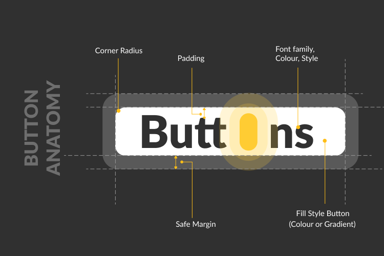
1. Shape
If you are concerned about button shapes, make squares with rounded corners or square-shaped button design, based on the app or website style. Studies recommended that rounded corners improve data processing and the center of the element grabs your attention.
If you want to execute something different from traditional button shapes, try to conduct usability testing on your designs to make sure that people can simply recognize the buttons.
Regardless of the shape, you select, ensure to maintain consistency throughout UI controls so the users can recognize the precise UX elements like buttons.
2. Size
This is one of the best practices to inform users about the necessity of a layout element and create a hierarchy of elements.
An effective and attractive button should be enough big to be found immediately but not very big so the layout structure doesn’t get ruined. Sometimes, market leaders give suggestions on the precise button sizes in their instructions.
3. Placement
While placing a UX button, try to use standard UI patterns and traditional layouts as much as possible as traditional button placement enhances discoverability.
The use of a standard layout will help users know every element’s purpose, even if it is a button with no other powerful visual indicators. Mixing a standard layout with enough whitespace and a clean visual design makes the layout clearer.
4. Color
You must select an appropriate color to make some buttons easily recognizable. Human behavior and mood are highly associated with the visual surroundings and color is one strong tool in this aspect.
You should remember while selecting colors for buttons that background and button colors should contrast properly for making the buttons different from other UI elements.
5. Microcopy
The strong button microcopy is generally consistent but short so it could grab users’ attention rapidly. Sometimes, it is performed in capital letters for making the copy more alluring in the layout.
However, this is not required as the decision is made as per the typography, basic design concept, and the text message’s mood.

Final Thoughts
The design of UX buttons plays a pivotal role in shaping user experiences on websites and apps. By focusing on the functionality, style, and usability of buttons – from dropdowns and toggles to CTAs and ghost buttons- designers can create intuitive and engaging interfaces that drive user actions and enhance overall satisfaction.
At MindInventory, we understand the critical role that well-designed UX buttons play in creating a seamless and enjoyable user experience. Our team of creative UI/UX designers is dedicated to crafting innovative and functional button designs that not only meet industry standards but also exceed user expectations.
Whether you’re looking to optimize existing designs or develop a fresh, user-centric interface, we provide expert-led UI/UX design services to deliver you a solution that make your digital product stand out in terms of exceptional usability and aesthetic appeal.
