Using Animation in the User Interface Design
- UI/UX
- August 3, 2018
We all know how important User Interface (UI) is in app designing and development. However, with changing scenario, app designers have to readily adopt trends in design concepts and patterns that have the power of instantly drawing the users’ attention and enhance the customer retention.
The use of animation in UI design has brought a significant change as the pictures are no more static and motionless but with animation tools, they have become more interactive.
Importance of Animation in UI Design
The moving or the in-motion animation graphic would certainly grab the attention of the users more than the traditional images and figures. This is one of the probable reasons why most of the designers are now incorporating the animation while designing the mobile app User Interface. It also offers some other benefits as well.
Makes your User Interface Very Interactive
You must know that if your user interface is not interactive, then there is no point in designing the interface. It is because people would show no interest in downloading your app even if it is very purposeful.
The animation becomes very important when you are developing a gaming app or an educational app to explain some concept in an interesting manner. The users will be able to connect with the subject easily and understand the concept much better.
Provide Interesting Options During Wait Time
The users simply dislike the waiting while the app is uploading or getting updated. They don’t have the patience to wait for long period and so if you don’t want them to uninstall your app, you can interestingly use animation during the wait time to pacify the impatience of the users. This approach would at least keep the users engaged for some time and reduce their frustration.
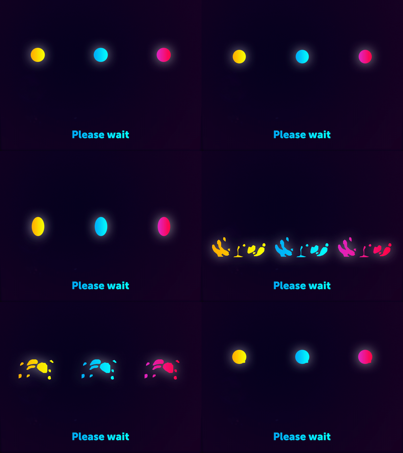
Animation concept for colorful gradient drop loader
Use Animations to Send Notifications
Sending notifications is an integral part of the mobile app marketing strategy. For instance, a lot of apps today use push notifications to send important information or promotional content to bulk users.

So, why not add some twist to the tale? Let’s use animation to inform the customers more interactively. Your messages won’t go unread if it has that animation element in it. In fact, it will be able to communicate the message more clearly and precisely.
The Use of Animation to Navigate Users
One of the key advantages of animation in user interface is that allows the navigation of the users smoothly. The users can move from one location to another with ease. It helps in smooth transitions and transportation of the users.
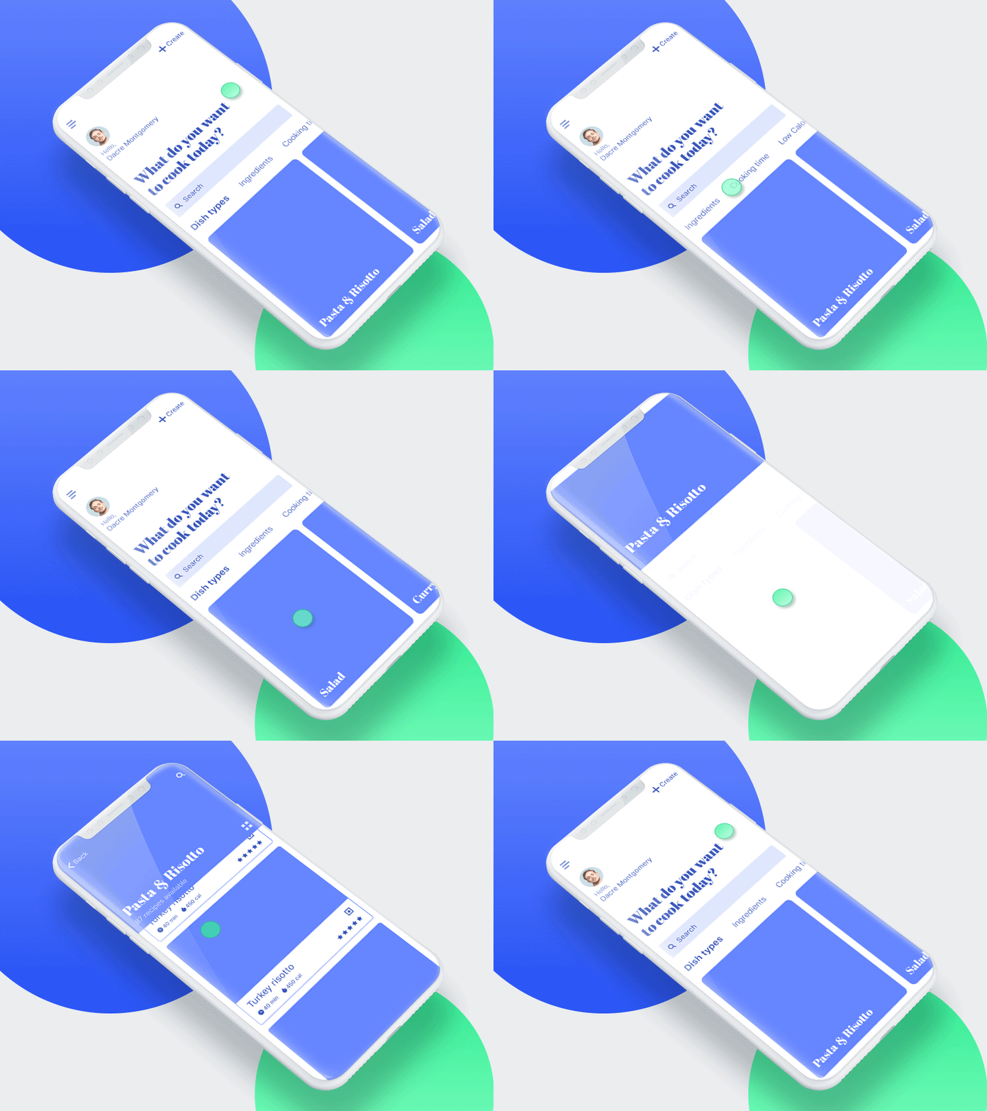
Animation concept for Home page interactions
In addition, it also assists in setting a visual hierarchy for describing the connection between the different elements and it also can be used to design a particular button to possibly describe a particular app functionality or feature.
Animations Show the Responses Better
The animation can show better responses to the users in the form of visuals. This enhances the interaction between the user and the app. Through animation, they can get even the smallest and slightest details.
Defining the Conceptual Animation
Before we can proceed further and get into the details of how animation is used in user interface design, let’s first get introduced with conceptual animation. It can be defined as a specific motion design that helps in conceptualizing an idea before it gets converted into a real animation. Actually, it represents important concepts such as transitions, interactions etc. in an animation.
The conceptual animation is something that provides uniqueness to your design that you are looking for. It has a distinctive approach and is relatively different from the conventional method.
However, it has also created some controversy up to some extend as animation of this type may seem unrealistic uncalled for and difficult to implement in real world.
Use of Conceptual Animation in UI
When it comes to using the conceptual animation in user interface, one can cite a few important examples including:
The Shift from a List to an Item
This makes the navigation of the list of items easier for the user as they can simply move from the list to choosing a specific product. This is basically categorized into two categories; the first where the changeover takes place in a usual manner and the second is making the transition more interactive.
Scrolling the List of Items
Well, this is one of the most important features or uses of conceptual animation where the users can scroll at the list of items provided. Here you find two types of scrolling; in the first case the user simply moves up and down the list. The second type you find a delay once the user scrolls the list. And this delay actually provides the life to the animation.
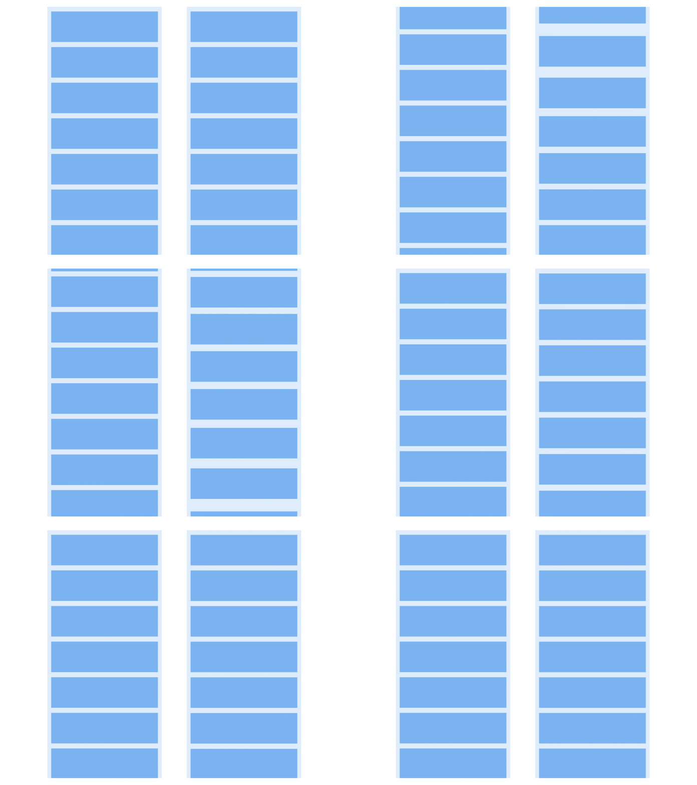
Use of Animations in Side Menu
Well, the side menu is one of the common features that you would cross in various apps. So adding the animation element would provide a dynamic view to even the common navigation of the app. This makes the menu list look more elegant.
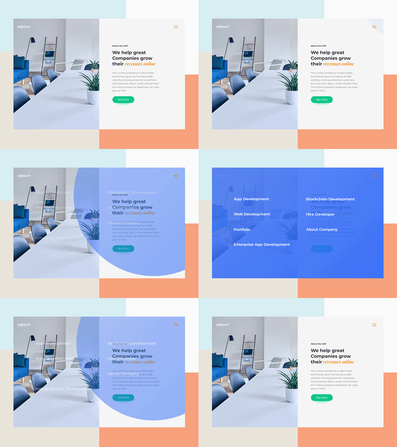
Animation concept for Website side menu
The Functional Animation
The Functional Animation is a type of animation which defines the functionality of the app and is usually embedded in the UI. The main purpose of designing a functional animation is to:
- Visual feedback
- Develop interactive transitions
- Help the user to get started
- Show system status
The Visual Feedback
The visual feedback becomes important as it helps them to take control and is regarded good for user interface. The feedback acknowledges the action of the user and depicts the result of the interaction whether successful or unsuccessful. The animation here has to be very subtle and responsiveness as well.
It increases the sense of direct manipulation by improving the level of responsiveness from user interface control.
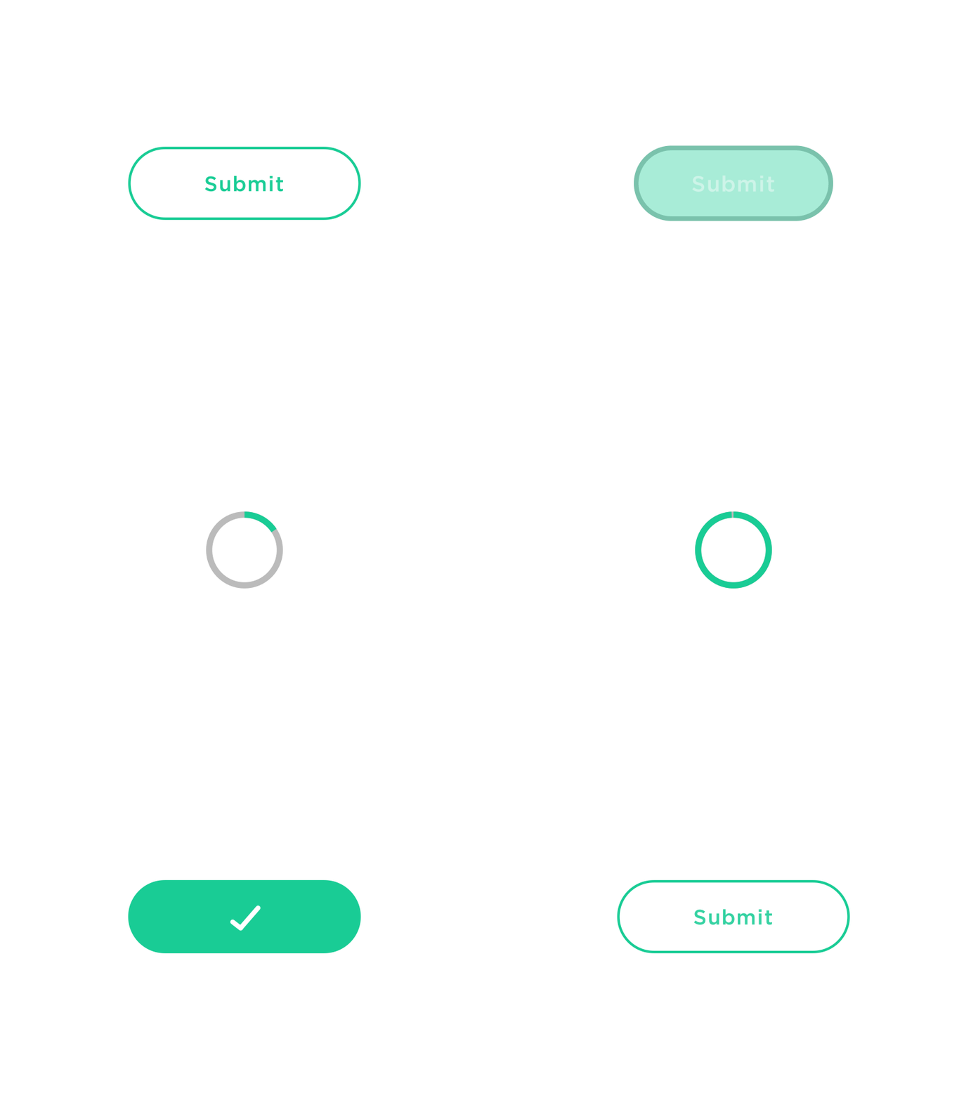
It also visualizes the action of result and tells the users the outcome of the operation they have performed. For example, when you finally, click submit after filling the form, it tells if it is successful or not.
Develop Interactive Transitions
When you are developing interactive transitions, it should be clear, precise and smooth. It helps the user understand where their attention needs to be focused.
Help the User to Get Started
The animations will become a true guide for the users and help them to comprehensively understand how to interact with the interface. This becomes handier if you have a complex app, with difficult functionality. It becomes more helpful in comparison to texts or the video tutorials.
Show System Status
You should inform the users that your app isn’t static and indicate the status of ongoing process. The users get to control the app through the app visuals. Some examples of animations include loading the indicators, while updating the content, or sending the notifications etc.

Conclusion
The animation has been one of the most powerful tools using which you can attract large number of users. It gives life to a simple looking interface design and also helps to improve the interaction with the users.
But it must be used precisely if you want to maximize its benefits. The animation is going to provide a very thriving future for the designing the user interface where designers will have much more varied tools to play with in the future.
