Netflix & Snapchat’s Design Revolution That May Inspire You in 2025
- UI/UX
- January 22, 2024
People say UI/UX design is all about following best practices and design principles. Expert says, “That is correct, but how about breaking rules and setting up new benchmarks in the world of app design?” This blog talks about those two digital product giant companies – Netflix and Snapchat, and how they achieved the attention of users through their exceptional app UX design.
In this modern lifestyle, we all rely on countless websites and mobile apps for different purposes. But what makes them reliable is their UI/UX design and performance.
Many UI/UX design aspirants and even designers with a certain experience, grow themselves with the philosophy that, when designing any app, all design rules must be followed! However, that’s not the case all the time, as many popular digital OTT platforms like Netflix and Snapchat have out-thought design thinking and UX strategy and still managed to excel in their digital business.
So, this blog is not only limited to study purposes but also includes use cases from top digital brands, like how they embraced unconventional design thinking and UX strategy.
The Evolution of UI/UX Design to Unconventional Experience
In the early days of digital applications, there was no such competition to design a web and mobile app UI – just problem-solving. It was all about taking the traditional offline processes to the digital level that develops user convenience; hence, the app interface was designed using standard color and boxed themes.
And it is pretty obvious as then the mobile app use case was limited to certain things. Also, the competition was limited.
However, now, the case is totally different. The app market is flooded with countless applications offering similar services with creative app interfaces. And in this case, following word-by-word approaches and not taking any risk in the design approach is also another risk. Hence, thinking out of the box is the only way for designers to lead their mission-critical app design projects to success.
Now, designers understand the app idea, target users, market trends, UX design principles, color philosophy, typography, app flow, and so on before designing the app. Today, design is not only limited to problem-solving; it is beyond creativity – all about breaking the rules and taking new ways, just like Netflix and Snapchat did!
And as your mobile app idea is new, why should the design approach be traditional?
Rules are meant to be broken!
We know, we know, you’re curious to know about the UX strategies of your favorite apps Netflix and Snapchat. So, it’s the time!
Netflix’s Design Philosophy For Uplifting UX
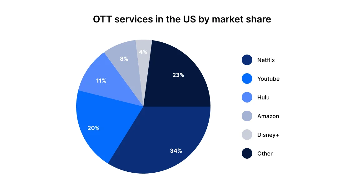
Taking the attention of the audience, preferring TV over anything to now enjoying weekend vibes with Netflix and Chill only! It might not be the first OTT platform around the world, but the first ever digital streaming platform that got global attention.
From just starting with 34.24 million subscribers in 2013 to gaining around 247.2 million paid subscribers globally in Q3 2023, Netflix has seen a big game in the sector.
The credit for this exceptional journey of Netflix goes to the team’s attitude of no-compromising in UX. The team does not only focus on one user but the preferences of all users. Hence, it is the first preference of viewers in OTT over other streaming platforms.

Netflix loves to experiment with its app UI/UX design and can go to any creativity level to give its users a seamless app experience.
Back in 2016, when Netflix introduced this auto-play trailer feature, many users got annoyed as this was totally new for them. In fact, many criticizing articles were written about the annoyance of this feature, and Netflix received many complaints from users regarding this.
Netflix knows what it needs – the attention of users to the newly launched shows and other shows/movies it streams and a business through viewers. The team knows how to get the attention of users even if they prefer not to see it in the first place by just reading the name, but after reading the synopsis about the show and a good part of the show/movie it is auto-playing, which may make users interested to see more.
Not just with that feature, Netflix changed the OTT experience by introducing many creative out-of-the-box features, including personalization, genre-wise categorization, country’s best, fast laughs, new & hot release window, surprise me, and now games.
Personalization
In this, Netflix has allowed users using one Netflix account to create different screens to watch only what they want and get recommendations about shows the user wants to see by reacting to the show with ratings, such as Not for me ?, I like this:? , and Love this with double thumbs up.
- It even categorizes the programs based on genres, like comedy, RomCom, action, thriller, country’s most watched, Oscar Winners, top-10 in your country, because you watched it, and whatnot!!!
Fast Laughs
Covering the best funny parts from different programs to make users see that show and even in that program-specific other chunks of fun parts in the show-particular window.
New & Hot
It shows the countdown of upcoming and new arrivals that might excite users by allowing them to see what’s coming next by easily changing through categories, like Coming Soon, Everyone’s Watching, Top-10 TV shows, Top-10 movies, and Games.
Surprise Me
If the user gets confused after getting bombarded with tons of suggestions, Netflix also has a window for them to escape choice fatigue by clicking on Surprise Me – launched in April 2021, which would play programs as per users’ liking. Netflix kept this feature in the app for over a year, but due to some reasons, it had to discontinue this feature in January 2023.
Security
When it comes to user experience and maintaining their security and trust in the platform, Netflix never misses an opportunity. As said earlier, though users don’t like it, to ensure their best experience with privacy, Netflix can go to any extent.
Not a long time ago, Netflix announced that there would be a special security feature in which only the people living in the same house sharing the same network can access the account and enjoy unlimited access to entertainment. Many people, especially friends sharing the same account living in distant locations, have shown their disagreement toward this initiation. But to ensure user security, what has to be done must be done.
This initiation has solved many problems for Netflix. Before, there were many accounts that were compromised because of sharing account login credentials. As a result, in the start, it faced many subscription cancellations, but later on, they understood the company’s intent and continued their entertainment journey with Netflix.
Not only from the UI design part but also from the UX strategy and development part, Netflix provides users with a top-notch digital entertainment experience. From unfailing brand identity and app UI design to UX to program selection and marketing, Netflix excels at everything by immersing users in its entertainment window.
Snapchat’s Design Philosophy For Uplifting UX
Snapchat started as a camera app with many AR filters – a leader in utilizing AR technology. An app that enables users to connect with their friends and family to share their new try-on filter-based pictures and what they are up to – to now find users from a global directory.
Of course, undertaking user privacy and then allowing businesses to promote their products and services through ads, Snapchat indeed has broken many rules in user interface design, user experience (UX) design, security, and business perspectives.

From 1B+ downloads on the Google Play Store alone with 407 million everyday active users globally, Snapchat is the popular media with AR lens filters amongst 75% of users of the age group Gen-Zs and millennials and 51% of users are female.
Also, Snapchat encountered a global adoption rate of 12.9% even after removing users from China, where the app is blocked, and that too through ad campaigns only.
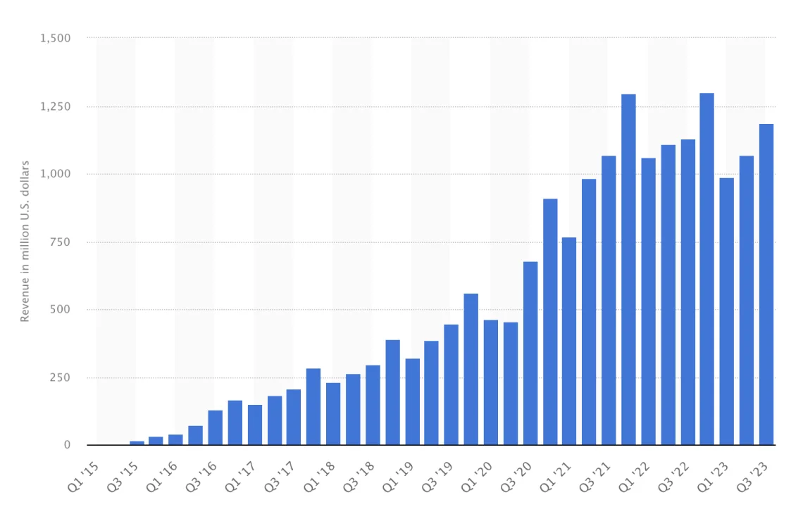
Considering all such and many other statistics, Snapchat is the camera and a mini-version of social media, with a revenue of $1.189 billion globally in Q3 2023.

All these figures say that Snapchat really has something that modern users and businesses are using actively for their benefit.
User Profiles & Avatars
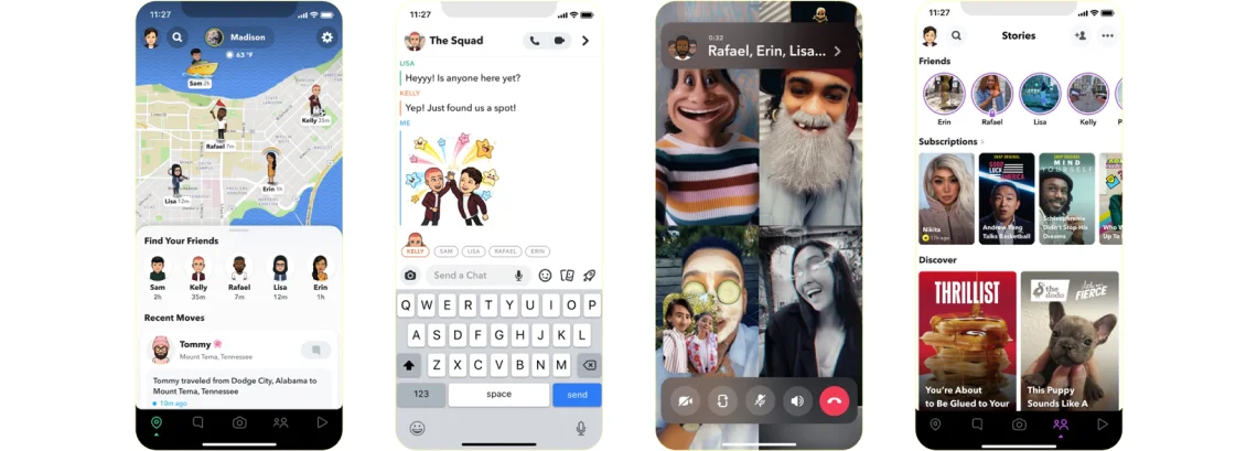
As a modern mobile app user, you must be using many apps daily, but the user profile of Snapchat, though looks simple, but in itself is attractive. Snapchat’s user profile doesn’t ask you to add your profile picture but instead creates an AR Avatar that resembles your looks.
It’s the avatar you can create and update as you like, from selecting eyes type, skin color, and outfits to many other body and facial shapes and gestures.
The uniqueness of your avatar-based Snapchat profile pic also shows black dots crafted surrounded by the avatar (in the form of a ghost), which refers to your Snapcode.
Below this, it shows users’ Snapscore, which increases when a user sends and receives a Snap; in short, a summation of sent and received Snaps.
Get a direct option to set a Snap Story from your profile, manage your Snap friends, add Snaps to Spotlight, get your saved Lenses in a Favourites, and create Cameo selfies using Snap Cameo’s filters.
Indeed, it’s more than just a user profile that exceeds the levels of UX part.
Maps & Friends’ Location
An amazing feature of Snapchat that lets you see your and your friends’ locations with a heatmap showing public Snaps when clicked on.
Lenses
Be it simple face AR filters or any AR-based Gamification Lenses or business-based AR-powered Try-on Lenses, Snapchat has everything to offer you might need for your amusing, influential camera activities. Even big brands like NIKE also use Snapchat AR-lenses to enable brand lovers to try on Nike shoes.
Unique User Chat Room with Tight Privacy
It allows users to share images only online with friends and even make it public for others for influencing effects. Allows users to send chats and streaks with a feature, an alert to know if someone has taken a screenshot of the chat or snap.
Not just that, it even enables users to set the chat to vanish mode, which will remove conversations from users’ screens in 24 hours. Also, get notifications if your friend replays your sent streak media.
It’s your chatroom, create groups with your close ones and share unlimited experimental pictures and make all-night-long conversations with an amazing range of custom, personalized avatar-based streakers.
User Streak
Snapchat came up with an amazing concept to make streaks and keep users addicted to maintaining the days STREAK with friends to finally celebrate 100, 200, 300, X days of commitment, which we call Snapstreak! ?.
Celebrate your 100(s) days streak with your friends by sharing the Snapstreak posters with them and other users, and you can also add a story for the same to let all your Snap friends know on the go.
This is not it! Snapchat has so many things to offer to its users, from its top-notch UI, cutting-edge lenses, and many other features to unlocking engaging, fun UX that crosses all levels of creativity, showcasing more outgrown design and UX best practices and strategies.
Seeing the success of avatar on Snapchat, many social media networks like Instagram have also embraced this trend to elevate their app user experience.

How Can MindInventory Help You With UI/UX Design Solution?
Indeed, regarding UX strategy, both Netflix and Snapchat have broken all the design rules and delivered users with unconventional app experiences that none from the same industry could offer. They have changed the definition of app designing and planning, and by taking inspiration from them, your digital business can also succeed.
At MindInventory, our UI/UX designers for hire make sure that your business-critical digital product is designed in such a way as Netflix and Snapchat are with an understanding of the target audience psychology and current market scenarios and trends to receive better attention from users, leading to a profitable business.
So, avail our UI/UX design services today to get the solution that solves the people’s problem you want and rock the market with your unique app UX proposals!


