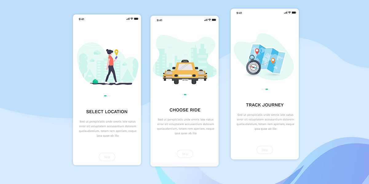
Top Mobile App Onboarding Best Practices
- UI/UX
- May 27, 2019
Onboarding is the brand identity of your mobile application. You can call it the first impression that defines either you will find somebody who declines to use it or get a loyal user.
When initially a user launches your app, he/she should get a user-friendly, pleasant, and easy experience. Not every app needs an onboarding screen, but it’s a great tool for discussing fast to the user why the application is important and how he/she can use it.
Importance of App Onboarding
Before getting into the best practices of effective onboarding, let’s have a brief discussion on why an efficient app onboarding procedure is so crucial.
App onboarding helps businesses optimize the first interaction of a user with the application. Making a positive and engaging first-time user experience is the key to an app’s success and maintains consistent user engagement.
Sometimes users also lose interest when the app makes them puzzled and they find it hard to navigate. In accordance with statistics, almost 77% of users no more utilize an app 3 days after the first installation. The reason behind this is that they just didn’t understand how that particular product could be beneficial for them.
Using app onboarding helps make the first-time user experience as smooth as possible, reducing possible pain points. The precise mobile app onboarding can save the app from getting deleted from a device and change the casual user to a serious and permanent one.
The basic purpose of onboarding is to make an interactive procedure of letting the user know a mobile app to help them easily and fast utilize it in practice.
Best Practices to Build an Efficient Onboarding
The app marketers should consider that the onboarding begins on the app’s product page in the app stores because it’s the time when the user uses the app and gets familiar with it.
Thereby, the whole onboarding procedure should be visually attractive and spontaneous. In this post, I will share the best practices for building a mobile app onboarding, alongside offering some good examples which can inspire you.
Let’s dive into some recommendations to remember for an efficient in-app onboarding!
1. Research with Login Options
The friction users experience while creating an account and login is one reason behind low retention rates with mobile applications. Maximum users ponder making an account a big hassle, particularly in case they require entering lots of details and activating the account from their email.
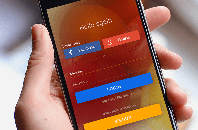
Hence, you must test with different login options for making an easy and enjoyable experience for your users.
Apart from the email login, you can ponder no login at all or social media login. If you find a login unimportant for your mobile app, just leave it out. Nevertheless, you may require including other ways of gathering your users’ details.
2. Ask Just the Most Important Things
People wish to use an app as fast as possible but most apps need the users to give their personal details or request access to extra data.
In case you also require this, just request the necessitous things, so you don’t have to waste your users’ time unnecessarily.
You should not puzzle users with requests for accessing personal data or device activities when your app is first launched. You can always do it later when they launch it next time.
3. Display Your Value-Add
At first, users get in touch with your onboarding flow. If you don’t have a precise grasp over how your app can boost their lives, there is a possibility that they may forget your app or uninstall it.
 For instance, The New York Times mobile app displays what they are all about straight on the home screen. A short yet strong value proposition displays the top-notch journalism which the newspaper is famous for.
4. Keep the Onboarding Screen Focused and Streamlined
Although you need to offer instructions to your new users, ultimately you should make them encounter a data overload. Hence, try to keep your mobile app’s onboarding screen as streamline and focused as possible. Include value proposition.
Add one or two sentences on the onboarding page which tells new users what they can acquire from utilizing your app. Do not forget to keep it sweet and short. Not all users prefer reading paragraphs, particularly when they want to explore a new app.
When it comes to technology, people become really impatient and don’t think twice to uninstall an app just because the onboarding flow is lengthy.
5. Give Importance to Personalization
Personalization is the only thing that can make you different in today’s app marketplace. There is no exact time to go for it. You can give your users a tailor-made experience directly in the onboarding procedure.
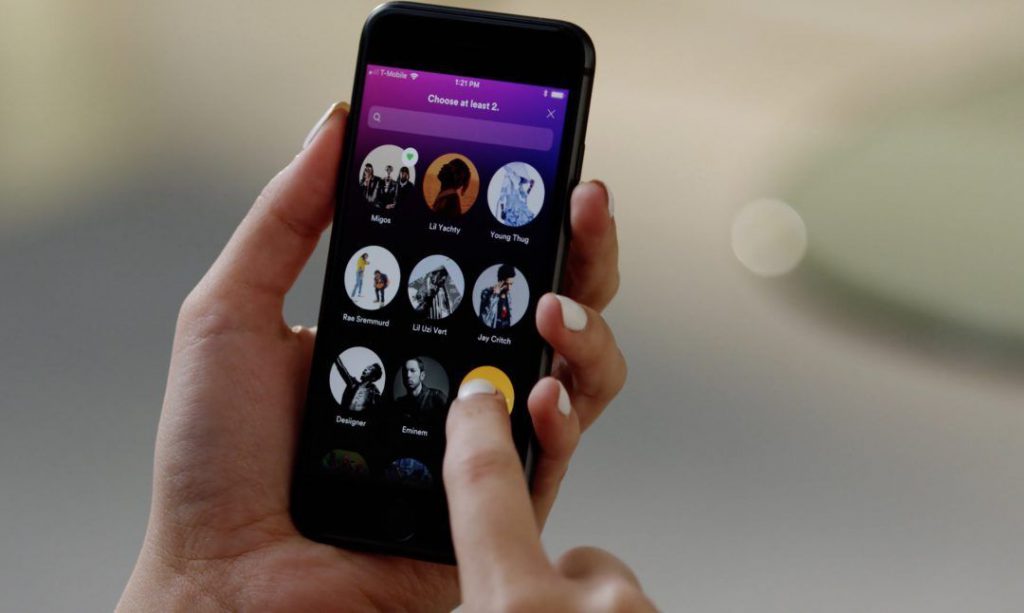
Take Spotify’s onboarding procedure as an example. After creating an account, you are prompted to choose musical artists you prefer – an onboarding procedure allows Spotify to make customized playlists for users directly.
If you choose nearly 5 artists, this data enables Spotify to acquire a better insight into your musical choices, even before you start involving with the app.
The way of customization may not be as precise for other applications as it’s for Spotify, but you should stay careful about scopes as they come along. Ultimately it builds great customization which will offer your brand a competitive advantage further.
6. Indicate What the Next Step will be
In case you need users to function a particular bunch of functions, inform them about the next step. Call to Action works amazingly in terms of raising involvement and audience retention as it can clarify people clearly what they should do next.
7. Give Scope to Skip
There are some users who like to sort out everything by themselves or are just very impatient; hence, you are recommended to offer them a scope to skip the app onboarding.
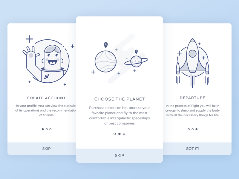 In a few cases, this can raise the number of users who work continuously with the app by 5 to 10%. There are some people who like to explore the product by themselves, instead of reading the guidelines.
8. Track Analytics on Each Screen
Try to use analytics for tracking your users’ functions on each screen. This will help you recognize which pages your users are leaving the app and its onboarding experience. This is how you can make changes on those particular screens to improve user retention.
You should not just know the conversion rates for every screen but also you should know how many users will make it to the end of the app’s onboarding experience.
9. Meet Clients at Different Channels
Using cross-channel messaging, an app can improve its onboarding procedure. For instance, push notifications are a great way to notify users to finish the onboarding procedure if they leave it halfway.
With in-app messages and emails, use leng-form text for communicating benefits or features which didn’t belong to the onboarding flow.
10. Make the Onboarding Page Visually Appealing
Although you don’t need the onboarding flow to be over-the-top or very complex, you still need it to be visually attractive. People always decide based on their first impressions.
Although your onboarding page’s look must not matter to the users, it will. Hence, try to accomplish the absolute balance between visual attractiveness and simplicity. Either too little or too much can be bad for your mobile app’s retention rate.
Experiment with different designs for the onboarding page to find which looks best for your app’s retention rate.
11. Opt for Animation
Since you have just 5 to 10 seconds for drawing the attention of your users, animation in the introduction is ideal for making a great impression and encourages further interaction with your app.
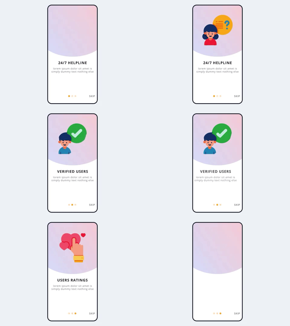
It’s also an amazing option to offer a short description of the features of your product or showing it definitively in operation.
Step-by-step animated illustrations capture attention and are quite interesting to users than normal images. Moreover, you can integrate animation with brief textual descriptions.
Read also: Using Animation in the User Interface Design
The Bottom Lines
Prior to designing the onboarding procedure, you need to think about the user experience in their initial navigation through your app. What are your expectations from users? What do you have to display for clarifying the added value of your app when they download it?
In addition, in case you accomplish in making a positive experience, the users will come back and thereby, boost the retention rate of your app. In case, vice versa, the onboarding is not much effective, the user will possibly not come back to your app and stop using it.
