Mobile App Navigation: An In-depth Guide to Creating It
- UI/UX
- June 30, 2022
Imagine you are in an unknown palace holding a torch that is about to switch off, that’s when you realize you are about to be misled. But let’s redo the situation for you: what if you have been welcomed to the palace and guided well throughout to witness its beauty! Doesn’t it sound pretty good?
That is exactly what proper mobile app navigation does to your mobile app: right guidance! Clear mobile app navigation acts as a bridge that fills the gap between prospects and business.
Today, there are more than 6 billion active smartphone users globally, and proper app navigation has become a great contributor to driving users’ attention. People are more likely to stick to the app that is designed in a simplistic way rather than fancy and complex stuff.
Creating guidance (app navigation) requires thorough and understandable guidance, too! So here we are with the solution for you all. Today we are going to help you with the best practices for creating the most effective mobile app navigation.
Also, we are going to help you with every single thing about mobile navigation design that will make your journey easier. Let’s get learning:
What is Mobile App Navigation?
Navigation in general is something that shows you the way to reach your destination. If we talk about mobile app navigation, it refers to the same concept: guidance. Mobile app navigation is the way of guiding users to make them reach from one point to another.
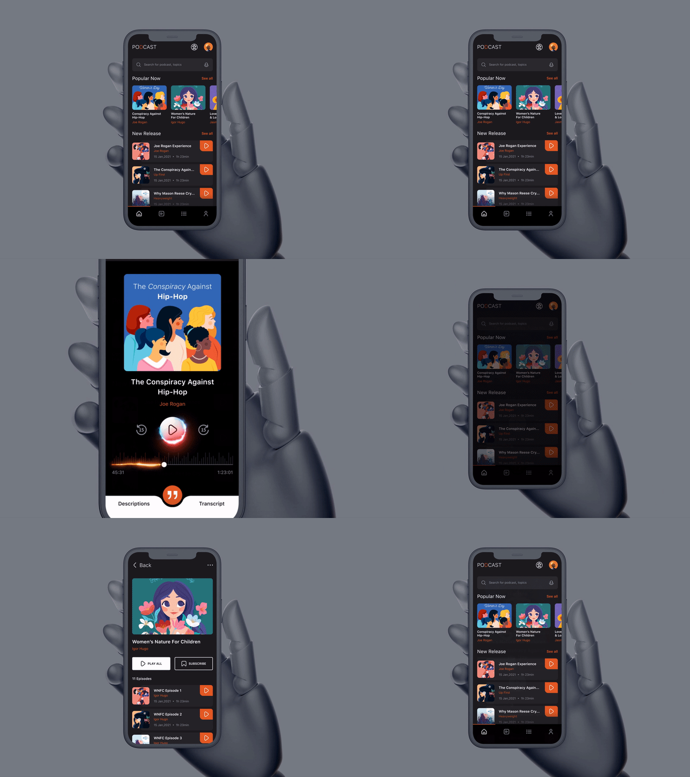
Source: Podcast App
If done keeping all the points in mind, app navigation can bring out the best results in terms of audience engagement. All you need to do is to aim at guiding your user and help him/her come across the vital buttons representing areas you want them to go to.
Importance of Mobile App Navigation
Let’s circle back to our introductory segment, remember we were talking about a palace? How the situation would be different if we had someone to guide us throughout the palace and vice-a-versa!
Taking this concept into consideration, let’s elaborate on the importance of app navigation because here’s more about it.
Navigation triggers users to explore all the vital sections of the app
Navigation is the source that will take users to all the important aspects of the mobile app. All this while, you have strived to create an application that offers value to your TG. What if your users are not reaching all the vital aspects of your app gives feels like rubbing salt on your bruise.
Your users need a path that leads them in a proper direction throughout, but that very path has to look promising enough that compels users to choose the same! Proper navigation ensures the same.
UX navigation ensures great engagement in the app
Navigating users as per your expectations starts with fulfilling their expectations.
You need users to see what you have created for them, but how would you convince them to do the same.
Of course, an appealing app navigation is something that works for you in the perfect way. It takes users to the aspects of the app where users find something of their interest. This boosts their engagement with the application.
Navigation defines the app’s key features effectively
The niche of your application has to be executed in a way that it draws users’ attention in one go. How do you do that? Navigation takes the responsibility of executing the niche of your application in an effective manner. This way users get to know what you are mainly good at. But you need to choose the pattern of the navigation after examining the category of your app and the target audience.
And that’s why we are with some best practices and patterns that give you the profound idea and clarity about how to create clear and persuasive navigation! Let us navigate further.
13 Popular Mobile App Navigation Patterns
Here you will be learning about the 13 best navigation patterns that will help you make your app stand out:
1. The Arguable Hamburger Menu
The concept of a burger menu is still uncertain and arguable in the designers’ community. Some do prefer it and others want to vanish it from the concept of designing.
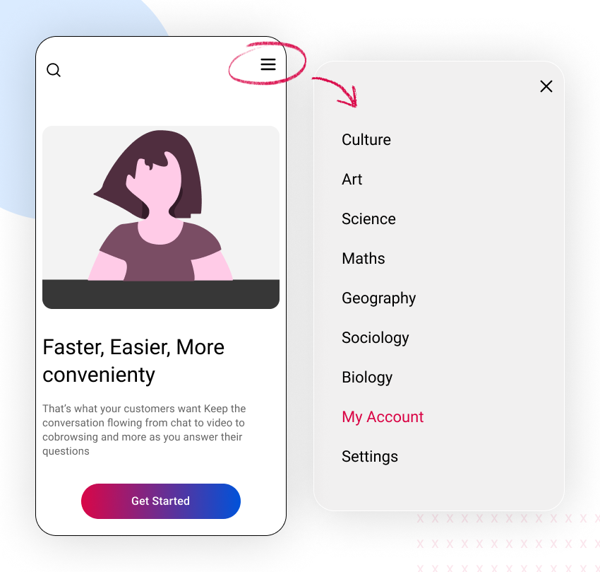
But if we talk about the logic behind the structure of the hamburger navigation, those three mere lines that lie in the corner of the page can prove to be extremely useful without hindering the whole feel of the design.
The hamburger menu is an ideal concept for the UI UX designers as it covers the all-inclusive navigation between those very 3 lines it helps the audience enjoy the rest of the screen space.
Moreover, this is not a new concept in the mobile app design, the users already know about the structure of this design. So, you can expect users to reach where your CTA lies.
2. Floating Navigation Button
Floating icons are circular-shaped icons and do not surprisingly float over the interface. The floating action button (FAB) triggers the primary action in your mobile app’s UI. When a user heads to a mobile screen that is stock-still then all can do is click FAB and move forward in the right direction with it.
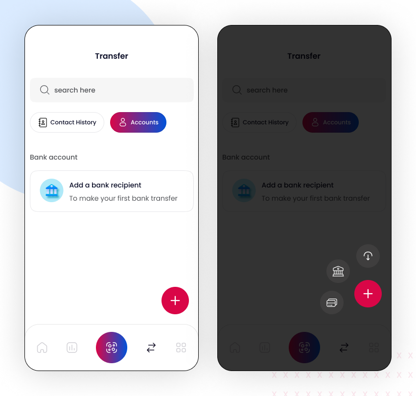
If prioritizing the content is your next major move, then floating button icons can help you stand out the content of important layouts.
Even though floating buttons take a little space on the screen, they have the power to distract the user. In such cases, content sometimes fails to notice. Thus, it is not necessary to put a floating button on every page.
When you are using floating icons, you need to ensure that it is leaving a positive impact on users’ minds.
3. Gesture-based Navigation
Gesture-based navigation is ruling ever since the concept of the touch screen mobile phone has been launched. This navigation allows users to swipe in any direction they please. And this actually worked out pretty well and gained traction among mobile app users.
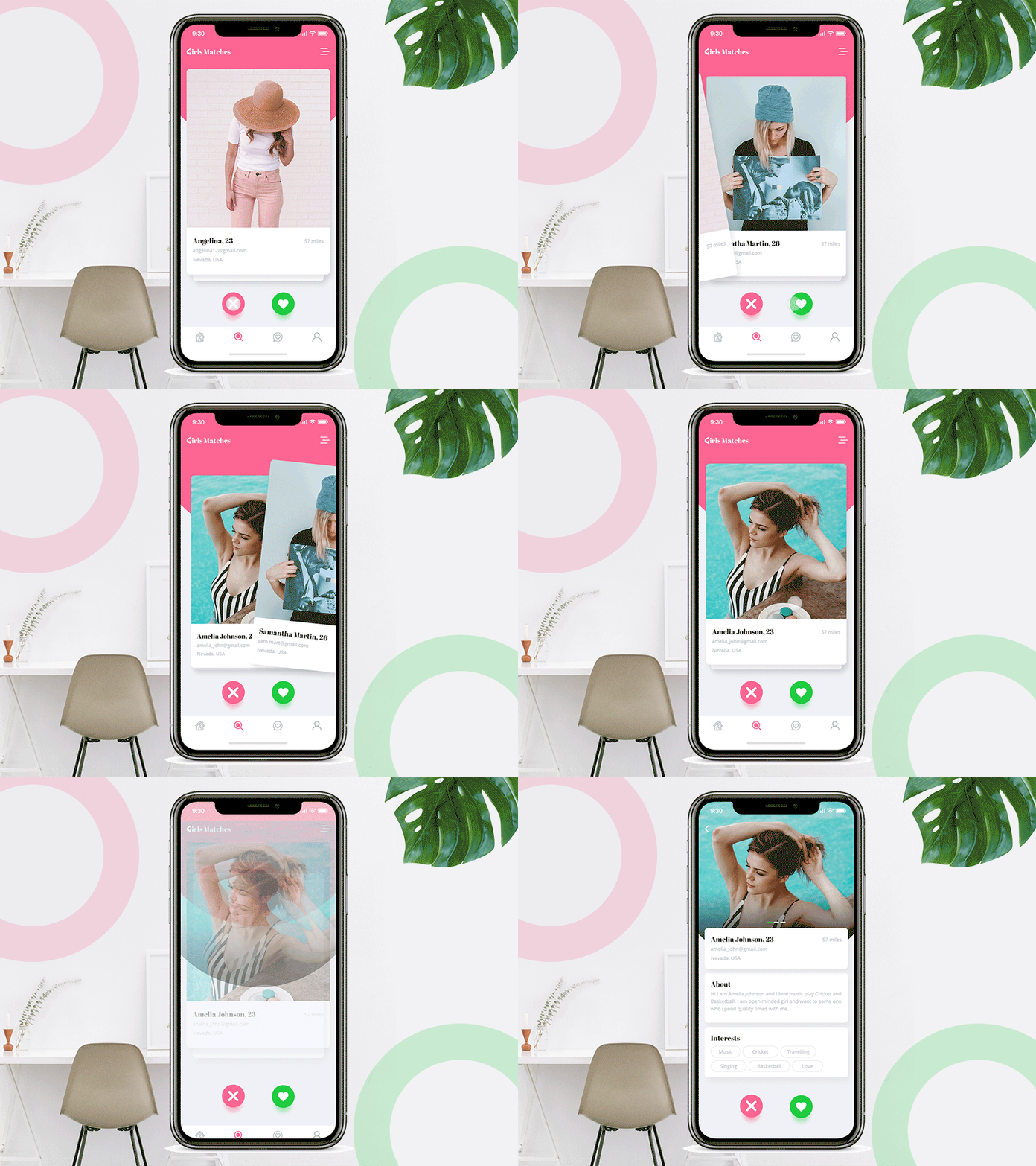
Source: Dating App Navigation
What makes gesture-based navigation different from the others is that it is quite feasible for a user to use it. This UI design pattern is pretty instinctual for users out there, just a little experimentation is needed.
4. Sub Navigation
There are many mobile applications that have multiple levels of hierarchy in app navigation. One of the most popular examples of the sub-navigation application is Amazon.
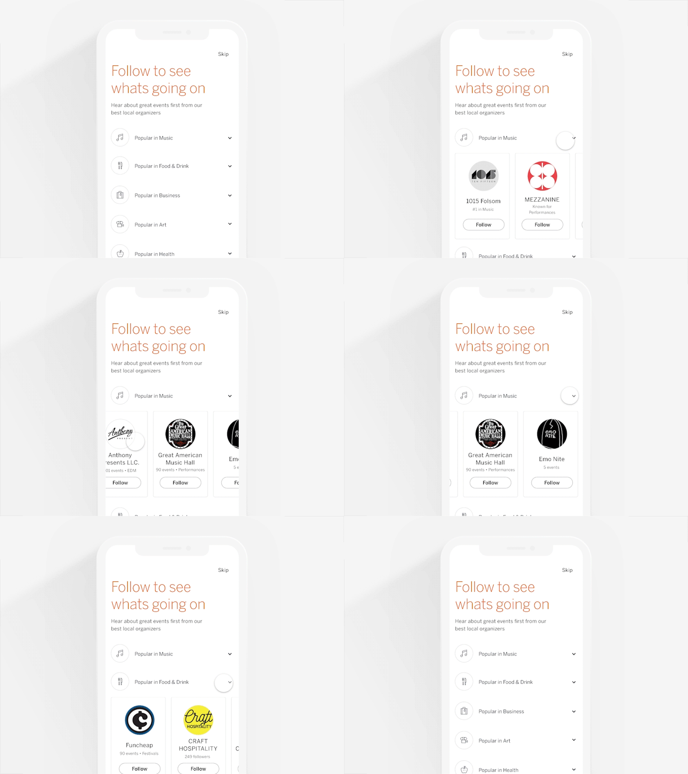
If the concept of your application is similar to an app like Amazon that comes up with various categories along with its sub-categories then sub-navigation would be an ideal choice for your app navigation.
5. Full-screen Navigation
So far we were paying more importance to the navigation patterns that made minimal usage of screen space. But full-screen navigation comes up with a completely opposite concept. Here designers do make use of the entire page for navigation.
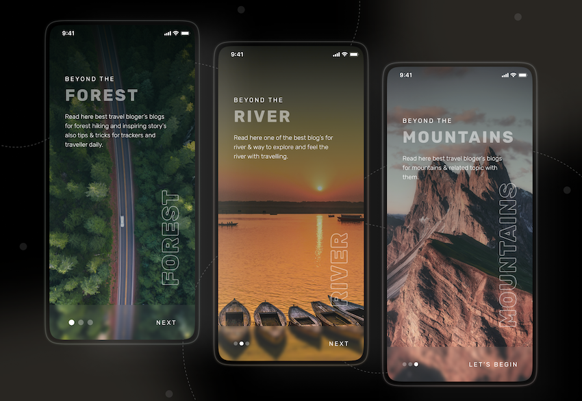
Source: Traveler Blog Mobile App
Well, this approach seems to be sort of over-powering in terms of design. Some designers are experimental to dedicate the whole screen to navigation. Users might be affected if the visual hierarchy of the design is not being taken care of.
But if a designer is making use of full-screen navigation in a lucid manner (eradicating all the complexities) then it becomes pretty clear for a user to explore.
Also, users do not need to put any effort to search for something as they have everything on a single page right in front of them.
6. Tab Navigation
Tab navigation appears on the top of android apps and bottom of iOS applications. A tab is generally a row of various options that lead users to the respective screen/page.
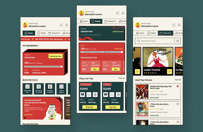
Source: Telecom App Design
Many designers do get confused to choose between the Burger menu, navigation bar, and tab menu.
Tab navigation menus are generally used to make users switch between alternative pages with the same context. Your Gmail account is an ideal example of the same, you are being given options to send the mail: 1st option is primary senders. 2nd are those contacts who you may not know.
7. Top Navigation
This navigation pattern carries a bar with primary icons on the top of the screen. This pattern is pretty easy on the eye of the user as you do not need to search here and there; everything is on top to be explored further.
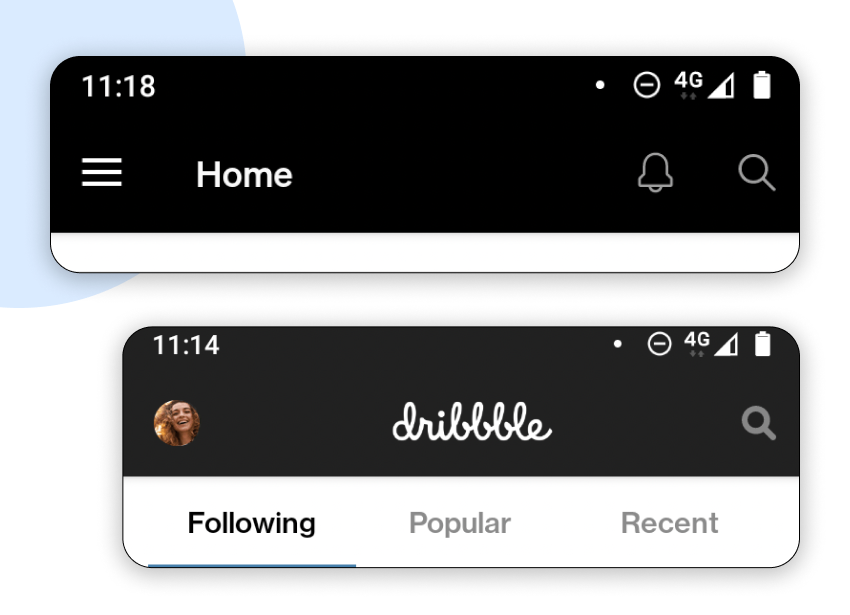
Moreover, the biggest advantage of this navigation is it’s pretty clear and simple for users to explore. The chances of users being confused with the navigation are nothing more than low.
Generally, top navigation is being combined with the other navigation. You can imply to users what are the key things to be referred to on a prior basis while making it look aesthetic with the help of another navigation pattern.
8. Bottom Navigation
This is the other side of the coin: bottom navigation. We are safe to say that there are minor differences between these two navigation patterns. But the biggest advantage of the bottom navigation is it’s quite easy on users’ fingers or rather thumbs.
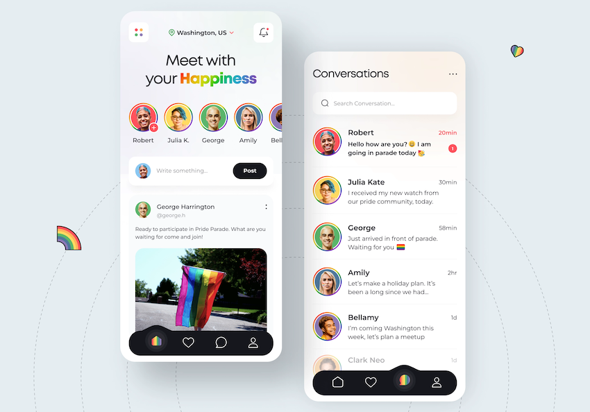
Source: Dating App Design
We generally make use of our thumbs the most while using cellphones, and bottom navigation is where your thumb can help you the most. With a couple of taps, you are exactly where you want to be; no complexity. This feature makes it pretty popular!
9. Sidebar Navigation
Sidebar navigation is the perfect pattern for the designers who want to place more categories, unlike the general way.
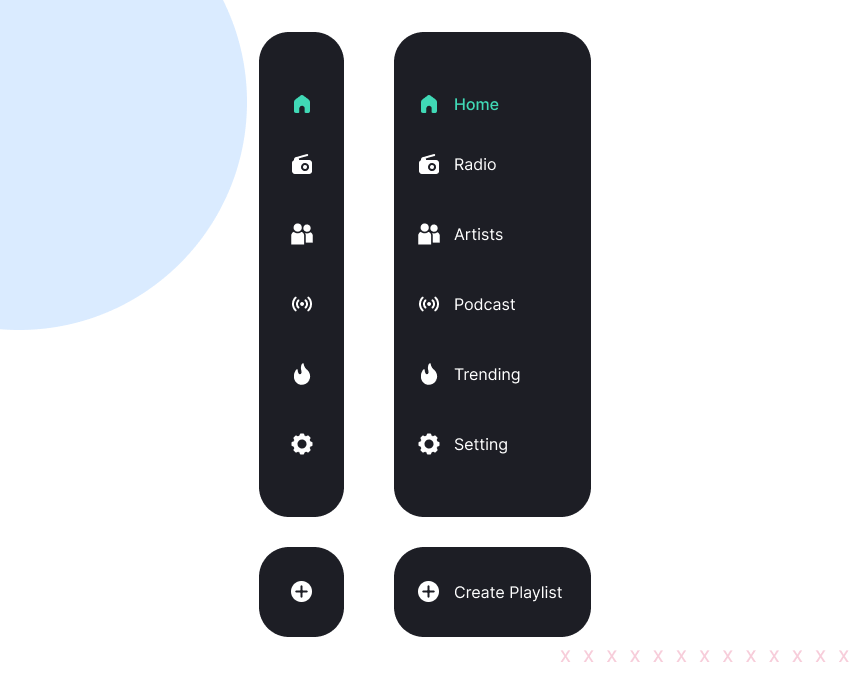
With this pattern, you can draw users’ attention to exploring particular categories as the icons get enough space to be displayed properly without hindering the appeal of the design.
You can make absolute use of this pattern by placing the icons where the CTA lies, that way you can manipulate users to reach there. This is just one of the benefits we are talking about, the more you analyze the more you learn.
10. Grid Navigation
In grid navigation, multiple categories are presented simultaneously; users are left with a choice that which they want to explore first. A popular example of this pattern is Spotify.
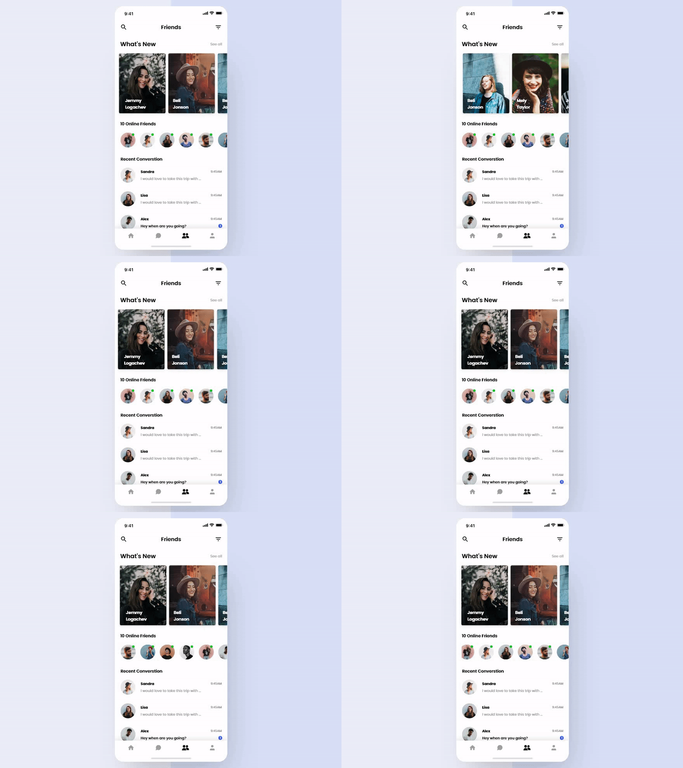
Source: Chat App Animation
In this navigation pattern, you need to take care of the color schemes and fonts as now users have the option to explore multiple categories at the same time.
You need to ensure that users are compelled to visit each and every one of these and finally reach the CTA.
11. Voice Navigation
Voice navigation is still not commonly used like other UI patterns, it is still a developing technology, but surely a promising one.
You may benefit from it by implementing this technology for your userbase. For that, users will need to give their voice input in order to get their voice identified.
Then it’s a cakewalk for them to look for anything in that application, all they need to do is “speak” and the app will present it to them. No need to explore menus, bars, or icons.
12. Search-based Navigation
You will get to see two types of users in general. 1. Who is tempted by a good design and explores app 2. Who merely want to search for what they are looking out for.
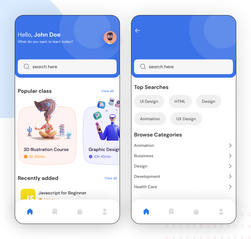
You should think to hire UI/UX designers who can make use of it in a wise manner to gain great traction as users expect to be treated conveniently while exploring the application.
A well-functioning search bar will make you see a major difference. So if a search bar is all it takes to see notable improvements in the results then why not implement the same?
13. Card Navigation
Card navigation is one of the most favorable options if you want to showcase multiple elements like text, pictures, and links all in one place. They are available in all shapes and sizes.

Source: Kidszoo
You see, users do need content in the form of guidance to learn more about the app and its features. Here cards are perfect to represent content in a personalized manner by aggregating single pieces of information in one place.
It’s not left up to that, cards are absolutely adaptable to different sizes of screens, making themselves a top choice for responsive app navigation.
7 Best Practices Every Designer Should Follow
Right from content clarity to design to putting icons sagely, you will get to learn everything you need to create a masterpiece. Here are the 7 best practices you should follow while making mobile app navigation:
1. Readability of Content Matters
When it comes to content in mobile applications, the issue of content’s readability is sometimes not taken care of. The navigation in an application is mostly based on content be it any pattern of mobile app navigation.
Having users struggle reading the content be it informative or just a text on any icon will leave an adverse impact on the app’s engagement. So, this is one of the common issues the audience faces due to the difference in the size of the screen.
It’s always a good idea to give your best effort while prototyping your app’s design including navigation to see how the users are interacting with that.
2. Choose the Order of Your Navigation Mindfully
The order of your navigation menu is often left unnoticed. The irony is that it’s the most important factor which impacts users’ thoughts about your app.
The purpose of intentionally setting the order of your navigation menu is to reflect your goals. For example, if you want users to reach out to the niche feature of your app first then you will set the order accordingly.
Users generally tend to pay more attention to the information that’s presented to them prior to other aspects of the app. So, if you put the niche of your application prior to some lesser important aspects then the chances of the user’s interest in your venture increases.
3. Take Care of Users’ Finger and Hand Positioning
This brings a whole lot of difference, imagine you are repeatedly clicking on a random link and it’s not getting open, your experience becomes horrible in no time.
You need to keep your icons and buttons big and clear enough so that a user can easily manage to explore further. If this aspect is left to be considered then the hard work of the team behind providing such a holistic experience through the app might meet failure.
Ideally, 10mm size buttons go well with the app, and users won’t find any trouble with it, too. The more personalized and updated experience you offer, the more interest users will have in your project. Keeping yourself updated with trends in design is always beneficial.
4. Choose Labels and Icons Meaningfully
If we are talking about the icons, their relevance to the app’s niche is pretty important. Try to keep it simple and easy to understand so that if a user reaches a certain icon of the app, he can easily guess what the icon is about.
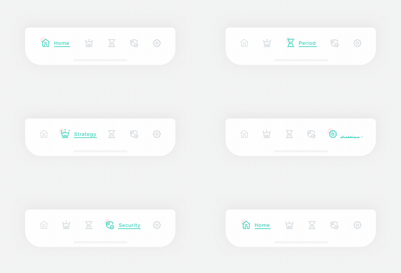
The next important thing to take care of is the size of menu labels, you do not need to shrink the size of the content’s fonts, and adjust the content and menu labels in a proper manner.
5. Reduce Cognitive Load
All this while, you have worked to enable your users to have a customized experience of your application. If the toil behind designing the app does not reflect in the app itself, then imagine the plight?
All your hard work can go in vain, aim to keep everything simple and easy to understand for the users.
The chance of having users enjoy the app becomes double when you have kept everything smooth and simple. Make their journey happier and easier!
6. Declutter the Space of the Screen
Sometimes running behind visual attraction can make designers over-do certain things, this is when you happen to create a mess in your design. Sometimes, the best thing you can do to make the app design look attractive is to leave it clean.
The design layout of the app should not look congested as it not only makes the design look untidy, but it also snatches away the relevance. So, do it mindfully.
7. Add a Search Bar
Even though the design of your navigation is pretty simple and clear, a little chance of users looking for help is always there.
Never leave any stone unturned to provide your audience with a personalized experience, remember, one shortcoming is enough to decrease the user engagement. So, always ensure to take care of everything that makes users satisfied.
It’s a Wrap on Mobile App Navigation
So, here we are after this extensive experience in mobile app navigation. Mobile app navigation is a pretty interesting and vast concept, hope we were helpful to you so far.
If you are looking for the best UI UX design services, we are always happy to help you with the same.
