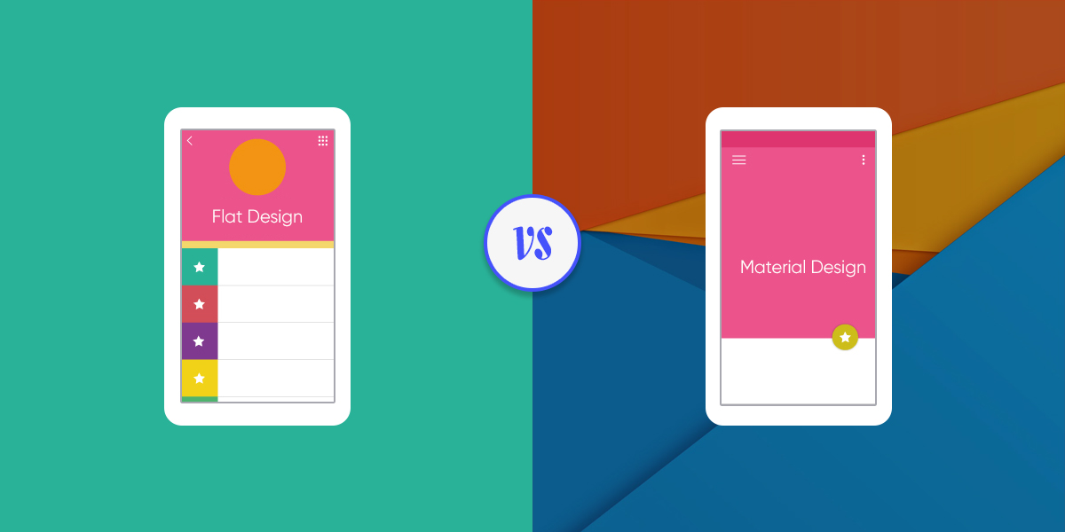
Material Design vs. Flat Design – Which One is Better?
- UI/UX
- March 16, 2017
There is a debate constantly raging on about Flat Design, Material Design, and how they are different from each other. While it is easy to confuse one for the other, they’re not identical and differences can be observed at a closer glance. In this article, we will shed some light on how the two differ and what people can expect from each design model.
Flat and Material Design have come to popularity after a long period of time in which the mobile OS world was dominated by skeuomorphism. Skeuo – what now? Skeuomorphism is the design approach that uses lighting and shading effects to try to bring depth to the UI so that its elements resemble similar things from the physical world. This was a popular approach to mobile UI in the early years of the phenomenon because it helped people better transition. The closest thing to a digital environment people had before smartphones popped up were 2 inch screen phones.
It was the new thing, and app developers and mobile manufacturers alike wanted the end product to be as flashy and awe inducing as possible. Now, people have shifted towards a more simplistic philosophy, and the current mobile industry and user community highly praises minimalistic design with clean features. While overall UI designs have moved away from skeuomorphism, you can still find this design approach within mobile games and other software where it is needed to contour a certain degree of depth and realism.
Flat Design
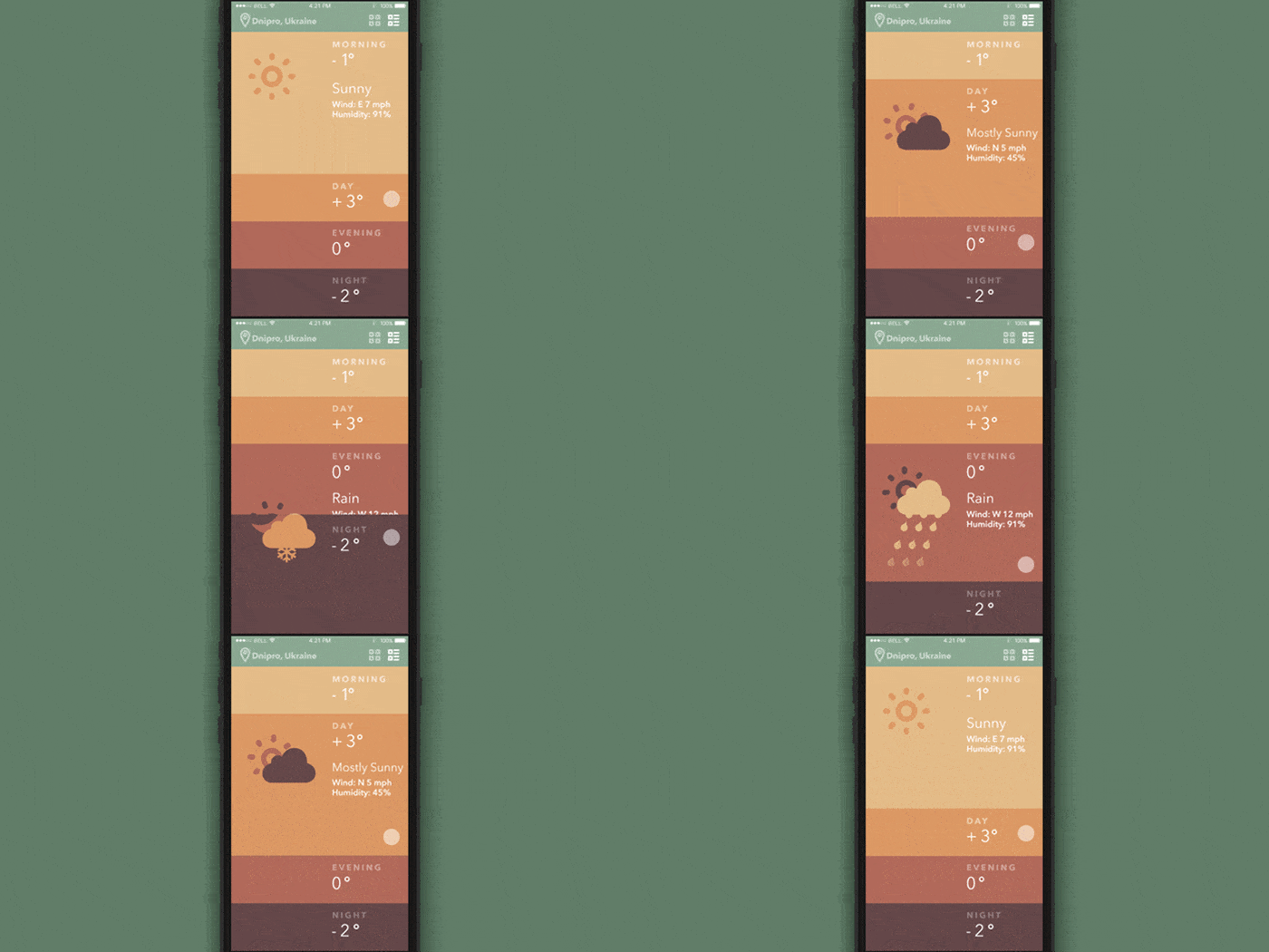
Flat design has been implemented for both aesthetic innovations as well as making the mobile environment more user friendly. What that last bit means is that with Flat design, users of both high end flagships as well as lower end devices with low screen resolutions can experience a good looking app. A skeuomorphic design will not look as good on low resolution displays, thus cutting the user experience considerably. From a performance perspective, it’s the same thing.
Pros and Cons
- All the immersive elements that comprise a skeuomorphic design take up a lot of space and harden the overall process of loading a page. This means that more resources and time need to be allocated to opening that page. Whereas Flat Design is comprised of simple elements, leveled on a single plane. This speeds up the process considerably.
- Although we have gone over the benefits of it, there is also the risk of making everything too flat. This can result in confusion amongst users as it is no longer obvious what parts of the page are interactive and what parts are not. Users end up tapping plain text in hopes of opening an app function and think that a nearby button is just a background element.
From a pure aesthetic perspective, skeuomorphic design is nice. It looks pleasing to the eye and most people are intrigued by the various ways in which it can be used to enhance an app icon or page design. However, this might end up being a counterproductive effect, because it will also distract users from the truly important content within an app or web page. Often times important text or functions can be buried away under stylistic shenanigans. Keeping it simple will direct people towards the important stuff without taking anything away from the aesthetics as Flat Design is also beautiful.
Material Design
Now that we’ve talked a bit about Flat design, it’s time to take a look at Material design and how it manages to take its own identity despite being so similar to the aforementioned UI style. What is very important to keep in mind is the fact that Material design has infiltrated mainstream design trends thanks to a very powerful push from Google. When Google came up with Material design, the whole scope was to make a unified platform that would look the same no matter what device you’d throw it on.
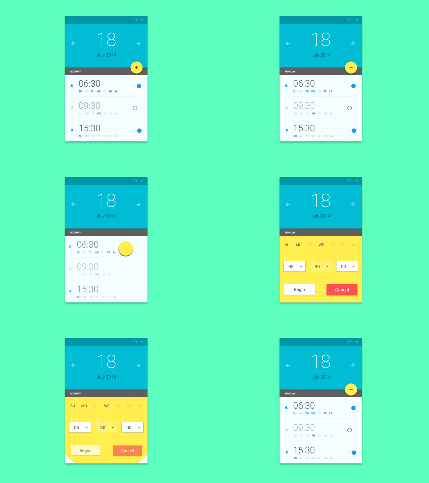
There are tons of Android operated smartphones, and creating some kind of unity between them was important. The end result was Material design, which keeps most of the properties of Flat design and also sneaks some sqeuomorphic elements here and there. By introducing the Z-Axis approach, Google was able to combat the impending risks that await Flat design adepts.
Differences between Flat and Material design
- It is also noteworthy that unlike the naturally-spawned Flat design, Google’s Material design was promoted by the company and those that seek to use it need to follow precise indications as to what they can and can’t do design-wise.
- This might make designers feel a bit less free in self-expression than with Flat design. The aforementioned Z-Axis sets up another very important parallel between Flat and Material, as it introduces a unique – Google skeuomorphism – aesthetic element which gives the design more realism to work with. This is probably one of the most important differences between the two.
So Which One is Better?
One of the easiest ways to explain these UI styles is by using a timeline indicative: First there was skeuomorphism, and then Flat design came along. Google took Flat design, gave it an outline and some depth, and that’s how Material design came to be.
Material design seems to be doing a great job in maintaining the benefits of Flat design while bypassing its setbacks. This means that Material design is no doubt better, since people would be using it for the same reasons they would use Flat design. The fact that Material design adepts do not get bogged down in technical difficulties such as have an interface that is “too flat” makes it superior to Flat design.
Conclusion
Most people see Flat and Material design as two solutions to the same problem, but others will argue that Material design is in fact the next step in solving the problem, and that there is no real competition between them. Flat design was the stepping stone, and an important building block for contemporary UI design. The upcoming years will see designer lean more and more towards Material design, but who knows what it will eventually evolve in.
