The Benefits of Using White Space in UI Design
- UI/UX
- May 7, 2021
Visual and graphic design has developed a lot over the past years and presently known as UI design. As data sharing, communication, business, and entertainment all are happening online now and everybody wants to retain all users by offering the best experience, UI design has become a field of massive importance.
One essential feature of visual or UI design that has remained the same over the last years is whitespace’s importance. This blog gives a brief overview of white space and how it can highly impact the efficiency of the UI design. Read on to learn more!
What is White Space in Design?
White or negative space is just an unmarked space in the visual design. We can find whitespace between the lines of paragraphs, layouts, among different UI components, paragraphs, and more.
Compared to its name, whitespace does not only apply to the white color. It can be any texture, color, background image, or pattern, as it refers to the design’s background.
Why Does White Space Matter in UI Design?
As white space is a crucial aspect of UI design, it can change the design and offer several benefits to your website if used correctly and properly. Being a designer, you must create and deliver layouts that are smooth enough and make people engaged in reading. One of the perks is white aesthetics; others grow around tangible effects on the webpage’s efficiency.
The prime difference between an average and a good product can be seen through its design. Being a designer, you should not only fulfill your clients’ needs but also consider the average users while making a product.
Whitespace not just enhances UI but also the UX of the webpage. Let’s take a look at some factors that depict why white space is crucial to consider and you should ask to your designer when availing UI/UX design services!
1. Adds Emphasis
What happens if you use whitespace for separating a design component? Our brains use to give stress and importance to design components surrounded by whitespace. After all, the negative space is offering visual clues regarding where you must be looking, giving sufficient buffer space around a component so your brain can process it ASAP.
For this reason, sometimes, whitespace surroundsthe crucial design components like logos so they are clearly visible and emphasized. Space can keep the logos separate from other components so the viewers get attracted by your branding and don’t get confused with other pictures.
2. Enhanced Comprehension
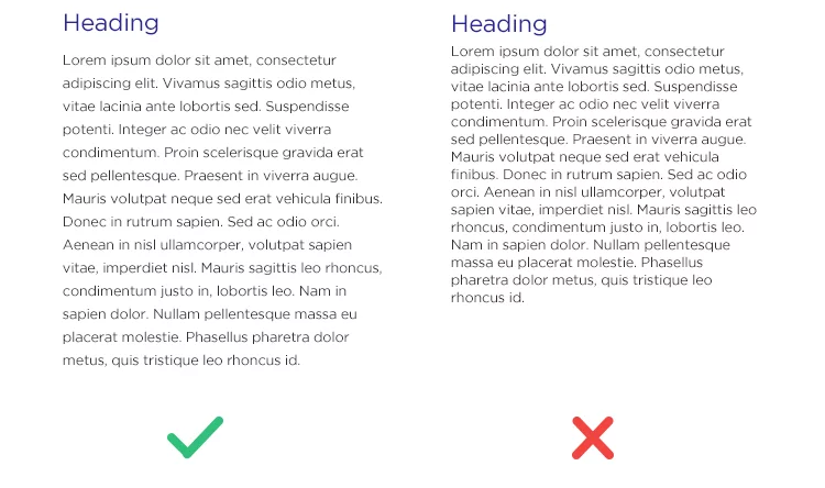
The use of whitespace smoothly makes the content in design scannable easily and enhances legibility significantly.

According to research, the appropriate use of whitespace between lines of paragraphs and its right and left margins can maximize comprehension up to 20%. The small spaces that we find between paragraphs, lines, or menu items are also known as Micro Whitespaces.
3. Guides Your Users’ Eyes
Using whitespace design can help you guide your users’ eyes. Do this by streamlining the content of your page into less than 15 points on that page. Then fix the order of priority for those 15 points. For instance, the first point might be the logo, the second one might be the navigation bar, the third one might be a hero image, the fourth one a text paragraph, and more.
While placing this content, you must decide on where the macro whitespace will be, i.e., where you will put every group of elements or piece of content on the screen. Macro whitespace surrounds every component or group of components.
On the other hand, this space surrounds different components in one group or the spacing between letters, lines, and paragraphs in a text.
4. Maximized Interaction Rate
According to studies, an internet user’s average attention period is 6 seconds. Efficient use of whitespace helps the UI design get the message via users fast and maximize the possibility of interaction by featuring the Call to Actions. So, designers must create communication lines between users and the design and whitespace can help much in it.
Have you checked the home page of Google Search Engine? The utilization of whitespace is quite apparent and communicates the page’s search purpose clearly.
5. Gestalt Principle of Proximity
The Gestalt Principle of Proximity keeps up that users relate closely associated components to have the same features. For implementing this principle properly, you will have to ensure that your group-related components close together. Take Form Design as an instance.
For instance, you might need to gather personal details like name and address in a single group, individualized by a little more space and followed by another group of fields under the details of a credit card.
6. Entails Luxury and Sophistication
Whitespace can become the core design element if it is used for making a specific appearance or mood. We relate a huge amount of whitespace to sophistication and luxury, so utilizing it efficiently may be the method of adding these associations to your design.
Lots of graphic components make the entire design cheap. Instead, try to boost the design by adding more imagery. Let the whitespace work so you can just concentrate on making a better appearance of your graphic elements.
7. Puts Imagination into Effect
While people see whitespace in a UI design, it enables their imaginations to travel free, which yields a more powerful emotional response. Humans’ brains have an elemental requirement for assessing things, which makes a type of narrative between what you see and how you can process it.
What our minds mark onto the whitespace does not really matter; thinking about it involved our mind is important. In case you are involved, you are personally investing in the design. Investing in a design personally makes it more possible to make a great first impression.
8. Showcases the Visual Hierarchy
Using whitespace helps you showcase the visual hierarchy between components on your page. Ponder increasing or reducing attributes like margin and padding for putting more stress on specific elements. Ensure to place essential components like CTAs in the place where they especially look different.
9. Focuses on Important Aspects
A professional designer must be capable of guiding his users’ focus on the content and make the message different. As simple as it can be to excessive design, designers must avoid unnecessary clutter for accomplishing the product’s goal.
Clarity is not about a boring design; rather, it’s a strong design that speaks for itself instead of snatching the audience’s attention.

Take Apple’s advertising and branding as an example. Apple uses huge areas of whitespaces for communicating a sense of simplicity and reflecting its products’ user-friendliness.
Common Designer Challenges Associated with White Space
Although whitespace comes with the aforesaid perks, it can be sometimes cluttered out of design even with the best intentions because of lower importance in client choices or does not match with the developers. For preventing this, you must understand its reason and the ways of fixing it.9
Most businesses rate whitespace as wasted space as they feel it can be used for displaying more content. It’s tough but crucial for a design to convince their clients and make them understand the value the whitespace will add to their businesses in terms of conversions and usability.
Even if the clients get convinced with the value of whitespace, another challenge appears i.e. the readiness of investment. Using whitespaces means less utilization of content per fold. So, there are more pages or folds to be created for covering up content. Naturally, it becomes an expensive deal, particularly in print design projects.
All along these times, the designer’s responsibility is to promote workshops and help businesses give importance to the content and features for attempting and creating a balance between the content and whitespace.
Final Words
Whitespace is the core element in website design. The inadequacy of content is as crucial as the content’s presence on your site. Whitespace is not basically an empty space; it is rather a strong design tool.
Whitespace not just makes balance, harmony and helps in brand designing but also you can use it for leading a reader from an element to another. The prime objective is to make the website look clear and simpler and to give details that the readers will appreciate and enjoy.
Don’t ponder whitespace just a blank space; it’s a design element that allows the objects on a page to exist. This space balances everything out and makes us remember that designs are aesthetic. You don’t require making a layout cluttered with images and text for conveying a simple and clear message.
Looking to hire expert UI/UX designers who take care of whitespaces in product design along with other design consideration? MindInventory has talents you need!
FAQs About Whitespace in Design
Whitespace removes possible distractions and helps the user concentrate on the text. It has been found that text with margins is easily readable and users can get a better understanding of the content.
You can deal with white space in many ways such as remove the border, enlarge the background image, use a colored background, use padding, etc.
The two most commonly used white spaces in design are Active white space and Passive white space.


