The Importance of Color in Mobile App Design
- UI/UX
- April 16, 2018
We are well familiar that both user experience as well as user interface plays a significant role when it comes to engaging more users. However, you cannot deny the influence of various colors in app design.
The fact is the app designers shouldn’t just concentrate on making the app user friendly but also equally emphasize on selecting the right proportion of hues for the app design.
Yes, people would love a colorful and attractive app, which helps in interpretation of your app’s content.
However, the question before the app designing is choosing colors for different segments of the mobile app. You have to choose the color for your app icon, the logo, and the primary colors and most importantly, select the color scheme.
The Significance of Various Important Colors
The app designers in most cases would follow the latest trends in app design while selecting the colors, which isn’t a bad idea. You must note that each of the hues have an impact and communicative power with the user.
So, let’s analyze a few vital colors that see what meaning they convey.
- If you are using red, it would simply imply the call to action and is more impulsive.
- The yellow is related to delight and optimism.
- Green is more associated with the nature and environment and is connected with money and wealth.
- Orange represents excitement and enthusiasm.
- Blue is again a dynamic color known for prosperity and serenity.
Choosing the Color for the Icon
If you visit the Google Play Store or Apple App Store, you can view numerous app icons having plethora of colors. The color of the icons is mostly chosen depending on what type of app is it?
So, here your understanding and knowledge of the hues will come into play. You have to make the selection very cautiously.
The possible way out is following the current design trends and then may be choose the prevalent colors such as red, blue or green.
If you have done a thorough research, you must have seen that blue is the most widely used color found in popular apps such as Facebook, Twitter, LinkedIn, Google, Safari etc.
But if you want your app icon to look different, then you can use the various shades of green.
Picking up the Right Color Scheme
You should know that selecting the right color scheme is indeed one of the critical jobs that you have got in hands.
Thus, when you go out for making the choice, there are different aspects that need to be taken into consideration such as color associates of your region and brand colors.

What you need to do is choose the simple colors to enhance the UX. The simple colors look pleasing to the eyes and at the same time, it becomes easier for the user to read the content.
In fact, according to one of the researches, it has been found that most users prefer like simple colors while using Adobe ColorCC.
When you are using simple colors, it is better to go with two or most probably three colors.
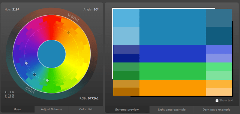
While developing the color scheme you can take the help of color wheel that contains several predefined schemes making the task easier for the designers.
Types of Color Schemes Used
Monochromatic
This is one of the simplest color scheme used for designing apps as you have to take each of the color right from the base. It will have a good impact and will give a sober look.
It contains only one color along with shades, tones and tints. You can create elegant innovative designs with it. The blue and green will be soothing for the eyes.
Analogous
This color scheme is prepared from associated colors where one is used for prominence, while the other is used to enhance the scheme. In the Analogous color scheme you have to mainly use three hues, which are closely related to each other.
In this case, the main challenge is to decide which color to use as to give the app a more sophisticated look. An instance of an app using analogous color is Calm meditation app making use of green and blue so that users feel more relaxed and at peace.
Complementary
These are mostly contrasting colors and contrary to each other. Their main purpose is to gain the focus of the user.
So, here basically two colors are selected; one remains dominant while the other is contrasting or balancing it. However, must be ensured that colors are chosen carefully for the content does not look very bright.
Custom Color Scheme
When you are deciding to implement the custom color scheme, use the color wheel intelligently. But it is not that only experienced designers can lay their hands on it.
If you have just started, then the advice would be to use more of traditional color scheme and if you want to succeed then try using only one or two base color.
Compound Color Scheme
Also known as the split-complementary scheme, it combines base color as well as a couple of analogous colors. It is similar contrasting as complementary color but does not have a good visual outlook.
Choosing the Color Shades
Selecting the color shade of the app is also important and here the designer needs to blend black with the base color.
Its main objective is to make the mobile design more attractive. It also highlights certain specific areas of the app such as its functionality.
The Use of Adobe Color CC
The main function of Adobe Color CC is to make the job of the designers easier by simplifying the task of selecting required color.
As such you can choose any color as base color and also add and save the palettes directly.
The Effects of Color Contrast
The designers need to make use of the color contrast (using two opposite colors) to prevent the eyes from strain. It divides the colors of the app so that user can easily get the attention.
The colors of an area on UI is not left alone but is laid over other colored object or area.

But one thing needs to be kept in mind. If you are using low color contrast to embellish the design, the content text may suffer as it may not be readable. So, better avoid using two colors with low-value contrast.
This proves to be true when the light outside is very bright. The best part will be examining the contrast ratio before selecting the color. It will tell you what the ratio of difference between the two colors is.
For instance, for smaller text, you can use the contrast ratio of 4.5:1 against its background and if you are using large text, then the ratio of 3:1 is recommended. You can use the same ratio figures while designing the icons or the logos. But remember, the text must be clearly visible.
It’s good that you are focusing on making your text legible, but making it eye-catching for users is as crucial. So, what you can do is use the high value contrast color if you want to highlight an important area or text. You can use it in call-to action buttons that are used frequently by users.
What about Visually Impaired People
So, you also can design for people suffering from the problem of color blindness who cannot differentiate between colors.
They have problem in identifying base colors such as red, blue or green. But you can make use of the strokes, patterns, signs and indicators etc. to make it easier for such people so they can read the content.
Read also: How to Create an App Design That Works?
Conclusion
So, we have evidently seen how color is important while designing the User Interface and User Experience of a mobile app. It can give your app a standout response in the market competition.
Therefore, you have to give equal emphasis on it besides focusing on various elements of UI and UX design.
The right choice of the color is most important and it must be done with extreme care. Make best use of the color schemes and contrasts to enrich the app design.
Searching for an extraordinary app design? Come to us for all your app requirements.


