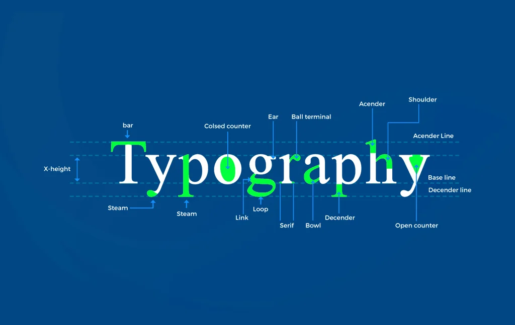
A Complete Guide to Use Typography in UI Design
- UI/UX
- June 28, 2019
Each and every element is important in the layout when it comes to UI design and one of the best ways to enhance UI design is Typography. Nevertheless, typography is pondered to be the most difficult part of UI design.
Hence, you have to learn the fundamentals of typography science in order to make an efficient UI design. But still, there are many webmasters and designers who don’t know the ways of using typography properly in UI design.
If you are a designer, you must have a massive chance of the text and not simply view it as content, but as a basic feature of UI design. 95% typography is contained by web design and you have to go above the typeface.
Read also: How to Create an Extraordinary UI Design for Mobile App that Instantly Draws Attention
You must ponder readability, accountability, and graphic balance if you want to optimize your typography for UI design, but usability is the most crucial aspect for sure.
What is Typography?
According to Wikipedia, it’s a method and the art of organizing type for making written language attractive, readable, and legible when showcased.
The systematization of type includes choosing point sizes, typefaces, line-spacing, line lengths, letter spacing, and modifying of the space between couples of letters.
The term ‘Typography’ is also applicable to the organization, style, and appearance of the symbols, numbers, and letters produced by the procedure.
In a nutshell, typography is about everything associated with the written language on the screen and needs both the tactic and art skills of a designer.
Best Practices of Typography in UI Design
In case you want to create excellent UI design, you should master in your typography.
In this piece of blog, I’m going to share some guidelines which will help you excel in the typography style in UI design.
1. Completely detectable letterforms
Numerous typefaces have specific letterforms which are not differentiable from others in that set. This can make it really hard to read that interface’s text.
Along with letters, figures are really sometimes ignored with compared to different attributes of fonts for a given assignment.
2. Text styles
Utilize in-built text styles if possible as they help you showcase context in ways which are visually different while maintaining absolute legibility.
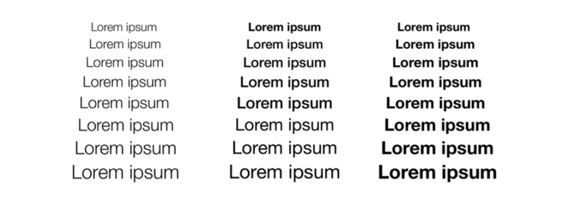
These styles depend on the system fonts and help you take benefits of basic typographic features like Dynamic Type that modifies leading and tracking for each font size automatically.
3. Prototyping
Alongside all types of designs, typography is essential in prototype design as well. Amazing mobile typography can function together with every UI element towards a productive and clean mobile UI; however, in mobile prototype design, the text doesn’t require being meaningful.
For instance, in Mockplus, one of the best prototyping tools, you can utilize text component for designing with easy drag-and-drop.
Mockplus comprises of both single-line and multi-line text elements. You are free to describe the properties of the text, such as font, font size, alignment, color, etc.
Moreover, the text’s auto data fill function will save you much time. Also, you can examine the design on a real mobile for checking whether it is of amazing readability.
4. Size is important
Usually, it is seen that numerous designers include text components which differ in size; for instance, button copy, field labels, section headers, and so forth.
Usually, some typefaces are ideal for large sizes whereas others look perfect when utilized in small sizes or for letterforms.
Thereby, you will have to ponder the text’s scalability in case you have a typeface which you need to apply to large headlines and small labels.
If you will choose a typeface which appears a specific way, ponder one which is compatible with different sizes and those which promote readability as well as usability.
5. Letter spacing
The single thing which you must ponder in letter spacing is that you have to make the spacing appropriate and smaller to the text size if the text is bigger.
When you pair large letters with large spacing, the typeface seems very open and this helps you fix the spacing manually. This manual setting of letter spacing is applicable to headers only in UI design.
6. Wide proportion
A character’s width in association with its height is explained as the proportion. Usually, you need a wide letter and not a condensed one for better letter detection and this happens due to the better legibility.
7. Readability
This is regarding the whole reading experience’s quality and it’s described as the ease with which you can identify text blocks, sub-headings, paragraphs, headers, and understand the text showcased to you.
You can consider it as some macro typography which makes the text appealing for encouraging website visitors for reading the content.
8. Sans Serif vs. Serif
According to history, serifs are more legible. They were utilized in print for an extended period and they highly enhance the reading experience for large text blocks. Serif enables the eye for flowing more easily over the text.
However, this story is not the same on the mobile and the web. There are different sans-serifs which can be read and present state of visual design likes simple letterforms. On the web and specifically on mobile, you can see more sans-serifs.
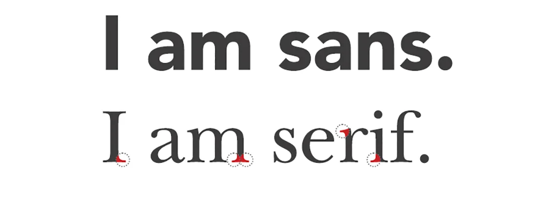
Moreover, the display is definitely not paper and generally, you will not read long texts on the web, particularly in applications.
Thereby, it all depends on the project you are dealing with and how the users will use up your content.
9. Hierarchy
The reading pattern is decided by hierarchy. It tells how to keep a header separate from the body text and subheading.
This can be done with the use of the effect of contrast, margins, text sizes, padding, etc. You need to learn this method properly to master amazing readability.
10. Scenarios in view
When you are about to finalize the text which you are going to include in your UI design, you have to check several scenarios. You will also have to understand how to match and mold the text. An alert message is an example of this.
The original text requires being different from the alert message’s text, and this brings meaning to the light that a good UI is one which encounters challenges but comes flawless at the end.
11. Actual platform
This appears really definite but is usually overlooked. In case you are developing a mobile app, you are recommended to test it on mobile platforms.
In case your user interface is built in a responsive format, run all tests on different sizes and devices for knowing if the decisions taken about the text which are relevant or not.
12. Rhythm and Repetition
This is a clumsy part of UI design. Every component which is repeated is done for offering unity in design.
This technique of repetition may be applied through boxes, backgrounds, text size, padding, colors, and margins. Repetition considers rhythm.
13. Line height
You are highly advisable to use the golden ratio when it comes to leading. In case you have more experiences, you can adjust this result manually.
Definitely, there are some exceptions to this rule and this rule can be broken always in case it is required.
14. White space
White space minimizes the text amount which your visitors will need to read at once. This boosts readability and avoids the page from looking as clumsy.
The white space enables the eye for observing the layout and as a result, it provides the attractive and finesses arrangement of content.
15. Text block width
Suppose you are reading on thin ice. Very wide text blocks will exhaust your eyes while adding the next line for reading.
Diversely, in case the lines are not wide, the eye will be forced to go line to line thereby preventing the flow of reading.
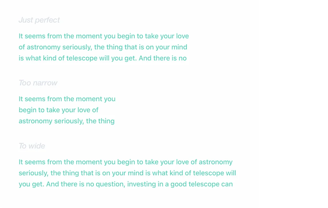
Readers get energy subconsciously by the concept of jumping to the next line. And to keep all readers engrossed and energized, you need to keep only 50 to 75 characters in your text line.
16. Text is a user interface
The difference between inexperienced and experienced UI designers is measured by their text view. Expert designers view the text as the UI whereas the inexpert ones will view it as another content piece.
In this modern digital era, your text should support a functional component and this makes it similar to the user interface. This implies that every feature of your UI design should be compatible with the texts you type.

In Conclusion
Regardless of the purpose, the type will always lead the UI. Your text will master if you set it properly, and it will fail if you set it wrong. All the UI design practices are applicable to your selected typeface.
An accomplished UI design comes with excellent typography. Thereby, a text which scores high in flexibility and scalability can rule the race of fluid encounter with your design.
Follow the aforementioned tips and make use of them in case you are willing to establish yourself in the market and win the race as a skilled UI designer.
