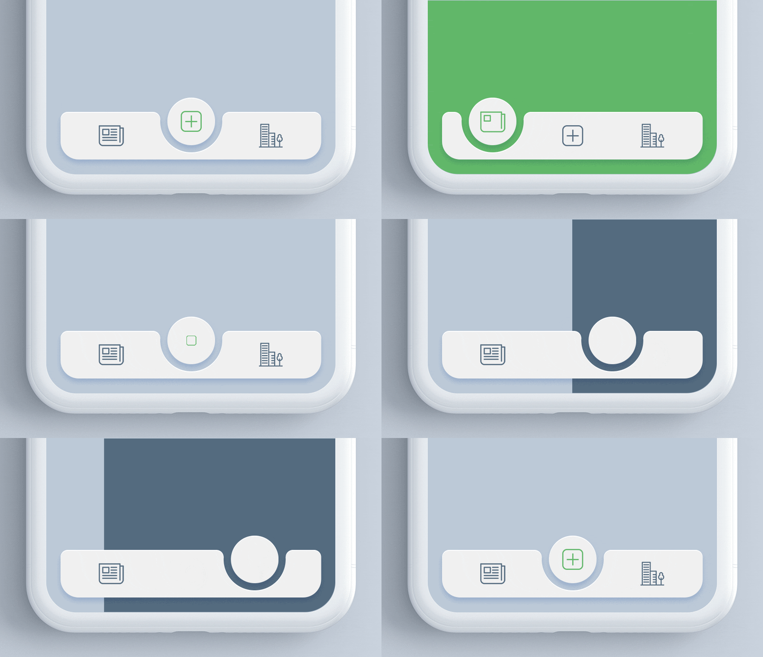
FAB Tabbar – Concept to Reality
- Mobile
- August 29, 2018
Now A days, React Native is one of the leading app development choice when it comes to cross platform apps development and at Mindinventory we love it like anything, but that is not enough for a Hard core developer to satisfy his desire of doing something out of this world, Isn’t it? usually now a days Google’s Material Design is the default choice when it comes to high quality UI/IX, We thought why not create something cool with the latest of Material Design and React Native and that lead us to this concept made to reality.
To write code of this beautiful Tabbar was not that damn simple as it may seem at the first glance. We tried various paths to develop it and finally we did it which can work the same as designed.
Let’s Look At The Development Story Of This Vision.
As usual what coders does, we did the same to place this idea in an app, we searched various plugin which could provide us the expected results, but was all in vain and there was no plugin available which could work, well that was a blessing in disguise, as a result, we developed a plugin for this custom tab design which is open source right now and you can implement it in your designs in quick, easy and simple steps.
The first way, we tried to do it with the React Native components, but it didn’t work as expected and the results were not exactly the same as designed. So, we came up with another technical idea to built it and let’s see what it was. Meanwhile you can also check the animation on Dribbble and Behance.

We decide to work on the idea of creating a complete Tabbar using SVG components. And followings are the elements which we put together to build this Tabbar.
- Hollow Semi Circular Tabbar
- Circular Tabbar Item
- Tabbar Item Image
- Animation in the Tabbar and circular tab item while switching.
So, the next challenge we did face was, React native doesn’t support SVG, so we need to get what could support the SVG and we found react-native-svg library, which was a point of emergence to get this technical idea work.
We created an SVG for Circular Tabbar Item and Hollow Semi Circular Tabbar.
import Svg,{
  Circle,
  Path
} from 'react-native-svg';

<Svg version="1.1" id="bottom-bar" x="0px" y="0px" width='100%' height="100" viewBox="0 0 1092 260" space="preserve">
        <AnimatedPath fill="#f0f0f0" d={ `M30,60h${this.state.pathX}
.3c17.2,0,31,14.4,30,31.6c0.2,2.7-0.3,5.5-0.3,8.2c0,71.2,58.1,129.6,129.4,130c72.1,0.3,130.6-58,130.6-130c0-2.7-0.1-5.4-0.2-8.1C${this.state.pathY}.7,74.5,${this.state.pathA}.5,60,${this.state.pathB}.7,60H1062c16.6,0,30,13.4,30,30v94c0,42-34,76-76,76H76c42,0-76-34-76-76V90C0,73.4,13.4,60,30,60z` }/>
        <AnimatedCircle ref={ ref => this._myCircle = ref } fill="#f0f0f0" cx="546" cy="100" r="100" />
</Svg>
Next was the key point that make tab bar attractive i.e. animation while switching between two tabs.
Well, where the default failed to work, we have to be the creator and have to create a customised one, as here the default animation didn’t work as transition animation fails for the Tabbar due to the hollow curvature and an animation along with the curvature in Tabbar we have to build custom SVG working with the dynamic path to support an animation and curvature.
Following is the code responsible for curvature transition along with circular tab item.
<AnimatedPath fill="#f0f0f0" d={ `M30,60h$ {this.state.pathX}
.3c17.2,0,31,14.4,30,31.6c-0.2,2.7-0.3,5.5-0.3,8.2c0,71.2,58.1,129.6,129.4,130c72.1,0.3,130.6-58,130.6-130c0-2.7-0.1-5.4-0.2-8.1C${this.state.pathY}.7,74.5,${this.state.pathA}.5,60,${this.state.pathB}.7,60H1062c16.6,0,30,13.4,30,30v94c0,42-34,76-76,76H76c-42,0-76-34-76-76V90C0,73.4,13.4,60,30,60z`}/>
We created a circle as an animated component and the Tabbar as an animated path.
const AnimatedCircle = Animated.createAnimatedComponent(Circle)
const AnimatedPath = Animated.createAnimatedComponent(Path)
When user clicks on the tab to switch the animation works due to work of below written code.
update(index) {
      if(index == 0) {
      this.setState ({
      selectedIndex: index,
      });
      Animated.spring(this.state.pathD,{toValue:22,duration: 10, friction: 10 }).start();
      Animated.spring( this.state.circleRadius, { toValue: 211, friction: 10 } ).start();
      }
      else if(index == 2){
      this.setState({
      selectedIndex: index,
      });

      Animated.spring(this.state.pathD,{toValue:691,duration:10,friction:10}).start();
      Animated.spring( this.state.circleRadius, { toValue: 880, friction: 10 } ).start()}

      else {
      this.setState({selectedIndex: index,});
      Animated.spring(this.state.pathD,{toValue:357,duration:10,friction:10}).start();
      Animated.spring( this.state.circleRadius, { toValue: 546, friction: 10 } ).start();
          }
      }
What makes an attractive look of the tab item and the Tabbar is done by styling it.
TabBar.Item = TabBarItem;
const styles = StyleSheet.create({
  container: {
    flex: 1,
    overflow: 'hidden',
 },
content: {
    flexDirection:"column",
    zIndex: 0,
    width: (Dimensions.get('window').width - 30),
    marginBottom: '4%',
    left: '4%',
    right: '4%',
 },
subContent: {
    flexDirection: 'row',
    marginLeft: 15,
    marginRight: 15,
    marginBottom: 10,
    zIndex: 1,
    position: 'absolute',
    bottom: 5,
 },
navItem: {
    flex: 1,
    paddingTop: 6,
    paddingBottom: 6,
    alignItems: 'center',
    zIndex: 0,
 },
navImage: {
    width: 45,
    height: 45,
 },
circle: {
    bottom: 18,
 }
});
Setting the Tabbar default state at initial state.
this.state = {
     selectedIndex: 1,
     defaultPage: 1,
     navFontSize: 12,
     navTextColor: "rgb(148, 148, 148)",
     navTextColorSelected: 'rgb(51, 163, 244)',
     circleRadius: new Animated.Value(546),
     pathD: new Animated.Value(357),
     pathX: "357",
     pathY: "675",
     pathA: "689",
     pathB: "706",
     showIcon: true
   }

this.state.circleRadius.addListener( (circleRadius) => {
      this._myCircle.setNativeProps({ cx: circleRadius.value.toString() });
});
So, that was the code to developed in the plugin.
You can use this plugin in your app and make it look great, let’s check how to use it.
Implementation
import TabBar from "react-native-tab-bar-interaction";
...
render() {
 return (<TabBar>
        <TabBar.Item
         icon={require('./tab1.png')}
         selectedIcon={require('./tab1_sel.png')}
         title="Tab1"
         screenBackgroundColor={{ backgroundColor: '#008080' }}
     >
        <View>

        </View>
        </TabBar.Item>
        <TabBar.Item
         icon={require('./tab2.png')}
         selectedIcon={require('./tab2_sel.png')}
         title="Tab2"
         screenBackgroundColor={{ backgroundColor: '#F08080' }}
     >
        <View>

        </View>
        </TabBar.Item>
        <TabBar.Item
         icon={require('./tab3.png')}
         selectedIcon={require('./tab3_sel.png')}
         title="Tab3"
         screenBackgroundColor={{ backgroundColor: '#485d72' }}
     >
         <View>

         </View>
         </TabBar.Item>
         </TabBar>);
}
After installation done as per the guideline provided on Github, you need to import “react-native-tab-bar-interaction” to add the Tabbar in your app.
import TabBar from "react-native-tab-bar-interaction";
Add Tabbar Item:
<TabBar.Item
       icon={require('./tab1.png')}
       selectedIcon={require('./tab1_sel.png')}
       title="Tab1"
       screenBackgroundColor={{ backgroundColor: '#008080' }}
>

<View>
/*tabbar body content here*/
</View>
* Your app must contain 3 tabs.
1. Add unselected icon in this line.
icon={require('./tab1.png')}
2. Add selected icon in this line.
selectedIcon={require('./tab1_sel.png')}
3. Add tab title in this line.
title="Tab1”mind
4. Add Tab Screen Background color in this line.
screenBackgroundColor={{ backgroundColor: '#008080' }}
Check full source code of React Native Tabbar on Github.


