How To Create Minimalistic UI Design for Your Mobile App?
- UI/UX
- December 31, 2018
We have often been told that one of the key elements that drive the users into an app is intuitive design. What users prefer today is a simplified user interface with basic functionalities. But have you ever heard about the term minimalistic design?
Actually, the word minimalistic design originates from the term Minimalism, which is said to be an art movement that started post the World War II. In the simple and plain language, it is clear, concise, and consistent design that brings the designing techniques to its core. It is not entirely related to app functionality. It is based on implementing the necessary design elements that takes your mobile app towards the zone of success.
A highly rated app is always simple on the cards with a clear visual communication. It is easily navigable with attractive color schemes and aesthetic background. As such, the designer uses his expertise to perfection while incorporating the various aspects such as the white and negative space as well as proportionality. He allows the app to breathe with the right choice of the visual balance.
Choosing the Simple Color Scheme
Choosing a simple and sophisticated color scheme is a great way to user the experience of the users. You cannot deny the influence of colors in mobile app design. Some UI designers have the concept that picking up various colors can provide a rich look to the app design; but that’s not true.
The UI designers are even free to select and develop their own color scheme based on the color scheme standards. As such, there are mainly two types of schemes that are popular.
Monochromatic scheme
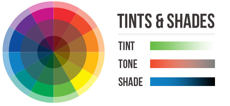
When you opt for the monochromatic color scheme, you get a wide selection of tints, shades, and tones within a specific color. You can change the brightness and the saturation point of the color scheme and even create other hues and schemes that do not overpower the eyes.
Analogous schemes
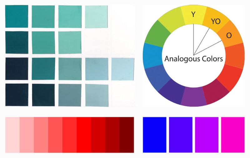
In this scheme, the designer is supposed to pick and utilize three colors that are placed adjacent to one another on a color wheel. You have to use the same colors for carrying out the tasks and highlight the important design of the app. Here the brightest color gains utmost vitality, while the lightest hue is least important.
One App, One Typeface
It is not a viable idea if you blend the various font sizes and types to provide a patchy or uneven look to your app. This where you can show your skills, deduct the font numbers to make the typography consistent. You will have to pay attention on important factors to enhance your typographic skills including the style, weight, size and avoid focusing on the different typefaces.
While selecting a typeface for any app, you need to note that the platform’s default font is very important. For instance, the iOS apps mainly use the San Francisco family of typefaces that improves the reading experience for the users across all the platforms. Similarly, in the case of Android and Chrome, the popularly used typefaces are Noto and Roboto.
Divide by Elements and Spacing, Not Lines
The designers mainly use the lines and dividers if they have to clearly outline and distinguish the different sections and categories of an app screen. However, like colors you cannot use too many lines, which can make your app interface look untidy and clumsy.
On the other hand, if you are using the lines and dividers in the appropriate ratio and proportion, the appearance of the app interface would become appealing, and functional drawing the attention of the users.
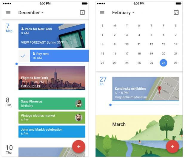
If you want to segregate the content part from the lines, you can use the blocks, and spacing colors etc. One can cite the example of Google Calendar App, where the lines and divisions have been spaced intelligently using the shadows rather than lines to show the different sections.
Blur Effects
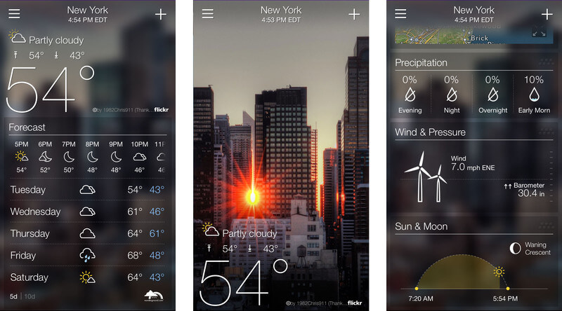
If you want to get a minimalistic design for the app UI, then one of the best solutions is utilizing the blur effects. This is where you can work with the layers and interface hierarchy. This is regarded as the optimum possible method because when you are playing with the layered UI, you get the chance of knowing the mobile’s flow to design an engaging menu and explore for more solutions.
If we want to give a perfect example of an app using blur effects, then you can see the Yahoo weather app. It shows some beautiful weather locations and what’s important is you just need a single tap to get the detailed data, whereas the important data is instantly visible.
Data Spotlight
Well, this is understandable. You need to highlight the most important piece of content or the one present at the center by using a bright visible color and large font. At the same time, you can use contrast colors for the call to actions, help, and others to make your app pleasing.
If you are employing the bigger fonts and using dark colors, it would grab the user attention into that particular spot where you want to draw. It would easier to collect information.
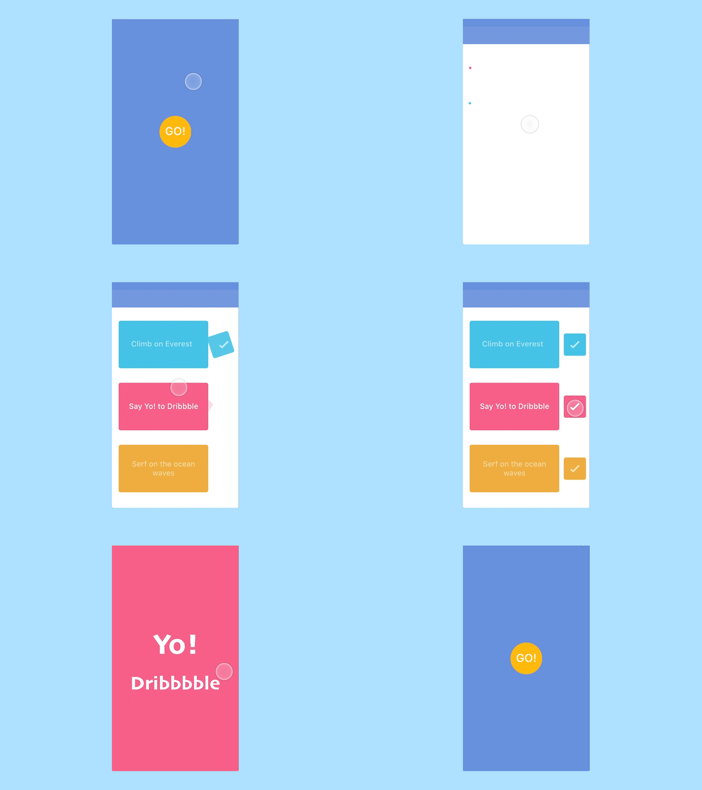
Making Use of the Whitespace
In order to implement an ideal minimalistic design, the whitespace or the negative space must be used wisely. This is more essential as these are basically the blank spaces in any app that are left empty for the purpose of developing contracts, and create other elements.
The whitespaces don’t have any color. But they are pivotal from the design’s perspective. Now, it all depends on the creativity and expertise of the designer on how skilfully he utilizes the negative space.
Icons: Stroke and Fill
Let’s first define iconography. Well, it is known as the visual language representing the app content and functionality. It must be ensured that the icons are identified with much ease and so there should be an element of simplicity in it. Therefore, you can use the stroke and filled icons similar to those used since the release of iOS 7.
Now, if we talk about the tab bar icons, it becomes an essential tool for app navigation and to browse the different app segments. It is important spotlight the active part of the application. The users then can easily identify the active tabs.
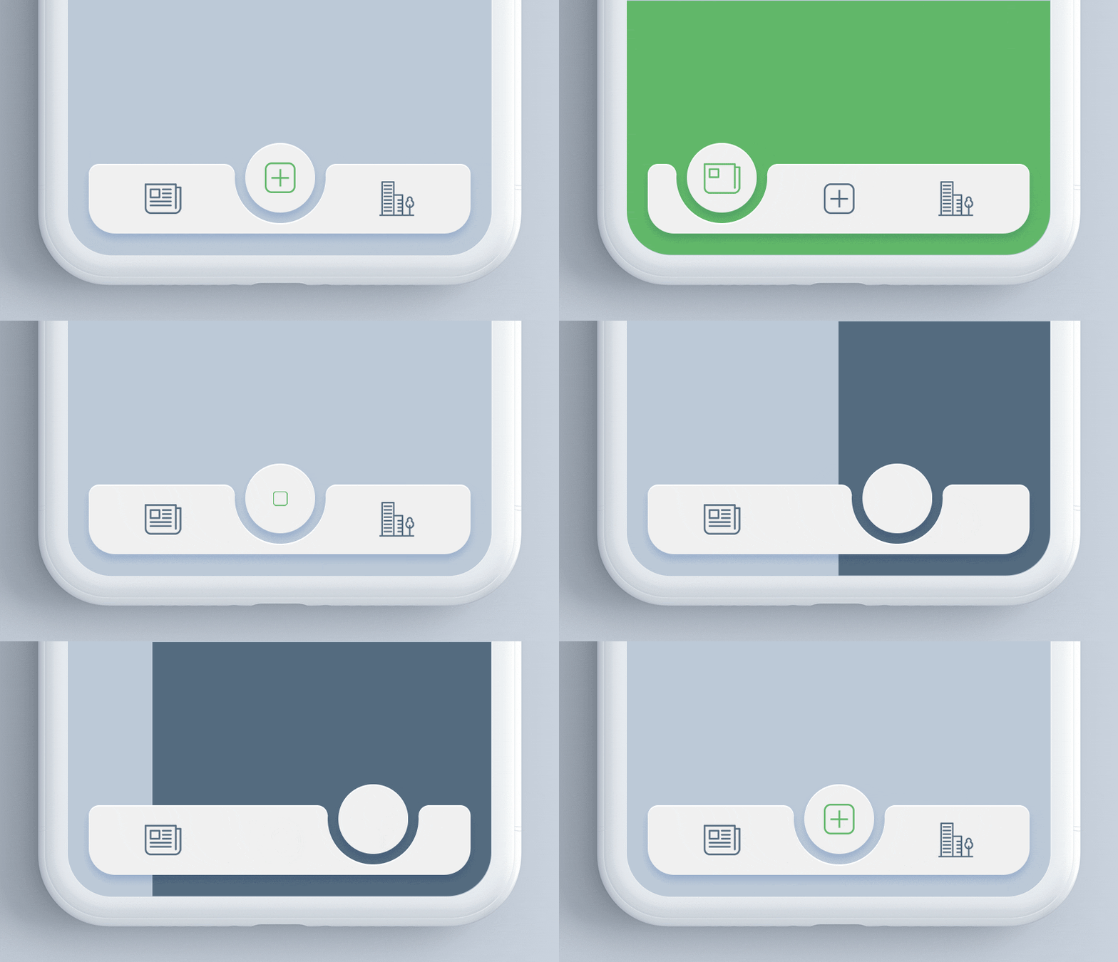
Read also: FAB Tabbar – Concept to Reality
Usual Tips on Obtaining Minimalistic Design
- It is imperative to focus on the various aspects of attaining the responsive designs. It ensures comprehensive app functionality across different platforms, devices, and OS.
- If you are in dilemma regarding the implementation of the app UI design, always choose your actual potential audiences to judge the app features. It would help to improve your design techniques.
- Follow the rule book and guidelines of the operating systems such as Android or the iOS related to design of the user interface. You would achieve a sure-shot success. Also, it would be advisable to do a bit of research before the app submission to the respective stores and get familiar with the number of successful apps.
- Make your app instructively navigable and more engaging to keep audience interested in your app. You can iterate the interface design as well.
- It’s not that you are a UI designer, so you don’t have any responsibility towards the security concerns. You must take all security measures into account while UI designing.
- You can integrate the minimalistic design both by combining the innovation along with technology.
Enhance the App Stickiness with Minimalistic Design
You can determine the success rate of your app by compelling users to use your app in large numbers and enticing them to come back. The stickiness is one such parameter that usually divides your audiences into two categories namely; the Daily Active Users and Monthly Active Users.
One of the most successful apps in this category is probably the Instagram. It can be considered as the stickiest apps excelling in sheer minimalistic design. Any user can easily understand it.
Read also: How to Create an Extraordinary UI Design for Mobile App that Instantly Draws Attention
Concluding Lines
The design trends are changing and the app designers are keen to follow and implement the minimalistic design and latest elements to surpass their app over competitors. They just don’t focus on embellishing and decorating the app with vibrant colors and stylish fonts etc.
They have understood the mantra of successful UI design methods where emphasizing on topography, typeface, blur effects, color schemes, and using the whitespace intelligently is more important to remain on the top.
Are you looking to implement the minimalistic design in your app? Our proficient designers are ready; contact us today!
