18 Mobile UX Design Practices to Delight Your Users
- UI/UX
- November 15, 2023
With users increasingly focused on how digital product interactions feel, such as smooth navigation and effortless interactions, especially within mobile apps, the spotlight shines brightly on UX design. This blog post provides you with some impactful mobile UX best practices that will elevate your user engagement.
We live in a digital world where our mobile devices come in handy for even the slightest tasks—whether it’s making online payment transactions, checking events on a calendar, or shopping. With every business digitalizing their services through mobile app development, understanding mobile UX best practices is essential to stand out and meet user expectations. Being aware of the competition you face means adopting strategies that prioritize seamless and engaging user experiences.
Currently, there are nearly 6 million mobile apps deployed across both the Google Play Store and Apple App Store globally. Not every app gets the attention and preference of users.
Many mobile app UX design mistakes, such as poor usability, confusing navigation, and unnecessary complications, lead to user rejection. Therefore, it’s necessary to use mobile app design best practices to craft a compelling UX design that modern users approve of.
This blog explores the mobile UX design best practices for designing a compelling app that retains users.
What is Mobile UX Design? Why Is It Important?
Mobile UX design is the process of making an intuitive experience for mobile apps. UI and UX designers focus on factors like solution effectiveness or accessibility to boost mobile interactivity. Mobile UX design best practices would be very helpful for designing your mobile app UX, as it is all about how users feel when using your mobile application.
Most successful apps provide their users smooth navigation, appealing user interface and best user experience. An effective UX design for mobile is the beginning to a successful app development. After all, most users like a visually attractive and user-friendly app with amazing functionality.
Apart from that, you should focus on designing a compelling mobile app UX design, following the below-mentioned reasons:
- A good mobile UX design should ensures that users find the app intuitive and enjoyable to use, which increases the likelihood of them returning to your app. High retention and engagement rates are critical for the success of any mobile app.
- In a market flooded with millions of apps, a superior UX can set your app apart from the competition.
- A compelling UX developed following mobile UX design best practices ensures higher user satisfaction and their likelihood of leaving positive reviews, recommending the app to others, and becoming loyal customers.
- By focusing on UX design best practices, one can reduce the likelihood of users abandoning app due to frustration or difficulty in use.
- Good UX design practices prioritizes usability, making it easy for users to navigate and accomplish their goals within the app.
- An app that offers a compelling user experience reflects well on your brand’s reputation and credibility.
- A seamless and intuitive UX can lead to higher conversion rates, whether it’s through in-app purchases, subscriptions, or other desired user actions.
- Investing in good UX design upfront can save costs in the long run by reducing the need for extensive redesigns and fixes.
- Moreover, adhering to mobile app UX design best practices ensures that your app complies with industry standards and guidelines, which can enhance its accessibility, performance, and overall quality.
You can also find many other mobile app design benefits by exploring our in-depth guide on the same.
What are the Best Mobile UX Design Practices to Follow in 2025?
Mobile UX designing needs understanding and knowledge of user expectations and requirements. The number of mobile device users will reach 6.4 billion by 2029, which showcases constant development in the following years. Hence, you can’t skip learning the best mobile UX design practices.
Let’s have a look at some of the best mobile UX design practices in 2025!
1. Prioritize Wireframing In The Star
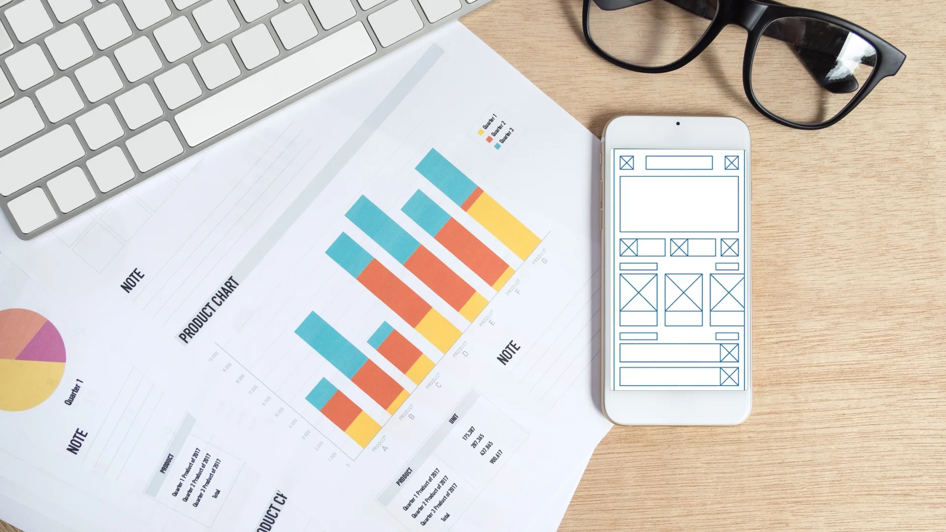
The most important mobile UX design best pracrtice is to start with wireframes to map out the app’s layout and functionality. This helps in visualizing the user flow and structure before diving into detailed design. Mobile app wireframing and product prototyping help to test and iterate on design ideas early in the process, allowing us to identify and fix usability issues before development.
2. Navigation should be Simple Yet Elegant
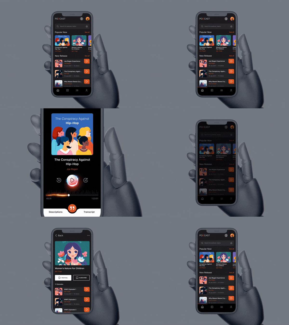
The unique content and features have no use if your users cannot discover them. Following best practices in mobile UX designing would help to create engaging and easy navigation.
Implement easy-to-find elements so that users can navigate from one screen to another or return without issues. Make sure to design the navigation menu so that it doesn’t occupy much space on the screen.
In short, your mobile app design should be intuitive when it comes to navigation by adding familiar UI elements that show them how to use the design. Use clear and concise labels for navigation elements. Ensure users can easily find what they need. Further, you must maintain consistency in navigation patterns to avoid confusion during app surfing.
Your mobile app UI can include bottom navigation bars, hamburger menus, or tab bars to ensure an intuitive app user experience.
3. Prioritize Minimalism In App Design
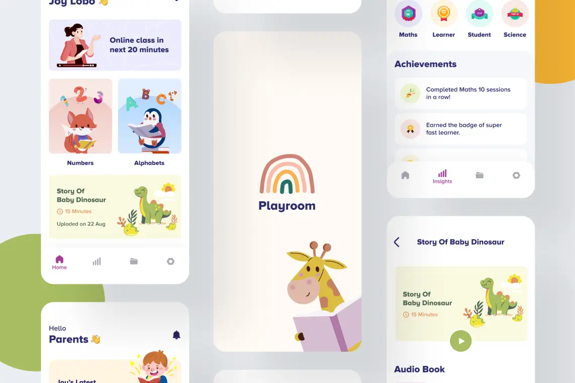
Minimalism in mobile app UI design is always in trend in mobile UX design best practices. Building a simple method is not difficult since users search for ease of use and usability. So, you must not clutter screens by adding many app interface elements. For better results, make a balance between unique functionality and a basic design.
A Minimalistic mobile app design comprises a touch of uniqueness, which is attractive enough to grab the attention of users and compelling them to the destination you want them to take – it’s mostly in terms of conversion points.
4. Design For All By Considering Accessibility and Utmost Usability
When planning to design your mobile app interface, ensure that you design it by considering all types of users and ways they could interact with it. This mobile design best practice, ensures your app is usable by people with disabilities by incorporating features like screen reader support, high contrast modes, and customizable text sizes.
You can also follow accessibility guidelines such as WCAG (Web Content Accessibility Guidelines) to do so effectively.
5. Make Buttons Clickable
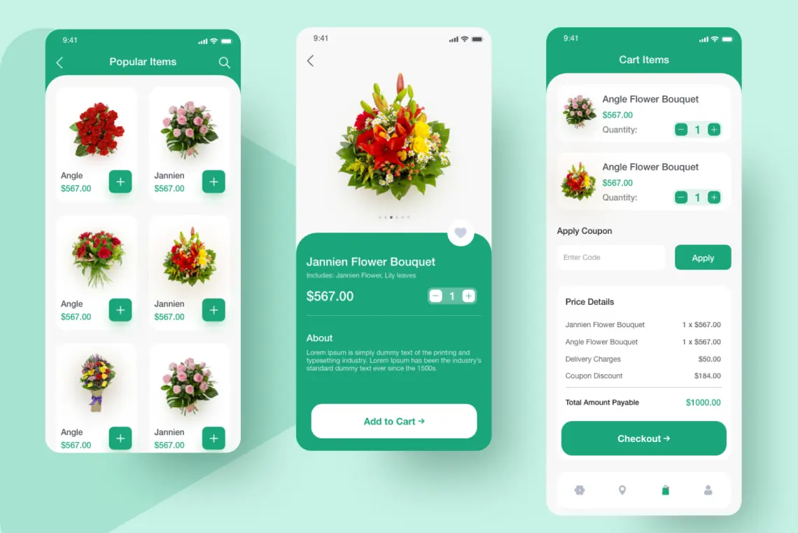
When designing buttons in mobile app design, it’s a must to ensure that users can easily interact with them and get a better experience.
To do so, you should design buttons and touch targets large enough to be easily tappable. A minimum touch target size of 44×44 pixels is recommended. Ensure sufficient spacing between touch elements to prevent accidental taps.
Your mobile button design should also provide immediate visual feedback (such as a color change or animation) when they are tapped on to confirm user actions.
Moreover, place frequently used buttons within easy reach, also consider one-handed phone use in your app design best practices.
6. Accept Familiarity
Execute standardisation, familiar icons and layouts in mobile design helps to eliminate users’ learning curve. Ensure that every UI element signifies its functions. For example, you can utilize an envelope symbol for triggering message sending and a phone symbol for the one-click call activity. In mobile UX designing do make sure to prioritize usability before creativity.
7. Keep a Constant Experience
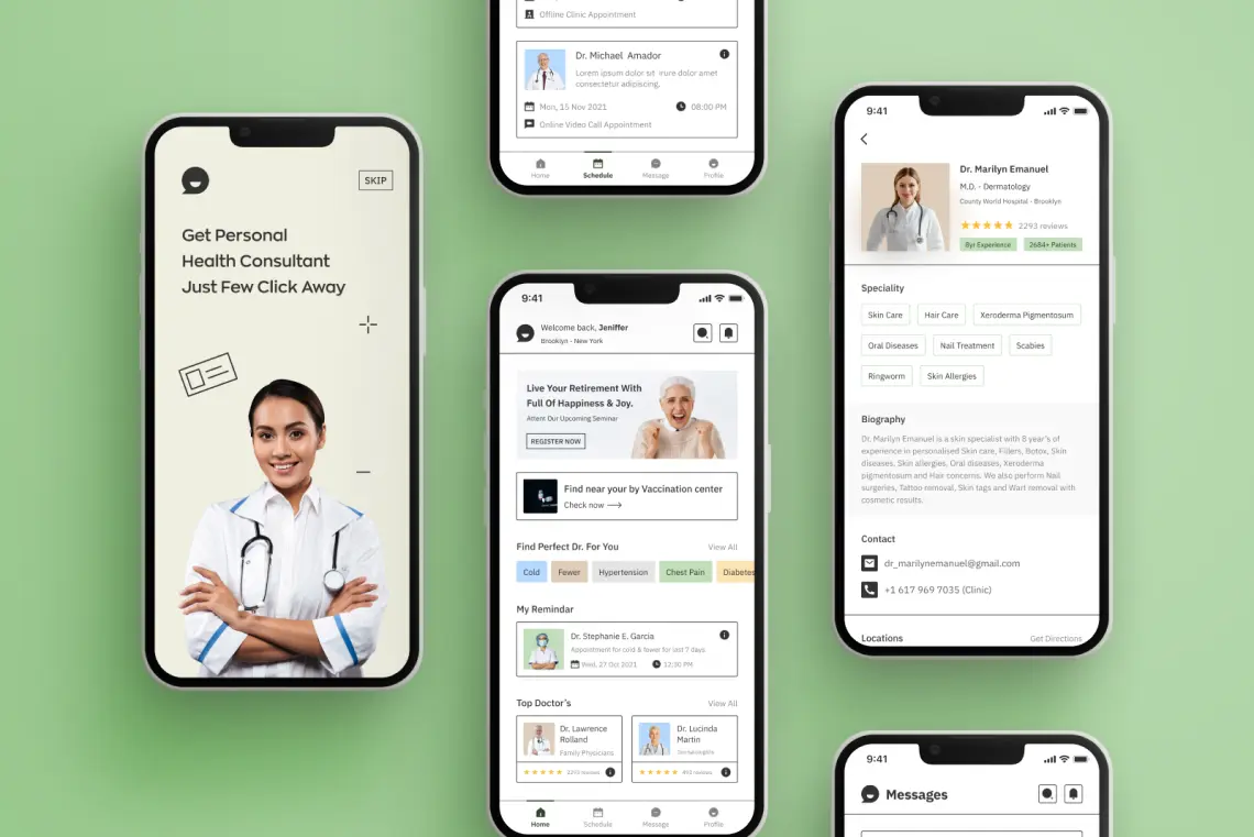
If your app is available on different platforms or has its web version, ensure users get a consistent, smooth experience. It must be worth comparing with other devices when somebody wants to shift, so it will not be difficult to suit.
Moreover, it makes your UX mobile design more noteworthy, as users become more familiar with it apart from the device.
8. Select the Right Font
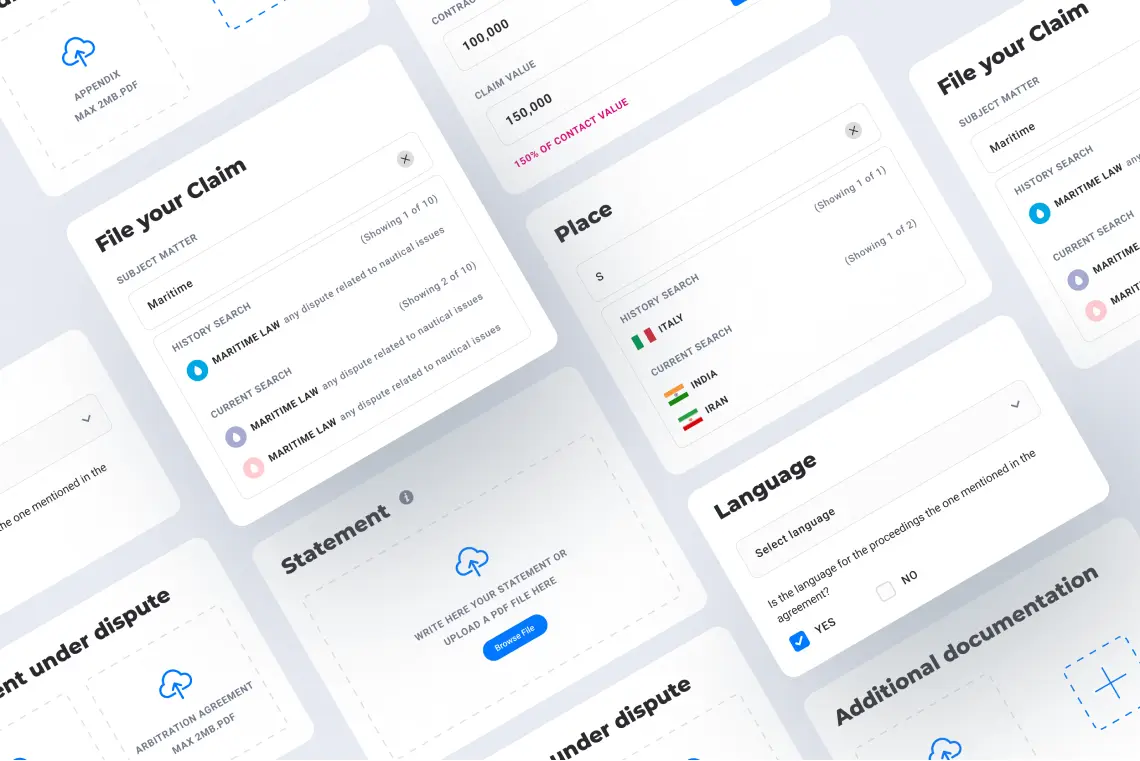
Selecting the right font is as crucial as building the visual components of your mobile app design solution. Picking the wrong fonts may make your mobile UX design look unappealing. Hence, opt for the font family that works perfectly in several weights and sizes and goes well with your mobile app design.
According to tech biggies like Apple and Google, you should keep the font size at 12 points. It helps users read the info on the screen without zooming in. Moreover, it helps them keep their device at a comfort-giving distance for viewing and better readability.
9. Prioritize User Feedback For People-Centric Mobile App Design
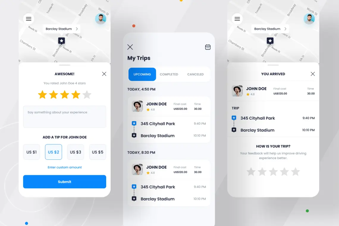
Your main purpose as a UI UX designer is to provide users with a good UX. And you can authenticate your ideas by encouraging users to provide feedback and use it to make iterative improvements in your mobile app design. Trustworthy feedback will help you decide what works for your app design and what does not.
This info will help you decide what to change in your app design. Applying analytics to your app will give all data to boost user experience effectively.
10. Enable Sufficient Spacing and Padding
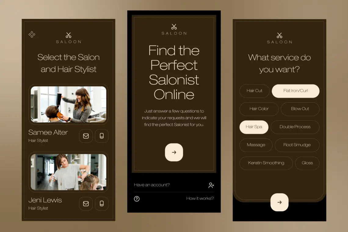
A small screen does not mean you need to use less space or smaller text. Prevent texts or other elements from overlapping. Increase element spacing or line height to boost legibility.
That’s where the concept of adding strategic whitespace or negative space comes in. Whitespace is a critical aspect of mobile app UX design that enhances readability and overall user experience.
Apart from that, you should prioritize content delivery over flashy design elements, while ensuring that content is easy to read and interact with. With padding and margin considerations, do consider proper typography and text hierarchy to enhance readability and make the screen design breathable.
11. Refrain from Random Color Options
A suitable color scheme may help you distinguish between your app and brand, which creates a durable impression on users.
Hence, your mobile app color palette selection is important. To do so, you must consider color palette selection criteria that align with mobile UX design best practices, ensuring a visually appealing and user-friendly design such as:
- Showcase your brand’s color palette
- Prioritize to design in grayscale
- Refrain from extra glowing or vibrant shades
- Do consider possible color blindness ratio
- Make sure the proper color contrast ratio
12. Study and Smartly Implement Gestures
Each mobile app design feature has its way of using it – and that way of using it is done by gestures. If there’s a button, you would want to tap or click on it in order to make it work like it is designed for. If there’s a payment process, you’d prefer to slide the button to make the payment on the selected payment type over tapping on the button and then enter details to complete the payment.
Nowadays, businesses prefer to design a mobile app UI in a way that helps users complete actions in a few steps. That’s where focusing on planning and implementing meaningful gestures helps you design an app that promises a good user experience.
What are the different types of gestures you can have for your app design?

- Double taps are mainly preferred for apps that ask users to like certain things.
- Long presses are implemented for users to know more about something in detail.
- Swipes (be it up, down, left, right) are used for multiple functions, such as Liking A Post/Profile (for social media, dating, matrimony sites, hotel, and travel booking apps), to move location pins or a direction of a device, or many other use cases.
There are many other gestures as well, which you should add to improve target users’ app navigation and usage experience.
13. Study HeatMaps If Redesigning Your Mobile App Interface
If your mobile app isn’t performing as expected in terms of user retention and conversion rate, it is time to consider a redesign following mobile UX design best practices. A highly effective practice in this scenario is studying your app’s heatmap.
Heatmaps provide valuable insights into user interactions, revealing where users tap on the screen and their touch behavior. This data allows you to personalize your app design and services, enhancing user experience based on their behaviors.
14. Consider UI Heuristics
UI heuristics are principles that guide the design process to create intuitive, user-friendly interfaces. Incorporating these principles can greatly enhance the usability and overall user experience of your app.
So, there are 10 UI heuristics which you should consider when designing UX for your mobile app:
- Design an application that gives users feedback on where they are and what’s happening within a duration of reasonable time.
- Keep UX design and content in a way that lets users connect with the system and real-world conventions.
- Keep UI and app navigation in a way that lets users Undo and Redo their actions.
- Design a consistent app interface to reduce the user learning curve
- Craft app design system by thinking of possibilities to avoid design error loopholes.
- Make objects, actions, and options visible to minimize the user’s memory load.
- Create a design with widgets that allow users to find shortcuts and accelerate their journey to their destination in an app.
- Keep the design clean and uncluttered, displaying only the necessary information.
- Use clear and concise error messages and graphics, suggesting constructive solutions.
- Provide easily accessible help and documentation to assist users in understanding and navigating the app.
15. Never Underestimate App User Onboarding Experience
Effective app onboarding can significantly enhance user experience and retention rates and add a solid first impression on UX by guiding users how to use the app.
As a part of mobile UX best practice, you should consider app onboarding screens designing best practices that creates AHA-moment and gives an effective learning experience through visuals and UX writing. It should also nicely visualize the way the app benefits users.
So, never underestimate app onboarding screen design as it lays the foundation for your app’s impression on users.
16. Design The App By Considering How People Hold Their Smartphones
People hold their smartphones in various ways to suit their convenience. Some prefer using one hand, while others opt for both hands. These differing approaches impact how they interact with mobile apps.
Users may engage with the app in several ways: cradling the phone, holding and touching it, using two hands in landscape mode, or holding it in portrait orientation. They might also alternate between using one hand and both hands, depending on the task at hand.
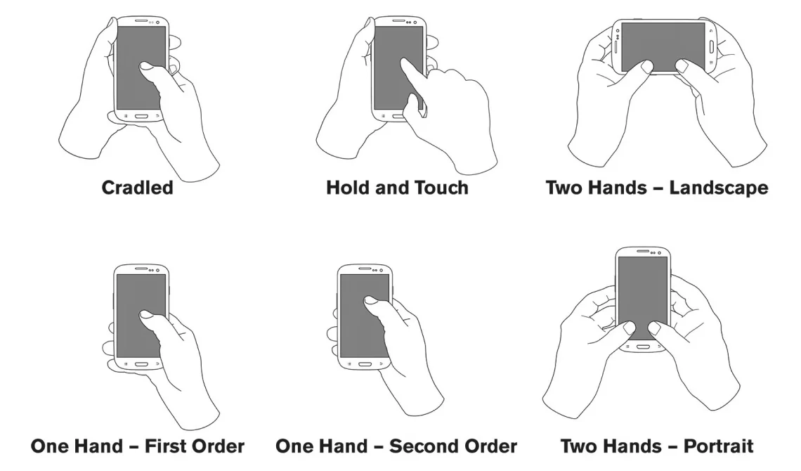
Additionally, optimizing app UX design with consideration for whether users will operate it single-handedly or with both hands is crucial. If you observe, around 72.56% of users use their smartphones with one hand only that too with their right hand and the remaining ones with their left hand. With increasing screen size, the accessibility of the app will also be at stake.
This worry also led many designers to analyze possible mobile app usage heatmaps to understand how users interact with the app based on their smartphone holding habits. This data-driven approach ensures a seamless and intuitive user experience for mobile apps.
This heat map illustrates the phone-holding habits of right-handed users, highlighting which areas of your app will be easily accessible for them. It’s essential to consider the app type, feature placement, and phone screen size in this analysis.
You should consider placing the important app menu, and features that need to be used frequently in the green zone only to ensure better app accessibility with one thumb.
17. Delight Users With Animation and Micro-Interaction
Delighting users with animation and micro-interactions involves integrating subtle, purposeful movements and responses within your app that enhance the user experience without overwhelming them.
- Use animation to provide immediate visual feedback on user actions, such as button presses, form submissions, or toggles.
- Implement engaging loading animations to keep users entertained while waiting for content to load.
- Utilize animations during the onboarding process to guide users through the app’s features in an engaging manner.
- Display progress bars or animations to show task completion, such as filling out a form or completing a level in a game, giving users a sense of accomplishment.
- Add hover effects on interactive elements to make the interface feel more dynamic and responsive.
- Use micro-interactions, such as swipe gestures or pull-to-refresh animations, to make interactions feel more intuitive and enjoyable.
18. Work Closely With Developers
This is the most underrated mobile UI best practice that often designers miss by not working closely with developers at the time of designing an app.
This synergy between UI UX designers and developers ensures that the app design concepts are not only visually appealing but also practical and implementable.
This interaction also gives developers a clear understanding of the desired user interactions and animations to avoid end-minute hurdles and mobile app design costs associated with it.

How MindInventory Can Help You Effectively Design Your Mobile App?
If you want to create a lasting impression on your app users, provide them with the best user experience by enhancing usability and design. It impacts the popularity of the app, the business’s success, and your profit as a whole.
To do so, you also need expert help! That’s where MindInventory comes in, allowing you to hire UI/UX designers who are trusted by top businesses like Tinder, I.AM+, AirAsia, and more.
So, want us to help you design your mobile app interface? Check out our UI/UX design services to know how we assist our customers and get a quote for your requirements.
FAQs About Mobile UX Design
Simplicity, clarity, responsiveness, accessibility, and usability are the key principles of mobile app UX design that ensure a positive user experience.
To enhance user-friendliness, focus on clear navigation, fast load times, touch-friendly interfaces, and consistent design elements. Regularly testing your app with real users can also provide valuable feedback for improvements.
Accessibility ensures that all users, including those with disabilities, can effectively use your app. This involves designing with consideration for screen readers, color contrast, and easy-to-use touch controls.
Common mobile app UI/UX design mistakes include cluttered interfaces, confusing navigation, non-responsive design, and ignoring user feedback. Avoiding these pitfalls can help create a more effective and enjoyable user experience.
Emerging mobile app UI/UX design trends include voice user interfaces/voice interactions, gesture-based navigation, and personalized experiences driven by AI. Staying updated with these trends can help you keep your design innovative and relevant.
