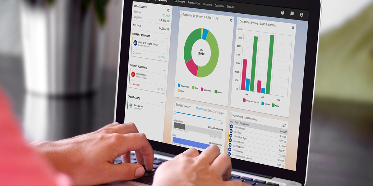
Best Practices for Dashboard Design
- UI/UX
- March 22, 2019
Building a perfect dashboard is anything but a cakewalk. It entails a great deal of meticulous planning and the right strategies to churn out an effective dashboard. Creating an effective dashboard design should be the culmination of a comprehensive Business Intelligence procedure, which includes collecting requirements, depicting KPIs and building a data model.
Primarily used for displaying the useful and crucial information or data in an application, the dashboards have become the integral parts of most of the mobile and web applications that we are using on a daily basis.
As mentioned earlier, the importance of an impeccably-built dashboard is paramount when it comes to conveying useful data and insights to the users. A poorly-built dashboard might fail to serve the purpose or even end up making the data or information less comprehensible than the original one.
But, how will you decide whether a dashboard is up to the mark, in regards to its functionality or performance? Well, an ideal dashboard should be able to..
- Simplify the complexities like meeting the different analytical needs of those data or information that are always changing
- Connect different data to its context in a business and to resolve the queries of the users
- Represent all the information or data impeccably, thus helping the users extract the piece of info that they are looking for
- Aid the users to tap into a more granular view of different data or information
It is needless to say that every dashboard has its own share of requisites, restrictions, and goals. However, there are some specific guidelines that should be abode by those who are looking to reach the peak of perfection in regards to designing dashboards.
Read also: Top UI Trends to Get Your App Ready for 2024
The Best of Dashboard Design Practices
Follow the “Five Second Rule”
A standard dashboard should be as quick as a whip, when it comes to providing the users with relevant data or information. A dashboard, which is capable of resolving the most frequently asked business queries within a narrow window of time, could be deemed as the most ideal one.
Anyone who is designing a dashboard should bear this fact in mind. A time span of five seconds is actually the standard amount of time that most of the users would prefer spending to find any data or information.
Significant Insights Should be Displayed
Ideally, the most significant insights should be displayed in the top section of a dashboard. The middle section of it should be comprised of the trends and the bottom parts must be dedicated to the granular details. One of the most useful principles of organizing details in a dashboard is by following the format of ‘inverted pyramid’.
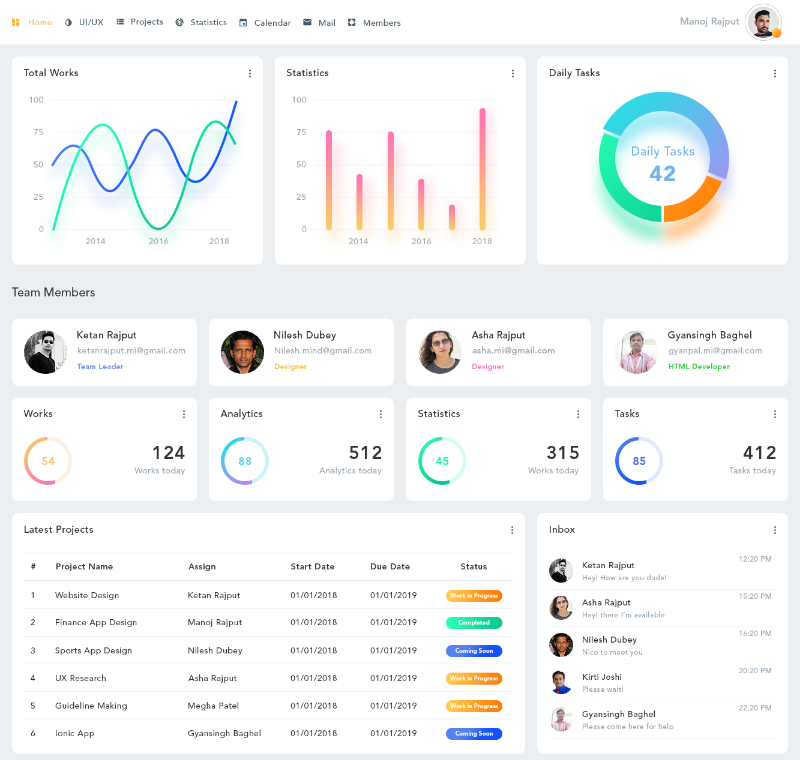 Source: Project management dashboard design
Originated from the field of journalism, the concept of inverted pyramid dissects different parts of a news report into three sections. As per the rules of the inverted pyramid, the most substantial news section goes at the top, while the lesser important facts remain in the middle section, and the least important section stays at the bottom.
Minimalism is the Key
Every dashboard should not contain more than 9 visualizations. Hence, there is no need to cram a dashboard with truckloads of details. According to cognitive psychology, a human brain is capable of comprehending only a limited amount of data.
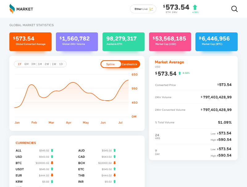
Source: Market dashboard design
This is the reason why one should allow a very specific amount of items that he/she wants in the dashboard. A lot of clutter or an overdose of visual noise does nothing but to detract a dashboard from its original purpose.
Understand the Users’ Needs
Almost half the battle could be done when you will gather at least a superficial level of understanding of what your users want to know from your dashboard.
Jot down a minimum five to six takeaways that you expect your intended users to look for in your dashboard. Depending on this understanding, you should construct your dashboard page.
Responsive Dashboard is the Chart-Topper
By including a responsive design to your dashboard, you can enable your users to determine which data they should pay attention to. A clutter-free design and an understandable UI are the keys to an impressive responsive design of a dashboard.
Also, the users should be able to control the data they would like to have on the front and at the center of a dashboard.
Good Dashboards Must be in Sync With Key Data
There are reasons galore to fall for those dashboards, which emphasizes cutting the bunk and leading with bold and big numbers. Such dashboards serve the way as they are communicating with the users very confidently and decisively. Such dashboards should be coupled with a clutter-free and modern design to reach the crescendo of perfection.
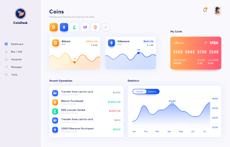 Source: Coindesk Dashboard
Make sure to include an ample amount of white spaces and bold takeaway data in your dashboard. By presenting data in this manner, you can allow your users to find important information without any hassle. This will save the users’ time and leave a good impression on them.
Information Architecture is Crucial
While designing a dashboard, ensure that you put an emphasis on the principles of data architecture as well as hierarchy, especially when you are on the process of deciding which cards to represent and in which positions they will be laid out.
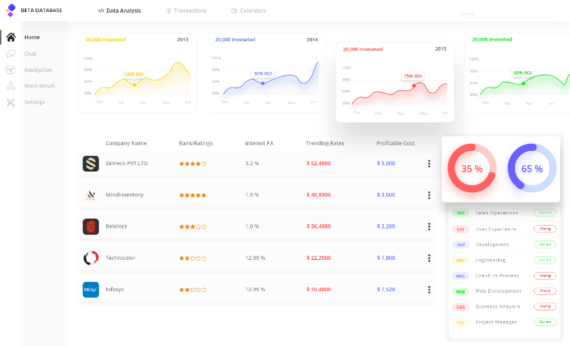
Source: Dashboard Design
Even though every element seems to be important distinctively, a few cards will always be more important than others. Strike a balance when you will put out or position the cards. After all, it is the bottom section, which counts the utmost.
Keep Things as Light as Possible
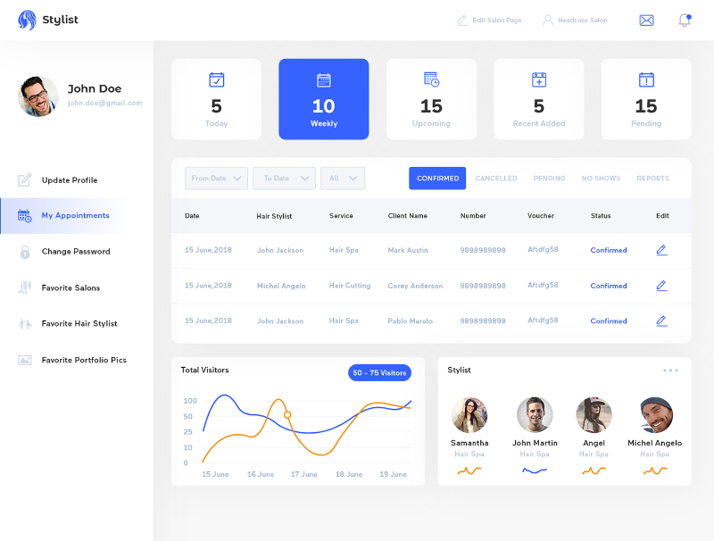
Source: Hair stylist dashboard
An ideal dashboard must be able to use different viewpoints for keeping the prime views in a simplistic manner. For an instance, you might filter different data by date, represent the relevant information about your services in a way that the users can access them easily, and acquire payment updates; all while keeping up with a clutter-free as well as a simple look.
No matter what, you must strive to include all the relevant information in just one screen for the sake of your users’ convenience.
Pay a Heed to a Dashboard’s Aesthetics
In a society that predominantly judges a book by its cover, it’s important that you pay adequate attention to the aesthetics of a dashboard as well. Just because a dashboard is supposed to include data views, it does not mean that it cannot have a visually-appealing look.
With the inclusion of clear visibility, easy navigation and the right pop of colors, you can churn out a brilliant-looking dashboard.
It’s Time for a Quick Wrap
Whether you are looking to build a new dashboard, or intended to revamp the user experience of the existing one, the aforementioned practices will help come up with a unique, user-friendly and praise-worthy dashboard.
An ideal dashboard must be able to convey the most relevant data or information to your intended users, albeit without squandering their time or sapping their energy. It must be structured in a way that it can reflect the relevant information hierarchy, offering the users adequate ways to rummage through the data whenever they feel the need of doing so.
If you are skeptical about your own prowess, you may consider hiring the right UI/UX designers, who have enough expertise to churn out the best of dashboards.
